Quick answer: A speaker one sheet is a single page (usually a PDF) that tells an event planner who you are, what you speak about, who it’s for and how to book you. Include a headline, a headshot and a stage photo, two to four talk titles with outcomes, a short bio, two or three testimonials and booking details.
A speaker one sheet gets about as much attention as a résumé in a stack of two hundred. The planner opens it, scans the top third, and decides whether to forward it to the committee. That’s the whole game.
I design speaker websites, LinkedIn profiles and brand materials for consultants who speak, and the one sheet is the piece most of them have either never made or made once in 2019 and forgot about. This guide breaks the page down section by section, explains when a web version beats the PDF, and shows how the one sheet should connect to your speaker website so the two never contradict each other.
Key takeaways
- Planners scan, they don’t read. The top third of your one sheet has to carry your headline, photo and topics.
- Two to four talk titles is the sweet spot. More than that makes you look unfocused.
- Keep a PDF for email and print, plus a web version on your site for anyone who clicks a link.
- Make a second, unbranded version with no direct contact details for speaker bureaus.
What a speaker one sheet is for
Think about where the sheet actually goes. You send it to a conference organizer. She forwards it to a program committee of six people, most of whom will never visit your website. Someone prints it for a meeting. A bureau agent attaches it to a proposal for a corporate client.
So the one sheet has to stand on its own. No context, no cover email, no you in the room to explain. If a committee member who has never heard of you can’t tell in a few seconds what you talk about and why their audience should care, the sheet failed.
It’s also different from a speaker media kit. A media kit is a bundle: bios in several lengths, a folder of photos, logos, sample questions for interviewers. The one sheet is the summary that sits on top of all that. Some speakers call the whole bundle a press kit and the one sheet its cover page. The names matter less than having both.
Speaker one sheet anatomy, section by section
Here’s the layout I recommend, top to bottom, with the job each section does. Most good speaker one sheet examples follow something close to this, even when the design looks very different.
| Section | What goes in it | What usually goes wrong |
|---|---|---|
| Name and headline | Your name and one line naming your topic and audience | A vague tagline like “Inspiring Change” |
| Photos | A headshot plus one photo of you on stage with an audience visible | Only a headshot, so you don’t look like a speaker |
| Talk titles | Two to four titles, each with a one line outcome | Seven topics with no outcomes |
| Short bio | Three to five sentences about why you’re qualified | A life story that starts with childhood |
| Proof | Two or three testimonials from organizers, plus a few past events or client logos | Quotes from friends with no names or titles |
| Formats | Keynote, workshop, panel, virtual; typical lengths | Missing entirely |
| Booking | Website, email, phone or booking link, plus a QR code for print | A gmail address in small grey type |
The headline
This is the part most speakers skip, and it’s the part planners read first. Write it as a promise to the audience, not a description of you. “Workplace violence prevention for HR leaders and executives” tells a planner instantly whether you fit their event. “Speaker, Author, Thought Leader” tells them nothing.
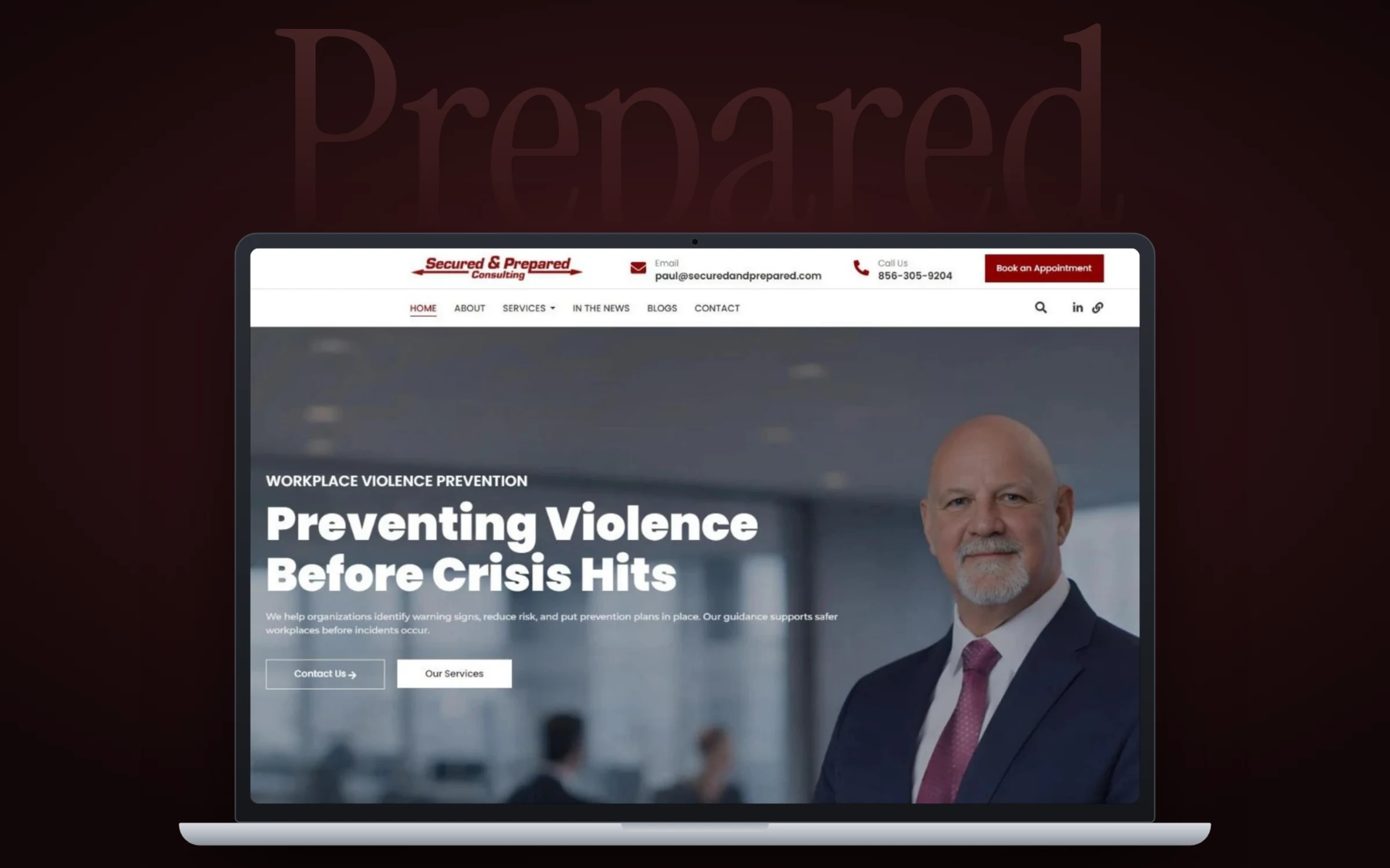
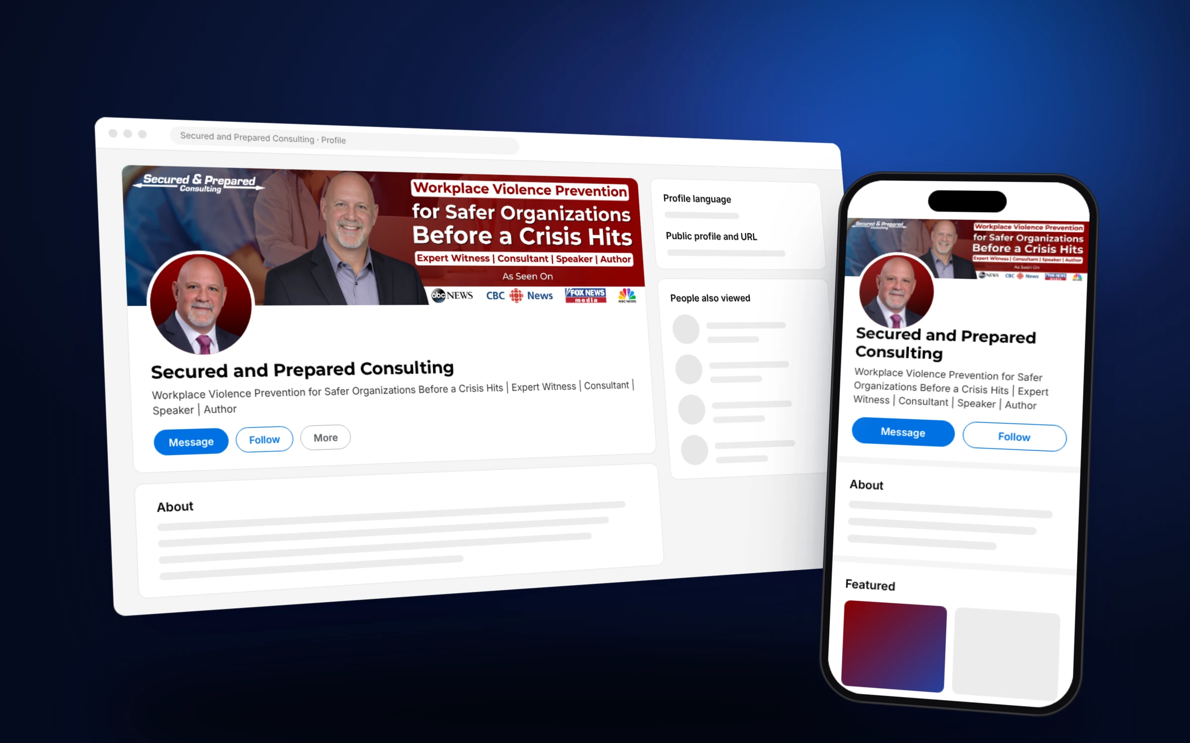
When we designed the LinkedIn banner for Secured and Prepared Consulting, the top line was “Workplace Violence Prevention” with the promise “Safer Organizations Before a Crisis Hits” right beside it, then a slim line listing four roles: expert witness, consultant, speaker and author. That same order (topic, promise, roles) works on a one sheet.
Photos
Use two. A clean, recent headshot, and a stage shot where you can see an audience. The stage photo is the one that does the selling, because it proves you’ve done this before. If you don’t have one yet, book a friend with a decent camera at your next talk. Our professional headshot tips cover lighting, wardrobe and framing.
Talk titles and outcomes
Each talk gets a title and one sentence about what the audience walks away with. Planners have to justify their choices to a committee, and outcomes give them the words to do it. A keynote speaker one sheet with one signature talk is perfectly fine. Four is the ceiling.
Bio and proof
Keep the bio short and specific: years in the field, the credential that matters most, a book if you have one. Then let other people talk. Testimonials from event organizers carry more weight than anything you say about yourself, so put a name and title on every quote. A row of past events or organizations underneath does the same job visually.
Stacey D. Porter of Porter Global Security is a good example of proof that’s easy to borrow. On the Porter Global Security website we built a “Trusted in the Field” gallery with speaking photos from Mount Aloysius College and the Atlanta Black Chambers, next to a stats bar with his years at Homeland Security and the number of assessments he has completed. Those same photos and numbers drop straight onto a one sheet.
Speaker one sheet template: a layout you can copy
You don’t need a fancy speaker one sheet template. You need a simple grid and discipline about what goes where. On a standard US Letter or A4 page:
- Top band (about a third of the page): name, headline, headshot on one side, stage photo on the other.
- Middle left: talk titles with outcomes.
- Middle right: short bio and formats.
- Lower band: testimonials and a row of past events or logos.
- Footer strip: website, email, phone, QR code to your booking page.
For speaker sheet design, stick to your brand colors and fonts (if you don’t have them written down, our guide to a brand style guide helps). Use real text, not text baked into an image, so the PDF is searchable and screen readers can read it. Leave white space. A crowded page reads as desperate.
Canva templates are a fine starting point for drafting. The trouble is that thousands of speakers use the same ones, so planners see the same layout over and over. Swap in your own colors, fonts and photos at the very least.
PDF or web page? Use both
The PDF is for email attachments, printed committee packets and bureau proposals. It should be small enough to email (aim for under a couple of megabytes) and named sensibly: firstname lastname speaker one sheet.pdf, not final_v7.pdf.
The web version lives on your site, usually as a “Speaking” or “Book me” page. It does things the PDF can’t: plays your demo video, updates instantly when you add a testimonial, and shows up in search when a planner Googles your name. It also lets you see in analytics who is looking.
My rule is simple. The web page is the master copy. The PDF is exported from the same content whenever it changes. That way your one sheet, your website and your LinkedIn profile always say the same thing, and a planner who checks all three sees one consistent person.
How to make a speaker one sheet in an afternoon
If you already have photos and a few testimonials, this is a half day job:
- 01
Write the headline first
One line naming your topic and your audience. Test it on someone outside your field: can they repeat it back?
- 02
Pick two to four talks
Give each a title and a single sentence about what the audience walks away with.
- 03
Gather proof
Choose two or three organizer testimonials with names and titles, plus a short list of past events.
- 04
Choose photos
One recent headshot and one stage shot with the audience visible.
- 05
Lay it out
Use the grid above, your brand colors and readable type. Keep the top third doing most of the work.
- 06
Make two versions
One with your contact details, one unbranded for bureaus with no direct email or phone.
- 07
Publish and link it
Add the PDF and the web version to your speaker page, your LinkedIn Featured section and your email signature.
Frequently asked questions
What should be on a speaker one sheet?
A headline naming your topic and audience, a headshot and a stage photo, two to four talk titles with outcomes, a short bio, two or three testimonials, available formats and clear booking details.
How long should a speaker one sheet be?
One page. Front and back is acceptable if you need room for more testimonials or a second talk, but planners rarely read past the first side.
Do I need a speaker one sheet if I have a website?
Yes. Committees and bureaus pass around files, not links, and many members will never visit your site. Keep both, with the website as the master copy.
What is the difference between a one sheet and a speaker media kit?
The one sheet is a single page summary for planners. A speaker media kit is the full bundle: bios in several lengths, a photo folder, logos and sample interview questions.
Should I put my speaking fee on my one sheet?
Most speakers don't. Fees change and depend on travel and format. Say fees are available on request and move the conversation to a call.
Can I use a Canva speaker one sheet template?
For a first draft, sure. Replace the default fonts, colors and layout with your own brand so your sheet doesn't look like the last five a planner received.
One page, many jobs
A good speaker one sheet travels further than you do. It lands in inboxes you’ll never see and gets printed for meetings you’ll never attend, so every line on it should be something you’d be happy to have read without you there to explain it.
If you’d like a one sheet, speaker page and LinkedIn profile that all match, take a look at our brand identity design service, or contact us and we’ll talk through what you have and what’s missing.