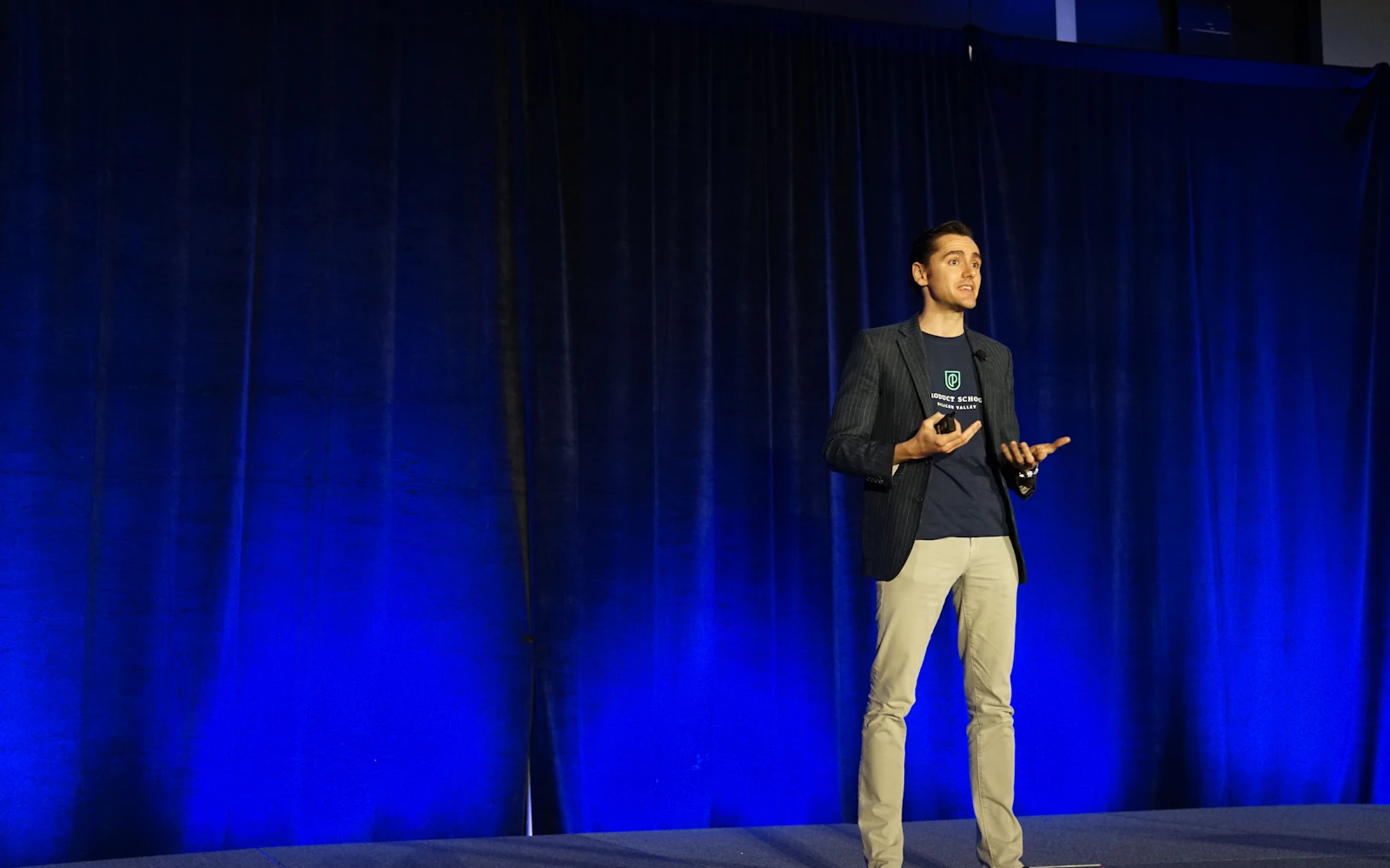
Speaker website design is not about looking impressive. It is about making it easy for one stressed person to say yes to you. Picture an event planner for a regional association conference. She has a theme, a date, a budget approved by her board and a shortlist of five keynote speakers from a bureau and a colleague. She has maybe twenty minutes to narrow it to two.
She opens five sites. On two of them she can’t find a video without clicking around. One has a beautiful homepage and no way to check availability. One has a reel, clear topics, a downloadable one sheet and a short booking form. You already know which one ends up on the call with her committee.
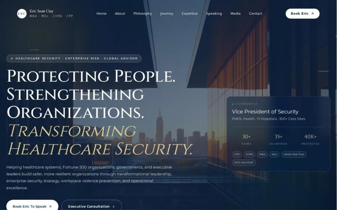
We have built sites for speakers and trainers, including ericseanclay.com, bethjsanborn.com and ballingerandassociates.com, and I have learned that the planner’s checklist is surprisingly consistent. Here is what goes into good speaker website design, page by page, and why each piece matters to the people who actually book you.
- Good speaker website design puts your reel, your topics and a way to book you within one click of the homepage.
- Event planners and bureaus need specific assets: a one sheet, photos, bios in several lengths and a media kit.
- Testimonials from event organizers carry more weight than any line you write about yourself, so start collecting them now.
- In speaker website design, a short availability form beats a generic contact page every time.
- Speed, mobile layout and captions on video are part of the design, not extras.
What event planners need from speaker website design
Planners are not fans. They are buyers with a lot riding on one decision. If the keynote falls flat, it is their name on the event. So when they visit your site, they are trying to answer a few practical questions quickly.
- Can this person hold a room? (They want to see you on stage.)
- Does their talk fit our theme and audience?
- Have other organizers like me been happy?
- Are they available on our date?
- Can I easily get what I need to pitch them to my committee?
Everything in speaker website design should serve those five questions. If a section doesn’t help answer one of them, it probably belongs further down the page or not at all.
Common speaker website design mistakes
- A homepage that opens with a long personal story instead of the reel.
- One “Speaking” page that lumps every talk together.
- No date on testimonials, so planners can’t tell if they are recent.
- A contact page with only an email address.
- Photos from ten years ago that no longer look like you.
Each of these is easy to fix, and fixing them usually does more for bookings than a new color scheme. When we review speaker website design for a new client, this is the list we check first.
The other audience: speaker bureaus
Bureaus review a lot of speakers and send links to their own clients. They want clean, unbranded assets they can pass along, and they need to trust that your site won’t pull their client away to book you directly. We’ll come back to this below, because it shapes a few design choices.
1. Put the speaker reel first in your speaker website design
Your reel is the most important part of speaker website design. A planner wants to see you on a real stage, with a real audience, before anything else. Put it near the top of the homepage and on every topic page where it fits.
Keep the main reel short, roughly two to three minutes, and lead with your strongest moment. Show audience reactions. Add captions, because many people watch on mute in an office. Then offer a longer clip of a full segment for planners who want more. Good speaker website design gives both, without making anyone hunt.
Reel tips from the build side
- Host video on YouTube or Vimeo and embed it, rather than uploading large files to your own server.
- Use a clear thumbnail of you speaking, not a title card.
- Don’t auto play with sound. It annoys people and many browsers block it anyway.
- If you don’t have pro footage yet, a well lit phone recording from a real event is better than nothing.
2. Topic pages for each keynote
Planners book a talk, not just a person. Each keynote or workshop you offer deserves its own page with a clear title, a short description, who it is for, what the audience will take away, the formats available (keynote, breakout, half day workshop, virtual) and a short clip if you have one.
This is also where speaker website design meets search. A planner looking for a “workplace resilience keynote” or “school safety speaker” is typing a topic, not your name. Separate topic pages give Google something specific to match. Our SEO services often start right here for speakers.

How to write a topic page planners can reuse
Write the description so a planner can copy it straight into their program or their email to the committee. Keep it to two short paragraphs, then three to five bullet takeaways. Planners love text they can reuse without rewriting, and that small favor gets you remembered.
3. Testimonials from event organizers
A planner trusts another planner. A short line from a conference director that says the audience was engaged and the speaker was easy to work with is worth more than any adjective you can write about yourself. In speaker website design, borrowed credibility beats self praise every time.
If you don’t have these yet, start collecting them now. After every event, send a short thank you email to the organizer and ask if they would share a sentence or two about the experience, and whether you can use it with their name, title and organization. Make it easy: suggest they mention the audience, the talk and what it was like working with you. Never invent or polish a quote beyond what they actually said.
Your best sales page is a sentence written by the last planner who booked you.
Where testimonials go in speaker website design
Put one or two strong organizer quotes on the homepage, near the reel. Put topic specific quotes on each topic page. Keep a full page of them for planners who want to read more. Photos and full names make them believable, and an organization name makes them useful.
4. A one sheet download
The one sheet is a single page PDF that sums up who you are, your topics, a short bio, a photo, a few testimonials and how to book you. Planners print it, attach it to emails and drop it into committee decks. It is often the thing that actually gets passed around inside an organization.
In your speaker website design, make it one click from the homepage and from every topic page. Design it to match your site, so it looks like part of the same brand. We often create one sheets alongside the site as part of brand identity design, which keeps fonts, colors and photo style consistent everywhere.
Quick tip: Make a second version of your one sheet with no direct contact details, so bureaus can share it with their clients. It is a small courtesy that bureaus notice.
5. An availability and booking form
A generic “contact me” page makes planners do extra work. A short booking inquiry form does the opposite. Ask for the event name, date, location or virtual, expected audience size, the topic they are interested in, the format and a way to reach them.
That form tells you right away if the date works and if the fit is right. It also tells the planner you run a professional practice. Of every piece of speaker website design, the form is the one people neglect most. On sites we have built, a clear form with a short confirmation message (“Thanks, we’ll reply within two business days”) sets expectations and cuts down on follow up emails.

About fees on a speaker site
Many speakers prefer to share fees on request or through their bureau, since they vary by format, travel and date. That is a fine choice. If you do want to filter inquiries, a simple note such as “fee details are shared once we confirm availability” keeps things clear without posting numbers.
6. A media kit for the marketing team
Once you are booked, the planner hands you off to someone else: the marketing coordinator promoting the event. They need assets fast, and they will judge your professionalism by how easy you make it.
In speaker website design, a good media kit page includes high resolution headshots, action shots on stage, your bio in a few lengths, your talk descriptions, your logo if you have one, social media handles and a short intro the emcee can read. Everything should download without needing a login or an email back and forth.
Bios in three lengths
- A one sentence bio for social posts and program listings.
- A short paragraph bio for event pages.
- A longer bio of a few paragraphs for the full program or press.
Write them once, keep them updated and make sure your LinkedIn says the same thing. Our LinkedIn profile optimization work with speakers usually starts from these bios. Consistent bios across your site, LinkedIn and bureau listings are a quiet part of strong speaker website design.
Want a speaker site that makes booking you easy?We design speaker websites around your reel, your topics and the assets planners ask for.
7. Client logos and past events
A row of logos from organizations you have spoken for gives planners instant context. They see that a peer association, a school district or a company like theirs trusted you. That is social proof in its simplest form, and speaker website design should show it early.
Ask permission before using logos where you can, and keep the row tidy: one consistent size, grayscale or one color treatment, no clutter. Then add a past events page listing event names, dates and locations. It shows you are active and gives planners another way to find a peer they can call for a reference.
8. Professional photos in several formats
Photos sell you before the video even loads. Good speaker website design uses a mix: a warm headshot, wide shots of you on stage with the audience visible, and a few candid shots of you talking with attendees afterward. Those last ones say “approachable,” which planners care about more than speakers think.
Offer photos in both horizontal and vertical crops, since event marketers need both for web banners and social posts. Avoid heavy filters. You want the photos to match how you actually look when you walk on stage.
Plan the photo shoot around the site
If you are booking a photographer, bring a shot list built from your speaker website design: a wide homepage banner with space for text, vertical shots for mobile, close ups for topic pages and a few relaxed portraits for the About page. Ask the event organizer in advance if a photographer can capture you on stage. One planned session can cover your site, your one sheet and your media kit for a couple of years.
9. Make speaker website design work for bureaus
If you work with bureaus, your site needs to show you respect their role. That means a clear note that bureau inquiries are welcome, a bureau friendly version of your one sheet and an easy way to request a private video link if a bureau wants to show a full talk to its client.
Some speakers create a simple “for bureaus” page with all of this in one place. It is a small addition that makes bureaus more comfortable recommending you, which is the whole point.
10. Fast, mobile friendly and accessible
Planners often look at sites on their phones between meetings or on the way to a site visit. If your site is slow or clumsy on mobile, you lose them. Mobile layout is where a lot of speaker website design quietly falls apart. Video heavy speaker sites are especially prone to this, so we compress images, lazy load embeds and keep the homepage lean. Google’s page experience guidance on web.dev is a good benchmark for speed.
Accessibility matters as well. Caption your videos, use real text instead of text inside images, keep color contrast strong and make sure the booking form works with a keyboard. The W3C’s WCAG guidelines lay out the standard. Plenty of event organizers care about accessibility themselves, so it reflects well on you.
Keep your speaker website design fresh
Speaker sites get stale fast. New talks, new photos, new testimonials, outdated past events. Broken video embeds are common too. Our WordPress maintenance services keep your site updated and secure so it doesn’t quietly fall behind your career.
11. Plan speaker website design around the people who book you
Different people use your site for different jobs. Planning the pages around them is the simplest way to make sure nothing important gets missed. The Nielsen Norman Group has written a lot about designing around real user tasks, and it applies here perfectly.
| Who visits | What they need | Where it lives on the site |
|---|---|---|
| Event planner | Reel, topics, organizer testimonials, availability | Homepage, topic pages, booking form |
| Selection committee | One sheet, short bio, video link | One sheet download, topic pages |
| Speaker bureau | Unbranded one sheet, full talk video, clear bureau policy | For bureaus page, media kit |
| Event marketing team | Photos, bios in three lengths, logo, social handles | Media kit page |
| Emcee or host | A short intro to read on stage | Media kit page |
| Attendees after the talk | Slides, resources, your newsletter or book | Resources page |
That last row is easy to forget. After a good keynote, people look you up. A simple resources page with slides or a checklist from the talk turns that interest into a connection, and sometimes into the next booking. You can read more about building that kind of presence in our post on personal branding for consultants.
Frequently asked questions
What is the most important part of speaker website design?
Your speaker reel. Every other part of speaker website design supports it. Planners want to see you on a real stage before anything else. Put it near the top of the homepage and make it easy to watch on any device.
Should a speaker website list speaking fees?
Many speakers prefer to share fees on request or through their bureau, since fees vary by format, travel and date. A short note explaining how fee details are shared is usually enough.
How many pages does speaker website design need?
A solid speaker site usually has a homepage, an about page, one page per topic, testimonials, a media kit, a booking form and a resources page. Some speakers add a page for bureaus and a past events page.
What if I don’t have testimonials or a reel yet?
Start collecting both now. Ask organizers for a sentence after every event and record every talk you give, even on a phone. A simple site can launch first and grow as your assets do.
Can you redesign my existing speaker site?
Yes. We work on WordPress, Webflow, Squarespace, Wix and other platforms. We usually start by reviewing your current speaker website design against what planners need, then decide whether a refresh or a rebuild makes more sense. Cost depends on scope, so a quick call is the best first step.
Let’s get you booked
Great speaker website design doesn’t try to dazzle. It respects the planner’s time. Reel up front, clear topics, real testimonials, a one sheet to share and a form that makes booking you feel easy. Get those right and the rest is polish.
Design Fly 24 is a New York agency working with speakers, trainers and consultants across the US. Take a look at our work, read about our website design services, or book a free call and we’ll talk through what your speaker website design needs to win more stages.