

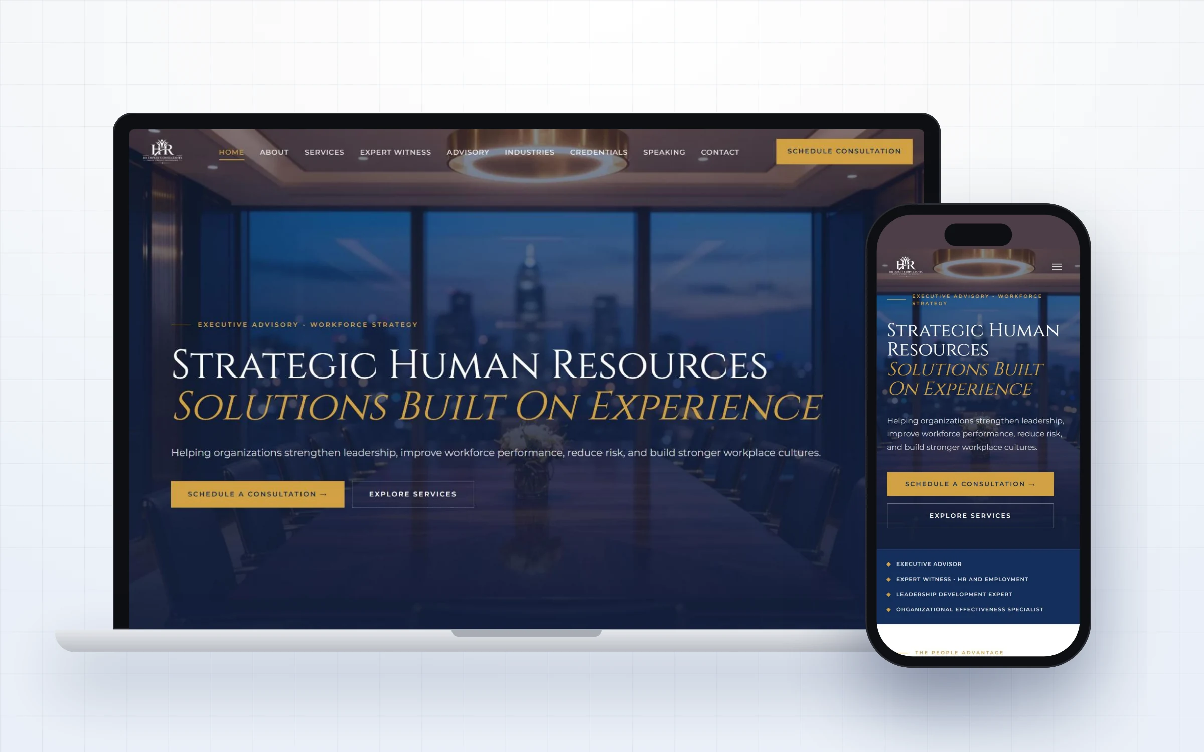
Explore our HR consultant website design for David Morris of HR Expert Consultants, a premium site built for executives, boards and attorneys.
Read the case study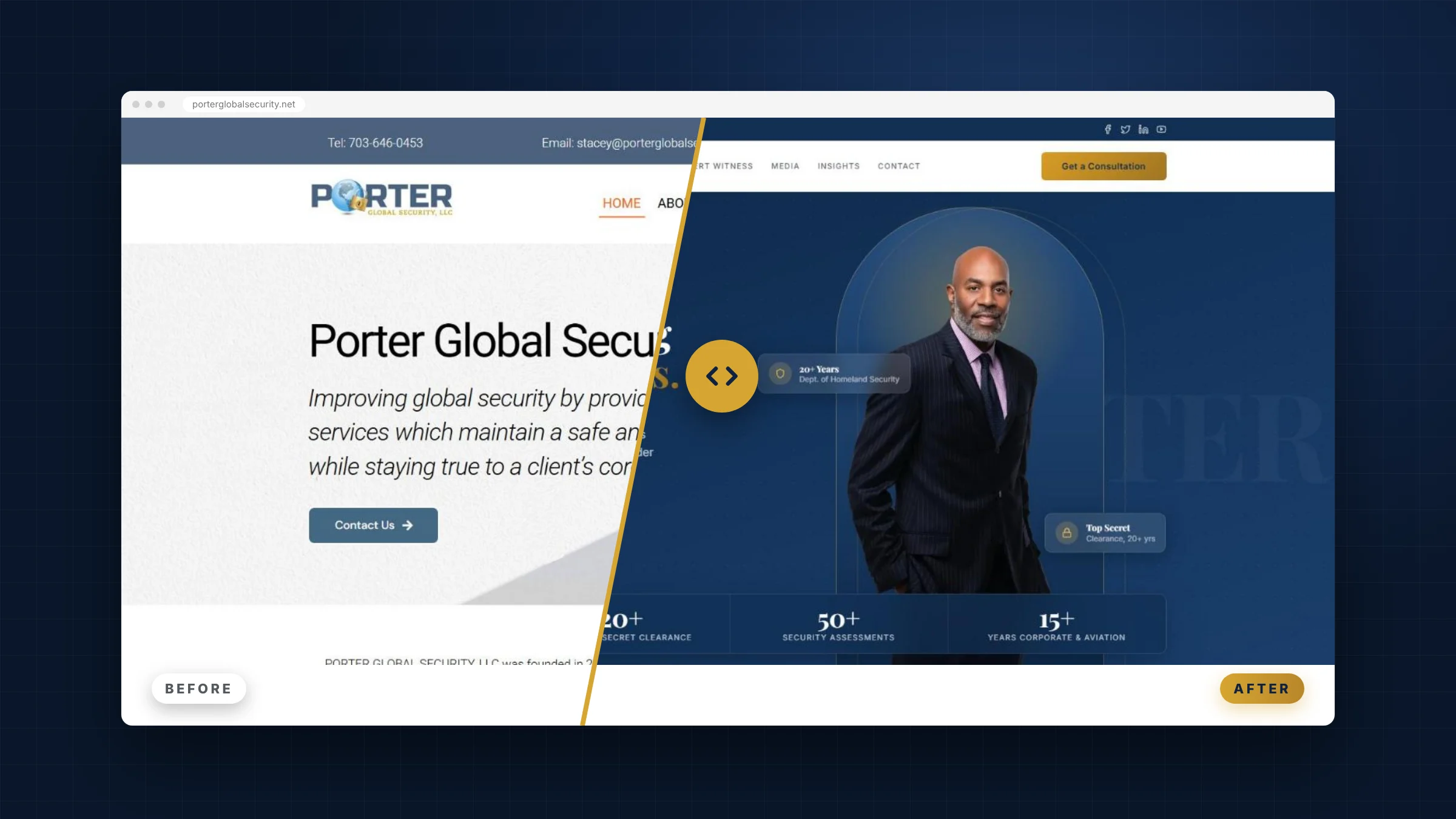
See the before and after of our security consultant website redesign for a former Homeland Security leader with 20+ years of federal experience.
Read case study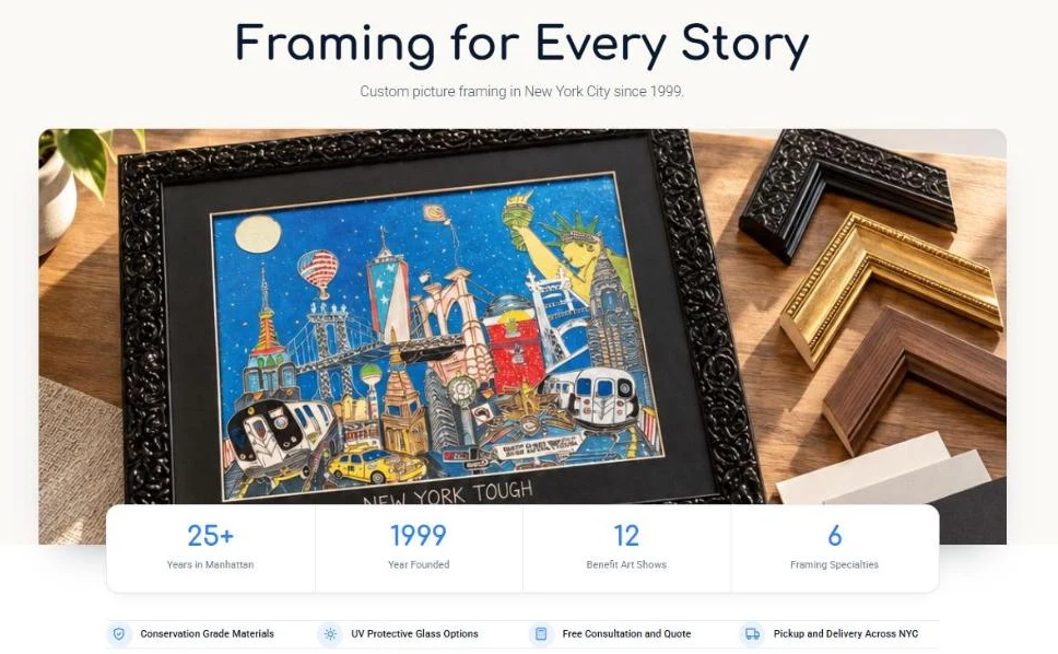
See how our frame shop website design, Google Ads and search work gave a 1999 Manhattan framer a Grade A site, $6.82 conversions and a 4.9 star profile.
Read case study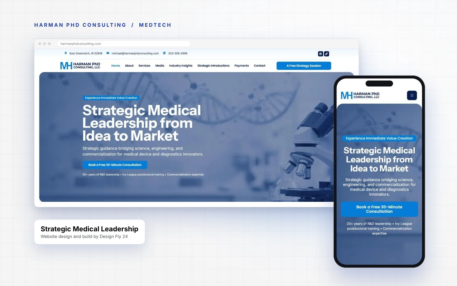
See how our MedTech consultant website design gave a PhD advisor a clear, credible site with credentials up front, structured proof and easy booking.
Read case study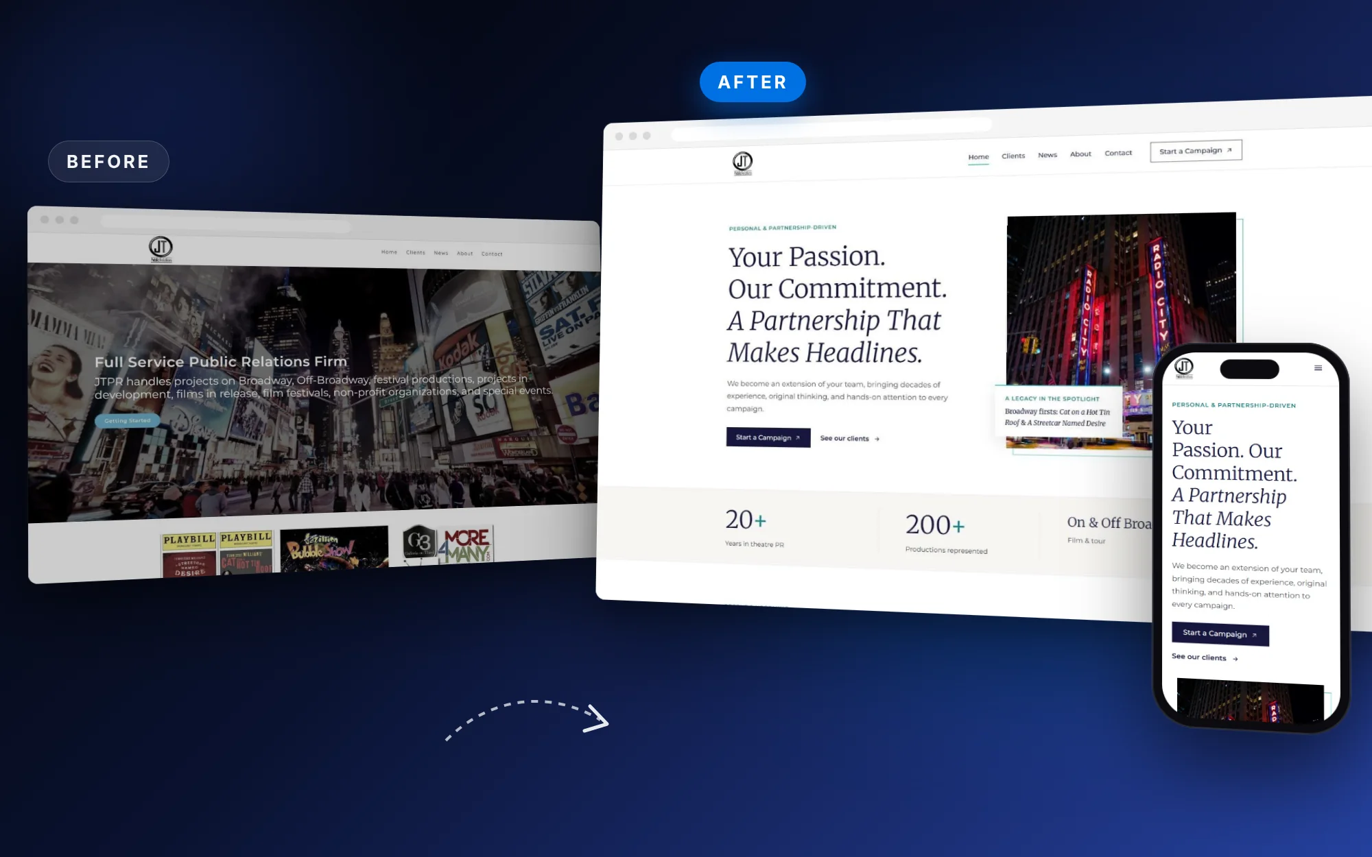
See how our public relations website design took a Broadway PR firm from a dated homepage to an editorial site that shows real productions and makes it easy to start a campaign.
Read case study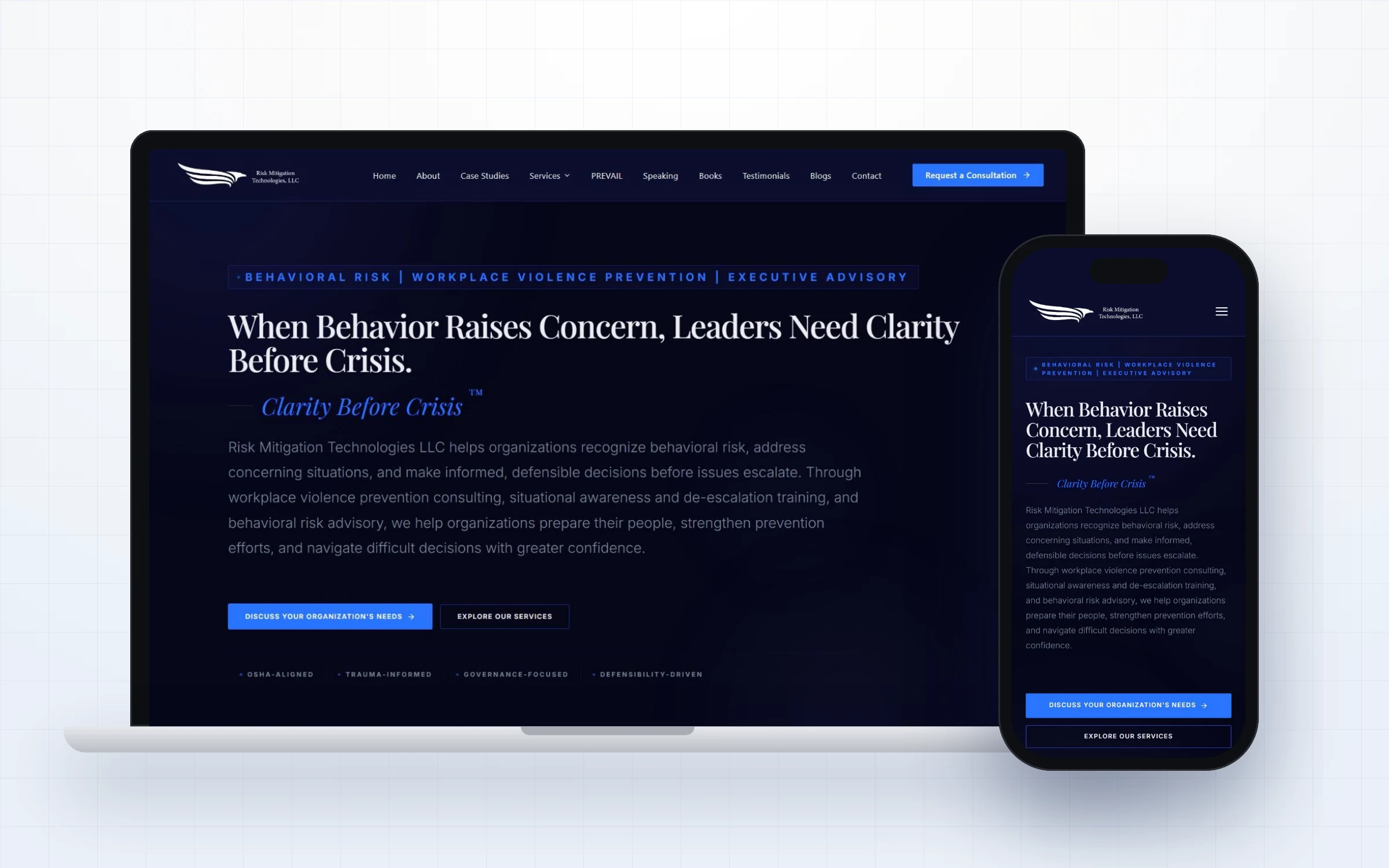
See how our threat assessment website design gave Risk Mitigation Technologies a calm, credible site that turns executives into confidential consultations.
Read case study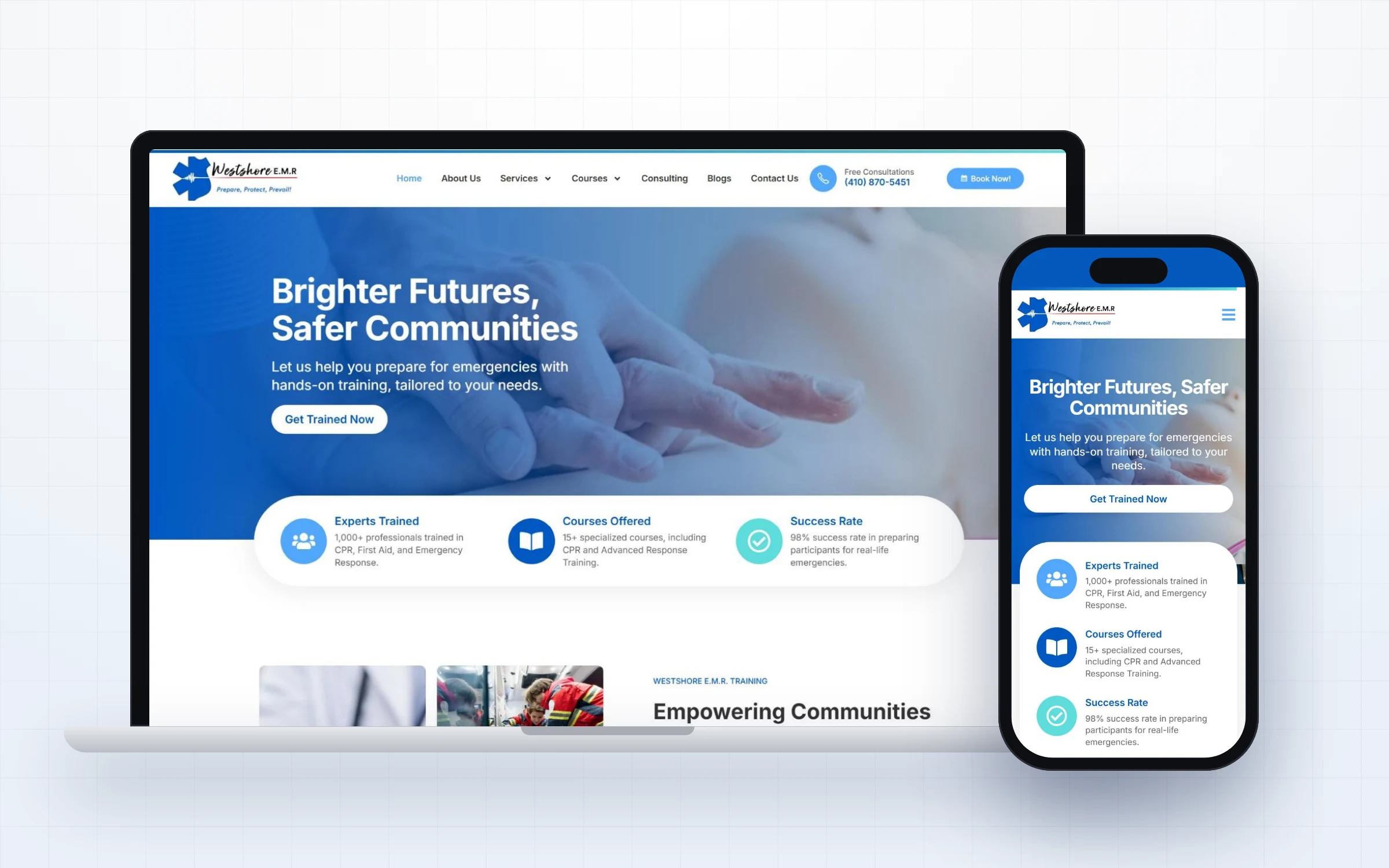
See how our CPR training website design helped Westshore E.M.R. present courses clearly, build trust and make booking emergency training simple.
Read case study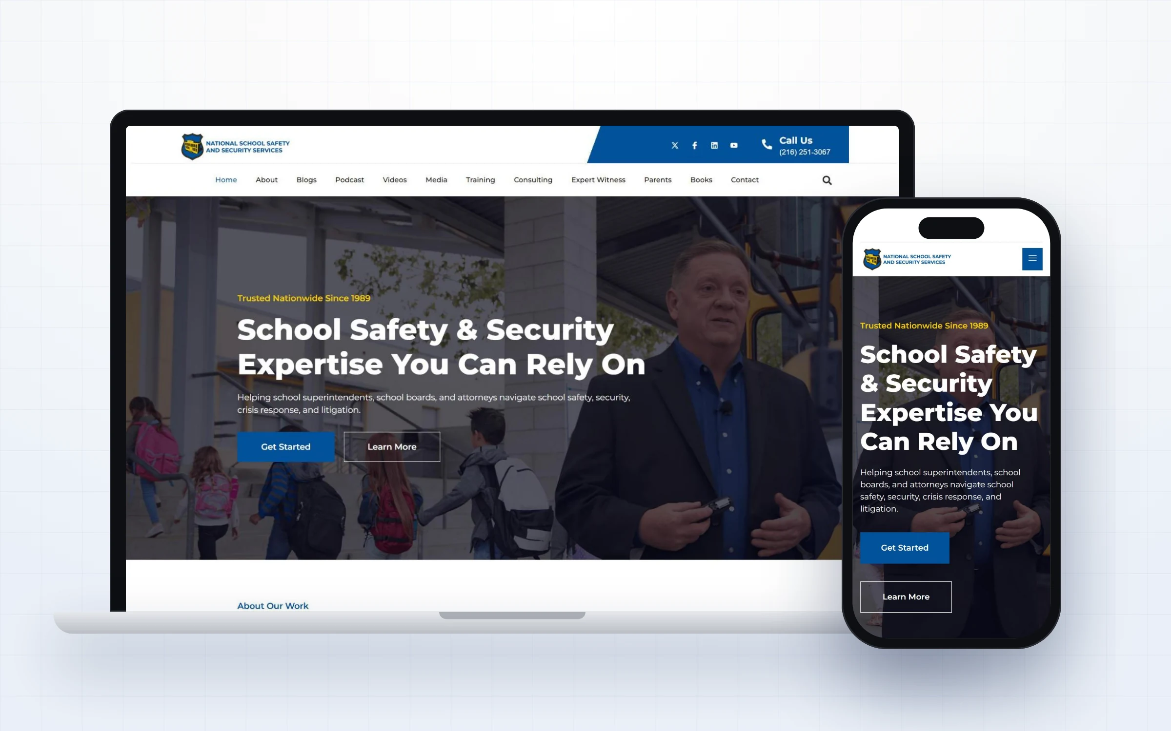
See how we built and grow the school safety consultant website for Dr. Kenneth Trump and National School Safety and Security Services.
Read case study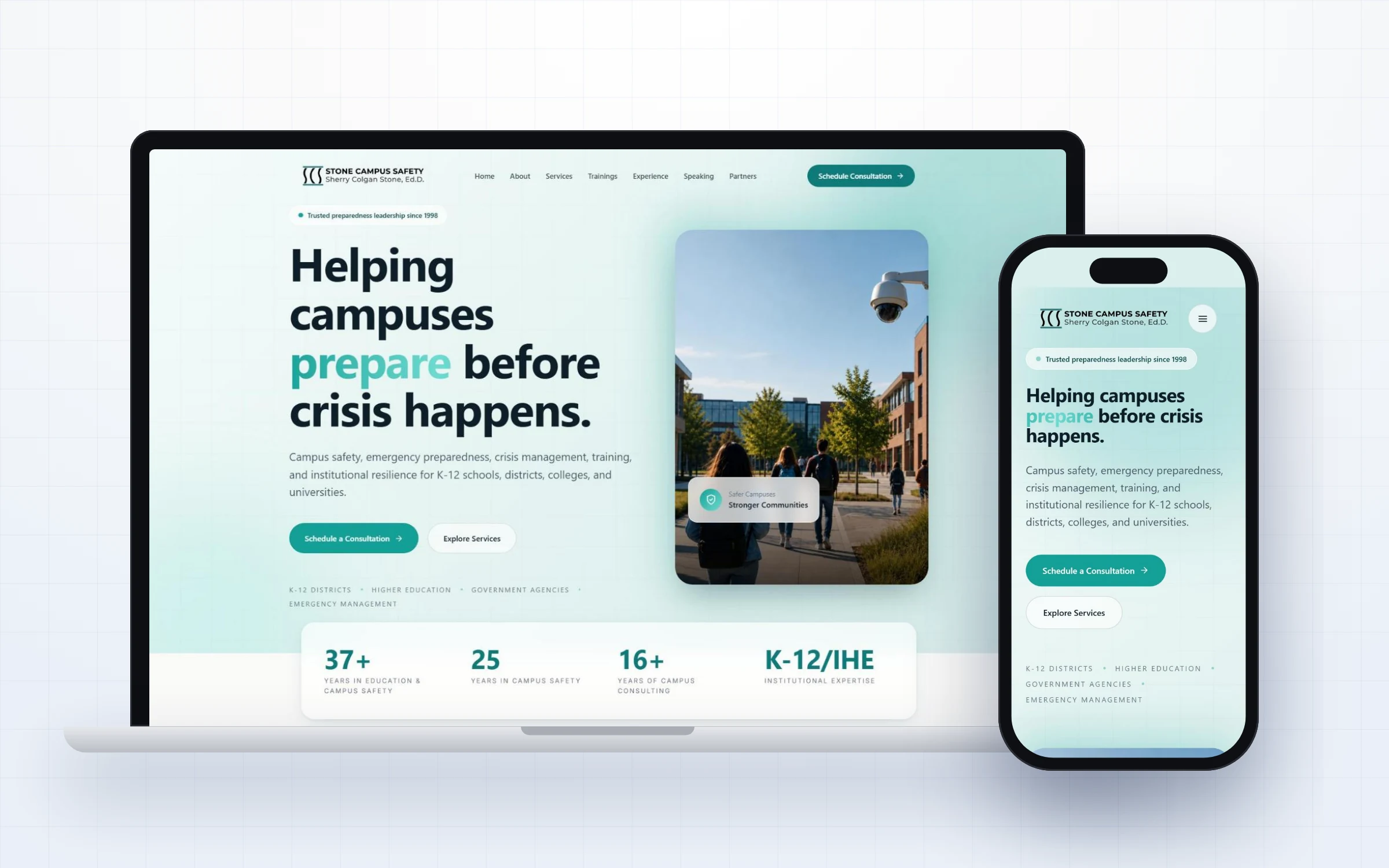
Discover how we designed a fresh, modern campus safety consultant website for Dr. Sherry Colgan Stone and Stone Campus Safety.
Read case studyShort on time? Here is a summary of every project in our website design case studies, so you can jump straight to the one closest to your own situation.
David Morris brings three decades of HR leadership to executives, boards and attorneys. This HR consultant website design needed to signal senior level experience the moment a visitor arrived, while making advisory work and expert witness services easy to understand.
Risk Mitigation Technologies helps senior leaders spot early warning behaviors and prevent workplace violence before it becomes a crisis. This threat assessment website design had one job: make a serious, sensitive service feel trustworthy from the very first second.
Westshore E.M.R. offers CPR, first aid, AED and emergency response training for individuals, schools and organizations. This CPR training website design focused on clarity: help every visitor find the right course and book it without friction.
Dr. Kenneth S. Trump is one of the best known independent school safety experts in the United States. His school safety consultant website needed to serve superintendents, school boards, attorneys and the news media, while staying visible for highly competitive searches.
Dr. Sherry Colgan Stone brings decades of education and campus safety leadership to schools, districts, colleges and universities. Her campus safety consultant website needed to feel modern and approachable while still carrying the authority of a seasoned preparedness expert.
Together, these website design case studies show a consistent approach applied to very different clients. If one of them feels close to your situation, it is a great starting point for our first conversation.
A consultant website has one main job: to help a busy buyer understand who you help, why you are credible and what to do next, all within a few seconds. Every project in these website design case studies is built around that job.
Inside each case study you will find full page mockups on desktop and mobile, the original challenge, the structure we chose and the reasons behind key design decisions. Some studies also include video testimonials from the clients themselves.
The clients include threat assessment advisors, school and campus safety consultants, emergency response trainers and HR experts. The details differ, but the approach is the same: clear messaging, strong proof and an easy path to contact.
Across every client and industry, the same principles show up again and again. They are the reason these projects look premium and work hard for the businesses behind them.
Every homepage opens with a clear promise, the audience and a single primary call to action.
Testimonials, credentials, media logos and results appear where buyers need reassurance.
Each service gets its own focused page, which helps visitors and search engines alike.
Clean code, compressed images and on page SEO help sites load fast and rank well.
Navigation, text and buttons are designed for thumbs, not just shrunk from desktop.
Sites are built so clients can edit text, add posts and update services without a developer.
A great consultant website feels calm and confident. It does not try to say everything at once. Instead, it guides each visitor through a simple story: the problem they face, the expert who can solve it, the proof that the expert is trustworthy and the easy next step.
The homepage carries most of that weight. In our website design case studies, every homepage opens with a clear promise, a short supporting line and one main button. Proof such as client logos, credentials or a short testimonial follows immediately, because buyers want reassurance before they read the details.
Service pages then go deeper. Each one explains who the service is for, what is included, how the process works and what results to expect. Separate pages also help search engines understand exactly what the business offers, which brings in more qualified visitors over time.
Finally, the contact path has to be effortless. Booking links, short forms and visible contact details remove friction, so a visitor who is ready to talk can do it in seconds. These small details are a big reason the websites in these website design case studies turn visits into conversations.
For most consultants, the website is where serious buyers go after a referral, a talk or a LinkedIn post. A dated or confusing site can quietly undo all of that good work in seconds.
The website design case studies here show what happens when a site is rebuilt around the buyer instead of the business. Messages get shorter and clearer, proof moves higher up the page and calls to action become impossible to miss.
The result is a website that works like a calm, confident salesperson, available every hour of the day, answering questions and inviting the right people to start a conversation.
Every project follows the same clear, collaborative process. You always know what is happening, what comes next and what we need from you.
We learn about your clients, your competitors and the impression you need to make, then agree on clear goals for the project.
We define your core promise, the audience you serve and the words buyers use, which shapes every design decision that follows.
We create the first design direction and refine it with your feedback until it feels right for your business.
Everything is checked on desktop and mobile, for speed, readability and consistency with the rest of your brand.
We launch, hand over all files and stay available for updates as your business grows.
Most of our clients are experts whose reputation is their business. They need an online presence that matches the trust they have earned offline.
Each case study follows the same simple structure, so you can compare projects quickly. It starts with the client and the challenge, then explains the strategy, the key design decisions and what was delivered.
As you read, look for the moments that feel familiar. Maybe your website hides your best proof, your logo no longer reflects your experience or your LinkedIn profile says very little about who you help. Those are usually the best places to start.
If you see an approach you like, mention the case study when you book a call. It gives us a shared reference point and helps us understand your taste and goals from the very first conversation.
Most clients come to us with the same frustrations. Their online presence looks dated, it does not explain what they do clearly, or it simply does not match the level of their expertise. Prospects visit, but too few of them get in touch.
Others have pieces that do not fit together. The logo says one thing, the website says another and the LinkedIn profile says something else again. That inconsistency makes even an excellent expert look less established than they really are.
The projects in these website design case studies fix those problems with a clear message, a consistent visual system and a simple path to contact. The goal is always the same: when the right person finds you, they should understand your value and feel confident reaching out.
Case studies are a great way to judge a design partner, but they are only part of the picture. Look for a team that asks good questions about your clients, explains the reasons behind its design choices and cares about results, not just appearance.
It also helps to work with a partner who understands your field. Many of our clients work in safety, security, HR and training, so we already know the questions their buyers ask and the proof they look for.
Finally, look for a partner who can grow with you. A website, a brand and a LinkedIn profile work best together, and having one team look after all three keeps your presence consistent over time.
Before a project, most clients describe the same feeling: their website does not reflect who they are today. It might have been built years ago, put together quickly or designed for a business that has since grown and changed.
After the project, the difference is easy to see in our website design case studies. The message is shorter and clearer, the design looks premium and consistent, and visitors can tell within seconds who the expert helps and how to get in touch.
Just as important is how clients feel. Many tell us they finally feel proud to share their website with prospects, partners and event organizers, instead of quietly hoping nobody looks too closely.
Every project is different, but the goals behind our website design case studies stay the same. These are the outcomes we design for from the very first call.
Visitors see credibility and proof within seconds, so they are ready to talk sooner.
People understand who you help and what you do without having to dig.
Clear calls to action make it easy for interested visitors to reach out.
Search friendly structure helps the right buyers find you online.
Every touchpoint looks and sounds like the same established business.
Ready to use assets make future updates, posts and proposals faster.
Our website design case studies show what is possible, but the best results come from clear thinking at the start. These questions help you prepare, whether you work with us or not.
Picture the buyer you most want to attract and what they worry about.
Choose one main action, such as booking a call or sending a message.
Gather testimonials, credentials, media mentions and results.
Write down why clients choose you over similar experts.
Note whether people arrive from Google, LinkedIn, referrals or events.
Decide how you will judge the project six months after launch.
Every project in our website design case studies was delivered remotely, for clients across the United States and beyond. Clear communication and a simple process make distance a non issue.
We share progress through short video calls, shared links and clear written updates. You always know what we are working on, what we need from you and when the next milestone is due.
Feedback is simple too. You can comment directly on designs, send a quick voice note or book a short call, whichever suits your schedule. Busy consultants appreciate that the process fits around client work, travel and speaking engagements.
Design Fly 24 is a small, focused agency that works closely with consultants, trainers and experts. You work directly with the people designing your project, not a chain of account managers.
We combine design, copywriting and SEO, so your website is not only attractive but also clear, persuasive and easy to find. That combination is visible in every one of our website design case studies.
Most of all, we care about long term relationships. Many clients return for new pages, brand updates and LinkedIn refreshes as their businesses grow, and we are always glad to help them take the next step.
Most projects take a few weeks from first call to launch, depending on the number of pages and how quickly content is ready.
Yes. We can write or refine all website copy so it is clear, persuasive and optimized for search.
Yes. Every site is designed and tested for phones, tablets and desktops.
Yes. We build on WordPress and Elementor, so you can edit text and images easily.
Every site includes on page SEO basics such as page titles, descriptions, headings and fast loading pages.
Yes. Most of these case studies are redesigns of existing sites that no longer reflected the client.
Yes. Design Fly 24 is a full service agency, so the same team that builds your website can grow it with SEO, Google Ads management, LinkedIn branding, email marketing and monthly website care. One point of contact, one plan, and everything working together to bring you clients.
Our website design case studies share one simple idea: experts deserve an online presence that matches the trust they have earned offline. Every project starts with the buyer and works back to the design.
If you only remember one thing from these website design case studies, make it clarity. A clear promise, clear proof and a clear next step will do more for your business than any visual trend.
We add new website design case studies as projects launch, so check back often or book a call to see work that is not published yet. We are always happy to walk you through the thinking behind any of our website design case studies.
Looking for something else? Browse our branding case studies and LinkedIn profile optimization case studies and SEO case studies, or learn more about our website design, brand identity design LinkedIn profile optimization and SEO services.
Tell us where you are today and where you want to be. We will review your current presence and suggest the best first step, with no obligation.