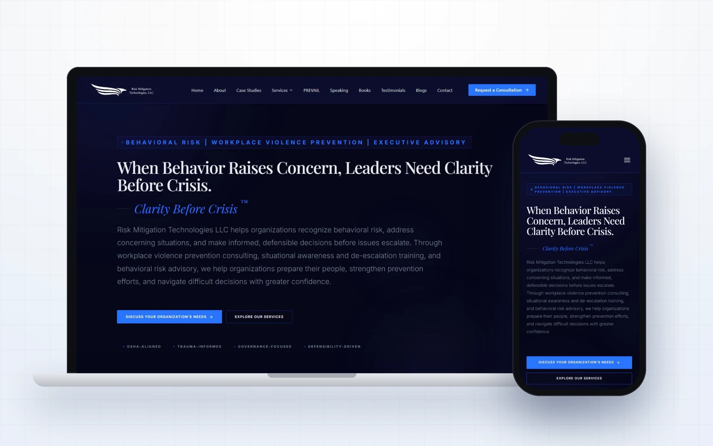
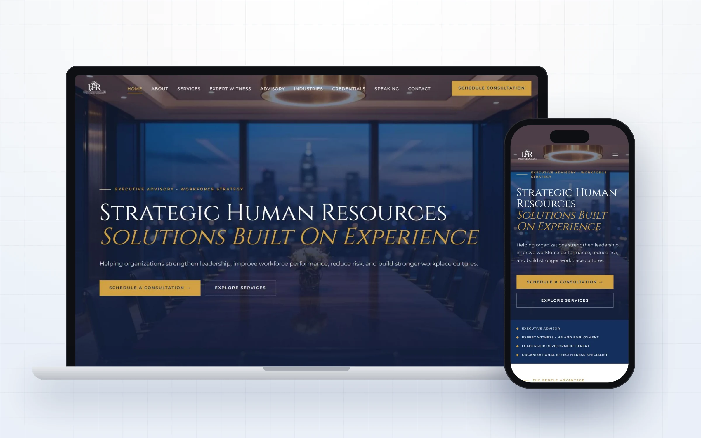
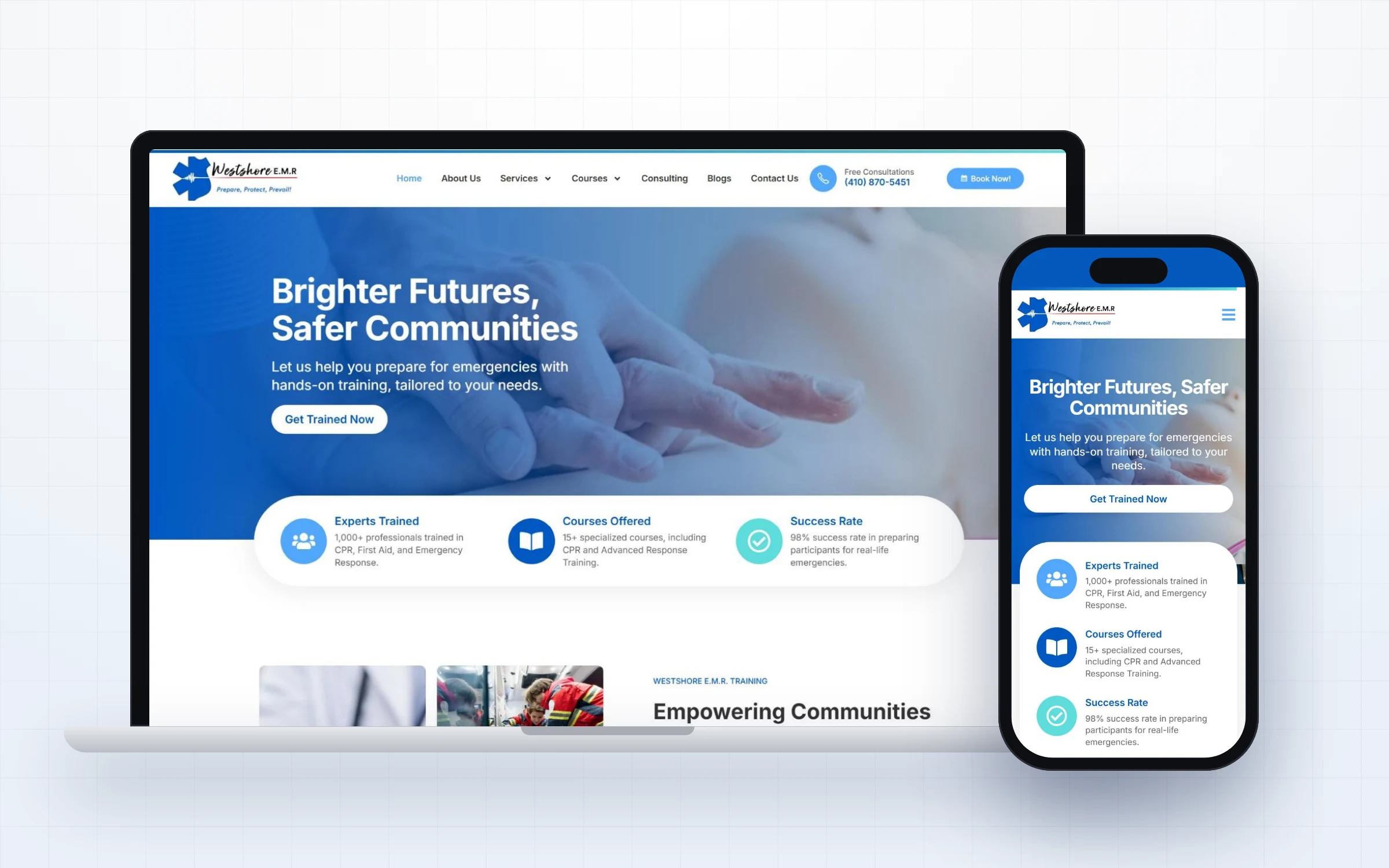
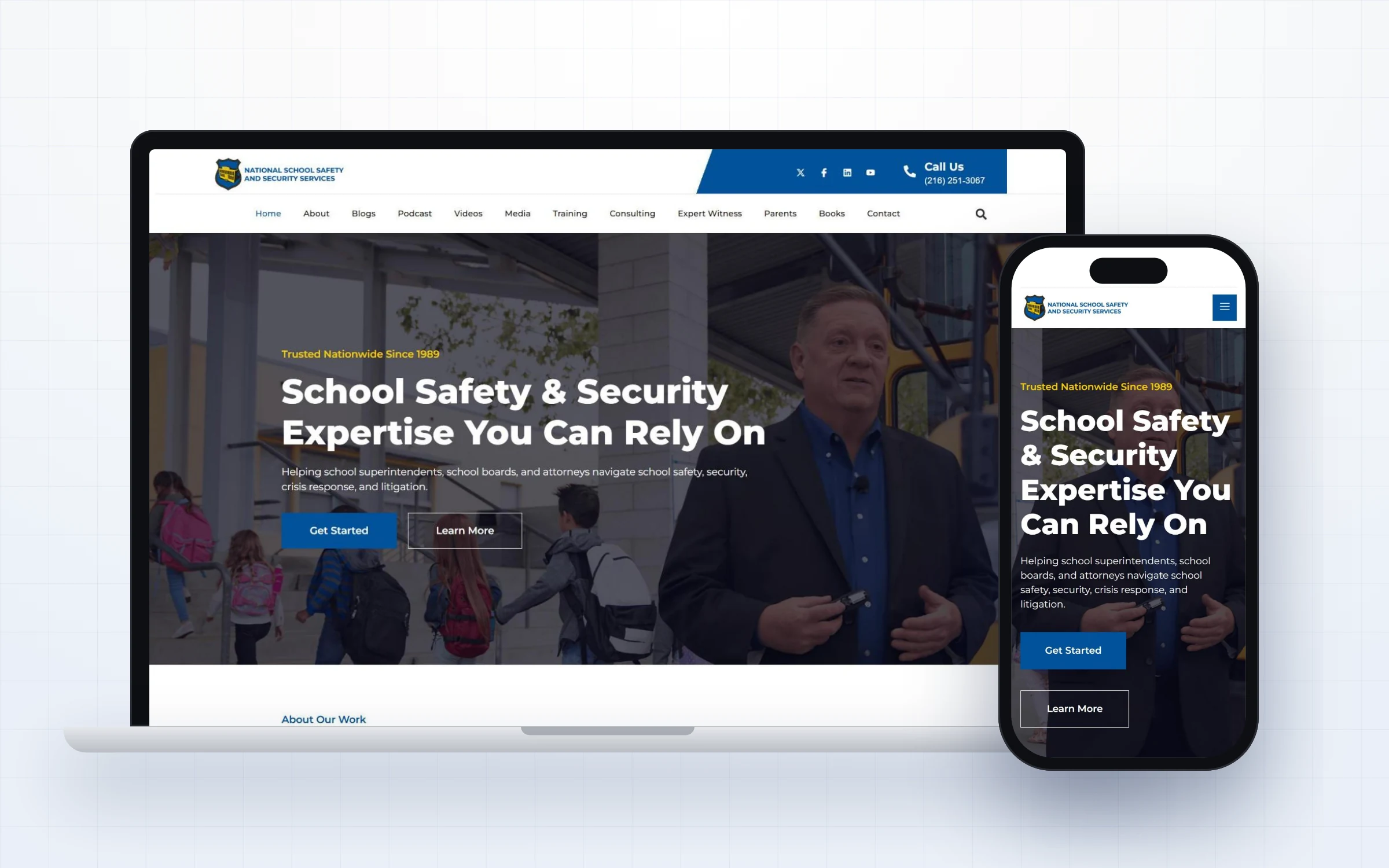
Dr. Sherry Colgan Stone brings decades of education and campus safety leadership to schools, districts, colleges and universities. Her campus safety consultant website needed to feel modern and approachable while still carrying the authority of a seasoned preparedness expert.
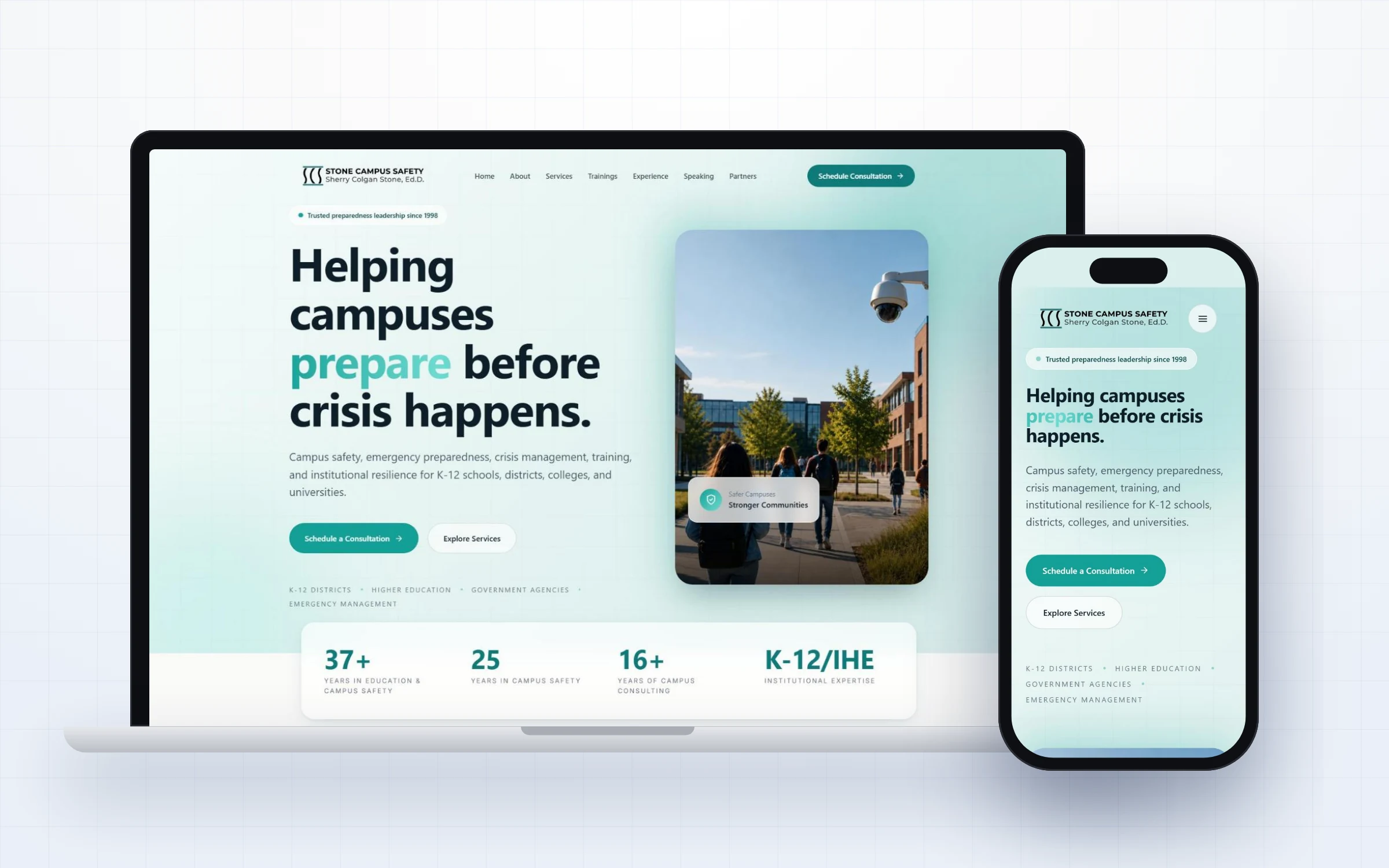
School districts, colleges, universities and government agencies.
Present deep expertise in a fresh, welcoming way and make consultations easy to schedule.
A teal and white design with large type, clear proof and a calm structure.
Stone Campus Safety is led by Dr. Sherry Colgan Stone, Ed.D., who brings decades of experience in education and campus safety. Her work covers emergency preparedness, crisis management, training and institutional resilience for school districts, colleges, universities and government agencies.
Her career began in classrooms abroad, where she navigated real security challenges, and grew into decades of campus safety leadership and consulting. Today she helps institutions plan, train, run drills and assess risk, always aligned with recognized federal and state standards.
Her website needed to share that story, explain her services clearly and invite education leaders into a calm, supportive first conversation.
Campus safety can feel heavy and intimidating. Many websites in this field lean on dark colors and alarming imagery, which can push away the education leaders who are looking for a trusted partner.
Dr. Stone needed a site that felt hopeful and professional, highlighted her decades of experience and her personal story, and gave leaders a simple way to schedule a consultation.
Every choice on this project was made to build trust quickly and guide the right visitor to a conversation.
Teal and white with soft gradients create an approachable, modern feel that stands apart from typical security websites.
The headline, Helping campuses prepare before crisis happens, focuses on readiness rather than fear.
A clean stats card highlights years in education and campus safety and institutional expertise right below the hero.
The Our Story section shares the experiences that shaped her career, building a human connection with readers.
A four phase path, Discover, Design, Practice and Sustain, makes the engagement easy to understand before the first call.
Great websites are planned around how people actually decide. This campus safety consultant website walks every visitor through four simple stages.
A clear headline tells visitors within seconds that they are in the right place and that Stone Campus Safety understands their situation.
Short sections explain the services in plain language, so visitors know exactly what is offered and who it is for.
Credentials, real experience and proof appear right where doubts usually come up, before the visitor has to ask.
The main button, Schedule a Consultation, is always within reach, so a ready visitor can take the next step in one click.
Most websites in this space lose enquiries for the same few reasons. Here is what we deliberately designed out of this campus safety consultant website.
Here is the complete homepage presented section by section, so you can see how the story flows from first impression to final call to action.
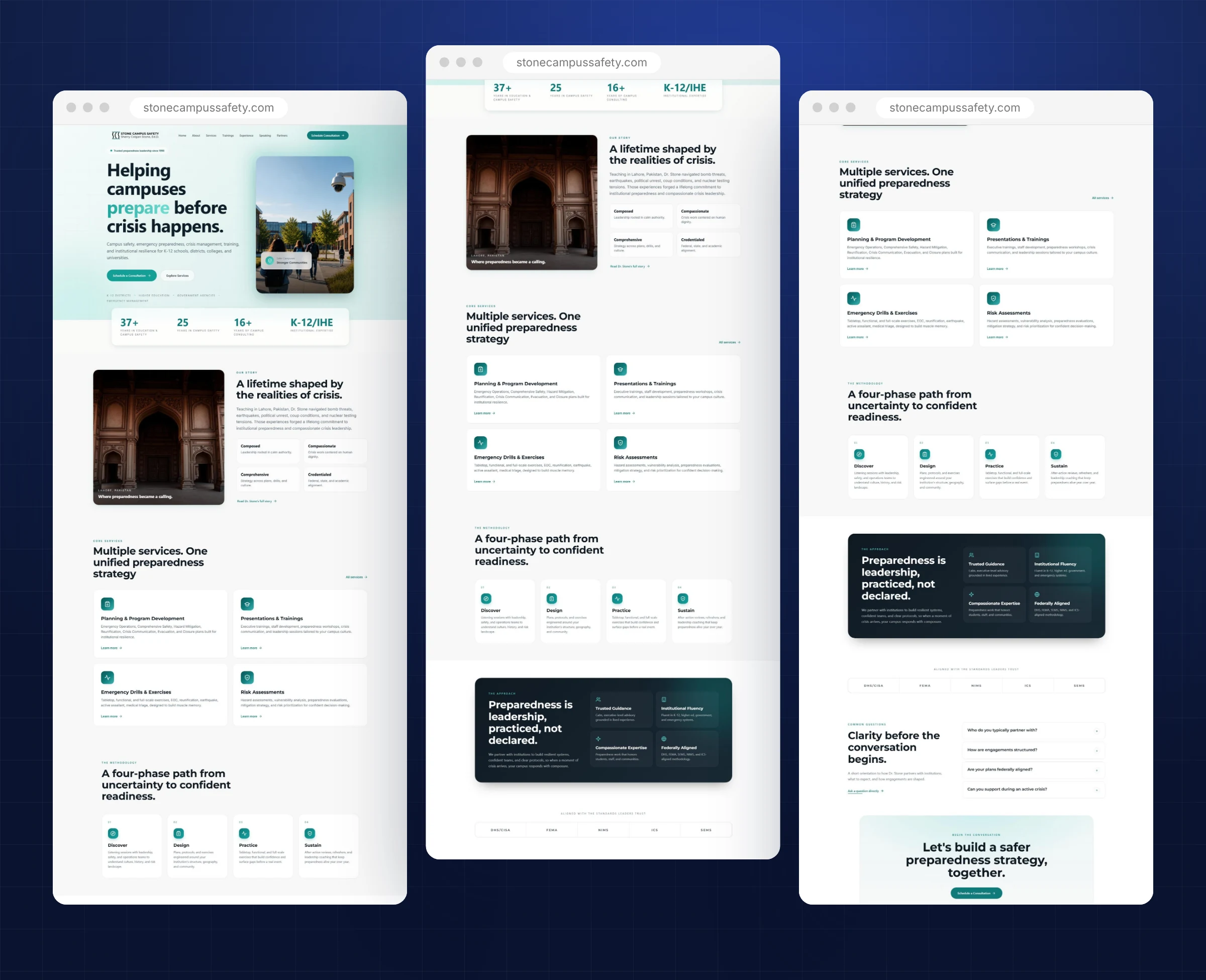
The complete campus safety consultant website, presented section by section.
Here is everything included in this campus safety consultant website project, from first strategy call to launch day. Each piece was designed to work together, so visitors move naturally from first impression to a confident decision without friction or confusion.
A bright, welcoming first impression with a clear consultation path.
Planning, trainings, drills and risk assessments explained simply.
A four phase process that sets clear expectations.
DHS, FEMA, NIMS, ICS and SEMS shown as trust signals.
Common questions answered before the conversation begins.
A friendly closing section that invites the first call.
A consistent visual language is what makes a website feel premium. For this campus safety consultant website, every color, font and image choice supports one goal: trust.
Teal and white with soft gradients. The palette feels calm, modern and hopeful, which helps education leaders feel supported rather than alarmed.
A bold, friendly sans serif for headlines and a light, readable body font. Large type makes the main promise impossible to miss.
Bright campus scenes and a meaningful story image. The visuals focus on students and places, not on threats.
A stats card, service cards, a four phase method and a clear FAQ, arranged so each section answers the next natural question.
Education leaders often browse between meetings. On mobile, the headline stays bold and readable, the consultation button is front and center and the audience tags are easy to scan.
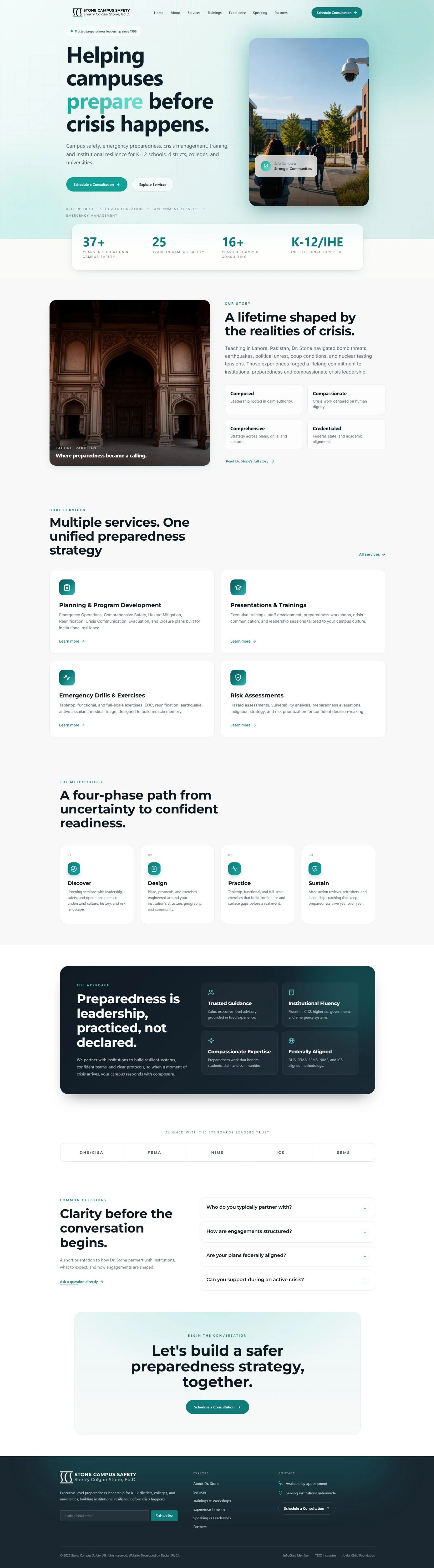
Scroll inside the window to explore the complete campus safety consultant website.
Every project follows the same clear five step process, so clients always know what happens next and nothing is left to chance.
We started with a focused conversation about Stone Campus Safety, the people it serves and the questions those buyers ask before they reach out. That conversation became the brief for the campus safety consultant website.
Before any commitment, we designed the homepage so Stone Campus Safety could see the direction, the message and the visual style. Feedback at this stage shapes everything that follows.
Once the concept was approved, we designed the remaining pages with the same system, keeping navigation simple and every page focused on one clear next step.
We built the campus safety consultant website in WordPress with Elementor, then tested every page on phones, tablets and desktops, checking speed, forms, links and readability.
At launch we connected analytics and Search Console, checked indexing and handed over a site the team can update with confidence, with ongoing support whenever it is needed.
Because the homepage concept comes first, there are no surprises later. Stone Campus Safety saw the direction early, shaped it with honest feedback and moved into the full build with confidence. That same rhythm of design, review and refine continued until every page felt right, and it is the reason our clients describe the process as calm and easy to follow.
A campus safety consultant website should make leaders feel supported, not alarmed. By pairing a calm visual style with strong proof and a clear process, this design helps Dr. Stone start conversations with the institutions she is best placed to help.
Just as important, the website now works as a long term business asset rather than a static brochure. It explains the offer clearly to new visitors, supports referrals from people who already know Stone Campus Safety, and gives every marketing effort, from LinkedIn posts to speaking events, a credible place to send people. When someone hears about Stone Campus Safety and looks them up, the website confirms everything they hoped to find.
Want to see more? Browse our full web design portfolio, learn how our website design services work, or check your own site against our free website checklist for consultants. You can also view the live Stone Campus Safety website.
Premium design needs a solid foundation. Here is how this campus safety consultant website is built and maintained.
A flexible, widely supported platform that gives Stone Campus Safety full ownership of the website and its content.
Custom built sections and widgets keep the design consistent while making everyday edits simple.
Reliable hosting, page caching and compressed modern images keep pages quick for every visitor.
Connected tracking shows how people find and use the site, so decisions about content are based on real data.
Every section answers a real question that clients of Stone Campus Safety ask before they reach out, in the order they usually ask it.
Proof, credentials and a calm, confident visual style work together so the expertise behind the site is obvious at a glance.
A reusable component system and ongoing care keep the website current, fast and on brand as the business grows.
A beautiful website only works if the right people can find it. Search visibility and speed were part of this campus safety consultant website from the first page, not added at the end.
If you work in a similar field, these lessons from the campus safety consultant website for Stone Campus Safety can help you win more of the right clients from your own website.
Education leaders respond to readiness and care. A positive promise invites conversation better than alarming language.
A short stats card communicates decades of work faster than a long biography.
A personal story builds a human connection and explains why you do this work.
A four phase method sets expectations and makes the first call feel easy.
DHS, FEMA, NIMS, ICS and SEMS references reassure institutions that your work fits their requirements.
If your clients are careful, senior or under pressure, the principles behind this campus safety consultant website apply to your business too. Buyers like these rarely decide in a single visit. They come back, compare two or three names and look for signs that you understand their situation better than anyone else.
That is why we start every project the same way: a short call to understand your audience, then a free homepage concept built around the exact questions your best clients ask. You see the direction before you commit to anything, and the finished site is built so you can keep it fresh long after launch.
Whether you need a new campus safety consultant website or a refresh of an existing site, the goal is the same: a clear message, visible proof and an easy next step on every screen.
You do not need to have every answer before we talk. Bring your goals, your best client stories and any questions you have. We will turn them into a clear plan, a homepage concept you can see and react to, and a website that represents your expertise with the same care you give your own clients.
Answers to the questions we hear most about this campus safety consultant website and how we work.
Lighter, calmer colors feel welcoming to education leaders and help a consultant stand out from typical dark security brands.
Yes. New pages follow the same layout and components, so the design stays consistent.
Yes. Every section was designed and tested for mobile screens.
A light, calm design helps you stand out from dark security brands and feels welcoming to schools, colleges and districts.
Yes. We turn your expertise into clear, simple copy that education leaders can understand quickly.
Yes. Every section is designed and tested on phones, tablets and desktops.
Yes. New pages and trainings follow the same layout, so the site grows without losing its look.
Usually a short discovery call, a review of the homepage concept and quick feedback on the remaining pages. We handle the design, build and technical setup.
Yes. The website, its content and its design are yours, built on WordPress so you are never locked in.
Book a free strategy call. We will talk through your goals and then design your homepage concept before you commit to anything.
Yes. Design Fly 24 is a full service agency, so the same team that builds your website can grow it with SEO, Google Ads management, LinkedIn branding, email marketing and monthly website care. One point of contact, one plan, and everything working together to bring you clients.
Tell us about your work and we will design your new homepage free. If you love it, we build the rest. If not, you owe nothing.