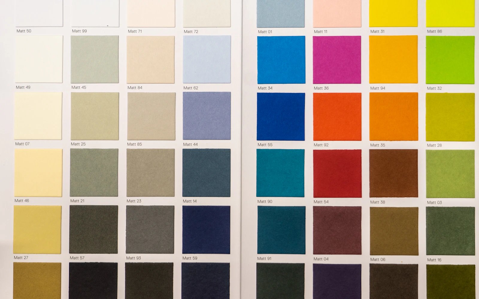
A brand color palette sounds like the fun part of branding, and it is, right up until you have to choose. We have watched consultants spend weeks going back and forth between two shades of blue, then pick a third one at midnight because a competitor used the first two.
Here is the thing nobody tells you. Your buyers will not remember your exact hex code. A hospital risk manager comparing three security firms will remember whether your proposal looked calm and organized or loud and scattered. Color does a lot of that work without anyone noticing.
This guide walks through how we build a brand color palette for consultants, expert witnesses, speakers and small professional firms at Design Fly 24. It covers meaning, roles, contrast, how many colors you need and how to test them before you print five hundred business cards.
- A good brand color palette has roles: one primary, one or two accents, and a set of neutrals that do most of the work.
- Color meaning depends on context. Your industry, your buyers and your competitors matter more than generic color psychology charts.
- Contrast is not optional. Text colors must meet accessibility guidelines on your website and in your documents.
- Four to six colors in total is plenty for most consultants.
- Test your brand color palette on a phone, a laptop, a LinkedIn banner and a printed page before you commit.
What a brand color palette actually does for a consultant
For a consumer brand, color can be the whole personality. Think of a soft drink can on a shelf. For a consultant, color has quieter jobs. It signals your level of seriousness, makes your materials look like they came from the same firm, and helps people find what matters on a page.
A brand color palette is the agreed set of colors you use everywhere: website, proposals, slide decks, LinkedIn banner, reports, email signature. When it is clear, everything you send looks consistent. When it is fuzzy, every document drifts a little, and over a year the drift adds up to a brand that looks improvised.
Consistency is the real payoff. A school district buyer sees your LinkedIn post, then your website, then your proposal. If all three share the same colors and feel, she starts to recognize you. That recognition is a small but real piece of trust.
1. Start with context, not color psychology charts
You have probably seen the charts. Blue means trust, green means growth, red means energy. They are not wrong exactly, but they are too general to be useful. Blue means trust partly because every bank, insurer and law firm uses it, which also means blue alone will not set you apart.
Before we pick a single swatch for a brand color palette, we ask three questions:
- Who are the buyers? A general counsel at a large company expects restraint. A wellness coach’s clients may respond to warmth.
- What do competitors use? Open the websites of your five closest competitors. If four are navy and gray, you know the expected baseline, and you know where there is room to stand out.
- What should people feel in the first five seconds? Calm and competent? Bold and direct? Warm and approachable? Write down three words.
Those three words drive the palette far more than any chart. A school safety consultant who wants to feel “steady, protective, modern” ends up somewhere very different from a leadership coach who wants “warm, energetic, human.”

2. Choose a primary color that can carry the brand
Your primary color is the one people associate with you. It shows up in your logo, your main headings, your website header or footer, and the cover of your reports. It needs to be strong enough to recognize and calm enough to use in large areas without tiring the eyes.
For most consultants we work with, the primary lands in a deep, slightly muted shade. Deep navy, forest green, dark teal, burgundy, charcoal blue. Bright, saturated primaries can work, but they are harder to use in big blocks and harder to read text on.
Two practical checks for the primary in any brand color palette:
- White text on it must be easy to read. If you cannot comfortably read a white headline on your primary, it is too light to anchor the brand.
- It must survive black and white. Print your logo in grayscale. If the primary turns into a muddy gray that disappears, you will have trouble on faxes, newspaper ads and photocopied handouts.
Your logo and your brand color palette should be designed together. If you are working on both, our guide to logo design for consultants covers the mark itself.
3. Add one or two accent colors with a clear job
The accent is where you get to have a little personality. It is the color of your buttons, your links, a highlighted statistic, a thin line under a heading. Used sparingly, it pulls the eye to exactly the places you want people to look.
The key word is sparingly. An accent that appears everywhere stops being an accent. We usually suggest that accents cover well under a tenth of any page. Many designers use the old 60/30/10 split as a starting point: about sixty percent neutrals, thirty percent primary, ten percent accent.
Good accent pairings in a consulting brand color palette often look like this:
- Deep navy primary with a warm amber or gold accent.
- Forest green primary with a soft coral accent.
- Charcoal primary with a clear teal accent.
- Burgundy primary with a muted sand accent.
Give each accent a job and write it down. “Amber is for buttons and key numbers only.” That one sentence will save you from a website where every heading is a different color.
4. Build neutrals that do the real work
Here is a secret about every brand color palette that looks expensive: most of it is neutrals. White, off white, a few grays, and a near black for text. These are the colors your readers actually spend time looking at, because they are the background and the body text.
Pure black text on pure white can feel harsh on screens. Many of our client sites use a very dark gray or a deep tinted near black for body text, and a slightly warm or cool off white for alternate section backgrounds. The difference is subtle, but the page feels calmer.
A typical set of neutrals includes:
- A text color (near black, sometimes tinted toward your primary).
- A secondary text color for captions and dates (medium gray, still readable).
- A light background tint for alternating sections.
- A border or divider gray.
- White.
Tinting neutrals slightly toward your primary is a small trick that ties everything together. A navy brand might use a gray with a hint of blue. A green brand might use a gray with a touch of warmth. Your brand color palette then feels like one family instead of a collection.
5. Check contrast and accessibility before you fall in love
This is the step most people skip, and it causes the most trouble later. A light gray on white looks elegant in a mockup and becomes unreadable for a sixty year old board member reading on a phone in sunlight.
The international accessibility guidelines from the W3C set a minimum contrast ratio between text and background. The details are in the WCAG contrast guidance. In plain terms: normal body text needs a ratio of at least 4.5 to 1, and large headings need at least 3 to 1. You can test any pair of colors in seconds with the free WebAIM contrast checker.
| Role | Typical share of a page | Contrast check | Common mistake |
|---|---|---|---|
| Primary | About a third | White text on it should pass 4.5 to 1 | Too light to hold white text |
| Accent | Under a tenth | Button text must pass on the accent | Used on every heading |
| Body text neutral | Most of the words | Must pass 4.5 to 1 on all backgrounds | Light gray text for style |
| Background neutrals | Most of the space | Text on each tint must still pass | Tints too dark for body text |
| Status colors (optional) | Rare | Do not rely on color alone | Red and green as the only signal |
Also think about color blindness. Red and green look very similar to a meaningful share of men. If your brand color palette relies on red versus green to show “risk” and “safe” in a report, add labels or icons too. Our website accessibility checklist goes deeper on this.

6. How many colors should a brand color palette have?
Fewer than you think. For most consultants and small firms, a complete brand color palette is one primary, one or two accents, and three to five neutrals. That is roughly six to eight swatches, and only two or three of them are what people would call “brand colors.”
Every extra color adds decisions. When you have seven bright colors, someone on your team will make a chart with all seven, and your report will look like a children’s book. When you have one primary and one accent, the decisions make themselves.
Some firms need a slightly larger set, for example a training company with several course tracks, or a nonprofit with programs that each want their own identity. In those cases we add a small secondary set, still tied to the main palette, with rules about where each one can appear.
Not sure your colors are working?We will review your current brand color palette across your site, LinkedIn and documents and show you what to keep.
7. Define your brand color palette in every format you need
A color is not one number. The navy on your website, the navy in your printed brochure and the navy on a conference banner are produced in different ways, and each needs its own code. If you only have a hex code, your printer will guess, and printers guess differently.
- HEX: for websites and most design apps, like #1F3A5F.
- RGB: for screens, slide decks and video.
- CMYK: for printed materials such as brochures, reports and business cards.
- Pantone (optional): for exact matching on signage, branded merchandise or premium print jobs.
Some screen colors simply cannot be reproduced in print. Very bright blues and greens are the usual problem. A good designer will pick colors that translate well in both directions, or adjust the print version so it looks as close as possible.
Write all of this into one simple reference page. That page becomes the color section of your brand style guide, and it is the first thing you send to anyone designing for you.
8. Test your brand color palette in the real world
Mockups lie. Colors behave differently depending on screen, paper, lighting and the colors around them. Before you finalize anything, put the brand color palette through a few real situations:
- Your website on three devices: a phone, a laptop and an older monitor. Cheap screens often make dark colors look even darker.
- Your LinkedIn banner and profile: LinkedIn’s own blue sits right next to your colors. Make sure yours do not clash. Our LinkedIn banner design guide covers sizing.
- A printed page from an office printer: most proposals and reports are printed by the client on whatever is in the hallway.
- A slide on a projector: projectors wash out light colors and muddy dark ones.
- Grayscale: print or screenshot in black and white. Your hierarchy should still be clear.
Expect to make small adjustments. It is normal to darken a primary by a few shades or warm up a neutral after testing. Better now than after you have printed signage.
Example directions for different consulting niches
Every brand color palette should be built for the specific firm, but it helps to see how context changes the answer. These are starting directions we have used in early concept rounds, not formulas to copy.
Security and risk consultants
Buyers here are facilities directors, superintendents, HR leaders and insurers. They want to feel that you are calm under pressure. A brand color palette built on deep navy, slate or dark teal, with a restrained amber or signal orange accent, feels protective without looking like a police department. Avoid heavy reds; they read as alarm.
Expert witnesses and legal consultants
Attorneys vet experts carefully and dislike anything that looks flashy, because a jury might see it too. Charcoal, deep green or burgundy with plenty of white space works well. In this niche the brand color palette should almost disappear and let the credentials do the talking.
Coaches, trainers and speakers
Event planners and HR teams booking a speaker want energy and warmth. Here we often use a warmer primary, such as a rich teal or plum, with a brighter accent like coral or gold. Photos of you on stage carry a lot of the brand, so the palette should flatter skin tones and stage lighting rather than fight them.
Small professional firms and arts groups
An accounting practice or HR firm with several partners needs a brand color palette that works across many people’s documents, so simplicity wins. A theatre company or arts nonprofit can be bolder, because their audience expects personality, but still needs a clear primary and readable text.
Quick tip: Save your brand color palette as a shared swatch library in whatever tools your team uses, such as Canva, PowerPoint or Google Slides. People use the right colors when the right colors are one click away.
Brand color palette mistakes we fix most often
We see the same issues in nearly every brand refresh. If any of these sound familiar, they are easy fixes:
- Too many colors. Five bright colors with no clear roles.
- Logo colors that do not work on the web. A pale yellow logo that disappears on white.
- Gray text for style. Elegant in the mockup, unreadable in real life.
- Different blues everywhere. The website, the proposal template and the business card each use a slightly different shade, because nobody wrote the codes down.
- Copying the leader. Picking the same colors as the biggest firm in your niche, which makes you look like a smaller version of them.
Your colors should make your work easier to read, not harder to forget.
A brand color palette is part of a wider identity, alongside your logo, typography and voice. If you are thinking about the bigger picture, our post on personal branding for consultants is a good next read.
Frequently asked questions
How many colors should a brand color palette include?
For most consultants, one primary, one or two accents and three to five neutrals. That keeps materials consistent and makes everyday design decisions simple.
Should a consulting brand color palette always use blue?
No. Blue is common because it feels steady and professional, but that also makes it crowded. Look at your competitors and your buyers first. A deep green, teal or burgundy can feel just as serious and more memorable.
Can I change my brand color palette later?
Yes, but it takes work, because the colors live in your logo, website, templates and printed materials. Small refinements are easy. A full change is best handled as part of a planned refresh.
Do I need Pantone colors?
Only if you print signage, merchandise or premium materials where exact color matching matters. Most consultants are fine with HEX, RGB and CMYK values.
What tools help test a brand color palette?
A contrast checker for accessibility, a grayscale screenshot, a real office printer and your own phone. Simple tests catch most problems.
Let’s get your colors right
A thoughtful brand color palette is a small investment that pays off in every proposal, slide and web page you produce for years. Done well, nobody comments on it. They just feel that your firm is put together.
If you want help choosing or refining your colors as part of a logo, website or full identity project, take a look at our work and book a free call. We will look at what you have now and tell you honestly what is worth changing.