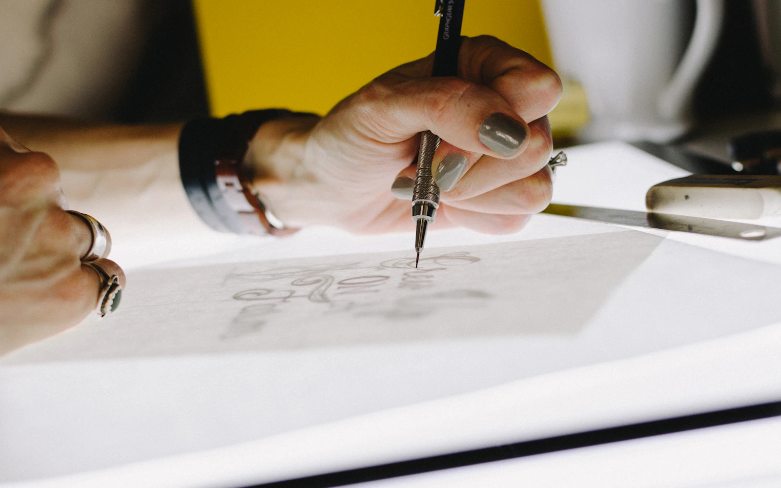
Logo design for consultants is a strange job, because the best result is often the one nobody comments on. A school district’s facilities director opens your proposal, sees a clean mark at the top, and moves straight to your scope of work. That is the logo doing its job.
Now picture the opposite. The same director opens a proposal with a pixelated clip art shield, a stretched font and three colors fighting each other. Nothing about your expertise has changed, but the first impression has. She starts reading with a small doubt, and you never find out it was there.
We design logos for security consultants, expert witnesses, HR advisors, coaches and speakers at Design Fly 24. This guide covers the seven decisions that matter most, in the order we work through them with clients, plus the mistakes we clean up most often.
- Logo design for consultants is about trust and clarity, not cleverness.
- In logo design for consultants, most independent experts are best served by a wordmark or monogram, with a symbol only when it earns its place.
- Pick two brand colors and one or two typefaces, then stick with them everywhere.
- You need four versions: horizontal, stacked, icon and one color.
- Every logo design for consultants project should end with vector source files (SVG, PDF or EPS) plus ready to use PNGs. Insist on them.
What logo design for consultants actually has to do
A consulting logo has a narrower brief than a consumer brand logo. Nobody is choosing you off a supermarket shelf. People meet your logo after a referral, a LinkedIn post, a conference talk or a Google search, and by then they are already half interested. The logo’s job is to confirm that you are established, careful and worth the call.
So good logo design for consultants does four things. It looks professional at a glance. It reads clearly at small sizes, like a LinkedIn avatar or a browser tab. It holds up in black and white on a printed report. And it feels like it belongs to the same person who shows up to the meeting.
What it does not need to do is explain your services. A logo for a workplace violence prevention consultant does not need a fist, a badge or a shield. The website, the headline and the case studies explain the work. The logo just signs the page.
Your logo is a signature, not a brochure. Let the rest of your brand do the explaining.
1. Choose your logo type: wordmark, symbol or monogram
This is the first real decision in logo design for consultants, and it shapes everything after it. There are three main types, plus a combination of them.
Wordmark
A wordmark is your name or firm name set in carefully chosen type, sometimes with a small custom detail. Think of the way many law firms and accounting practices present themselves. It is the most common choice in logo design for consultants, and for good reason: when your name is the brand, the name should be the logo.
Wordmarks work well for expert witnesses, keynote speakers and solo advisors whose reputation is personal. They are also the hardest to get wrong, as long as the type is chosen well and the name is not too long.
Symbol
A symbol (sometimes called a brand mark or icon) is a graphic shape that stands for the business. On its own, a symbol takes years of exposure and a big budget before people recognize it without the name next to it. In logo design for consultants, a symbol almost always appears beside the name.
A symbol makes sense when you plan to grow beyond yourself, when your firm name is abstract, or when you need a strong small icon for apps, social avatars and favicons.
Monogram
A monogram uses your initials, often in a custom arrangement. It is a smart middle path. You get a compact icon that still connects to your name, which helps when your full name is long or your firm is called something like “Ballinger and Associates”. Monograms suit consultants who want a little more presence than plain type without inventing an abstract shape.
Combination mark
Most logo design for consultants projects we deliver end up as a combination: a wordmark paired with a monogram or simple symbol. That gives you the full name for proposals and your website header, plus a small mark for places where the name will not fit.
| Logo type | Best for | Watch out for |
|---|---|---|
| Wordmark | Solo experts, speakers, expert witnesses whose name is the brand | Long names that get tiny on mobile |
| Symbol | Firms planning to grow, abstract firm names | Generic shields, globes and lightbulbs |
| Monogram | Consultants with long names who want a compact icon | Initials that accidentally spell something awkward |
| Combination | Most small consulting firms | Too many elements competing in one lockup |

2. Decide whose name goes on the logo
Before any sketching, settle the naming question. Are you building the brand around your personal name, a firm name, or both? This matters more in logo design for consultants than in almost any other category, because so much of the trust is personal.
If clients hire you specifically (a school safety expert called in to testify, a leadership trainer booked for a retreat), lead with your name. A site like schoolsecurity.org, which we built for Ken Trump, works because his name and his subject are tightly linked. If you plan to hire associates or sell the practice one day, a firm name gives you more room.
Some consultants use both: “Jane Smith” as the main wordmark, with “Workplace Safety Advisory” set smaller underneath as a descriptor line. That is a good compromise, as long as the descriptor stays short enough to read on a phone. We cover the bigger naming question in our guide to personal branding for consultants.
3. Pick colors that fit your clients, not your mood
Color is where a lot of logo design for consultants goes sideways. People choose a color because they like it, or because a competitor uses it, rather than asking what their buyers expect to see.
A few practical rules we follow:
- Start with one primary color. Navy, deep green, charcoal and dark teal all read as steady and serious, which suits most professional services.
- Add one accent color. Use it sparingly for buttons, highlights and small details. A warm gold or muted orange works well against navy.
- Make sure the logo works in black. If it only looks good in color, it is not finished.
- Check contrast. Your colors will become text and buttons on your website, so they need to pass the W3C contrast guidelines for readability.
Industry matters too in logo design for consultants. A security consultant can carry a darker, stronger palette. A coach working with nonprofit leaders may want something warmer. An arts organization like La Femme Theatre Productions, one of the sites we built, can use far more color than an expert witness practice ever should.
Quick tip: Print your logo on a cheap office printer in grayscale. If it turns into a gray smudge, the contrast between your colors is too low.
4. Choose type that reads at every size
For a wordmark, the typeface is the logo. Even for a combination mark, the type carries most of the weight. Good typography is the single biggest difference between a logo that looks like a template and one that looks considered.
Serif typefaces (with the small strokes at the ends of letters) feel established and traditional. They suit legal experts, financial advisors and anyone selling judgment and experience. Sans serif typefaces feel cleaner and more current, which fits technology consultants, trainers and coaches. Neither is right or wrong. What matters is that it fits how you want to be perceived.
Whatever you pick, test it small. Shrink the logo to the size of a LinkedIn profile thumbnail and look at it on your phone. Thin strokes vanish, tight letter spacing turns into a blur and decorative scripts become unreadable. In logo design for consultants, legibility beats personality every time.
Finally, choose a body font for your website and documents that pairs with the logo. It does not need to be the same typeface, but the two should feel like they belong together. Getting type right is half the work of logo design for consultants.
5. Get every version you will need
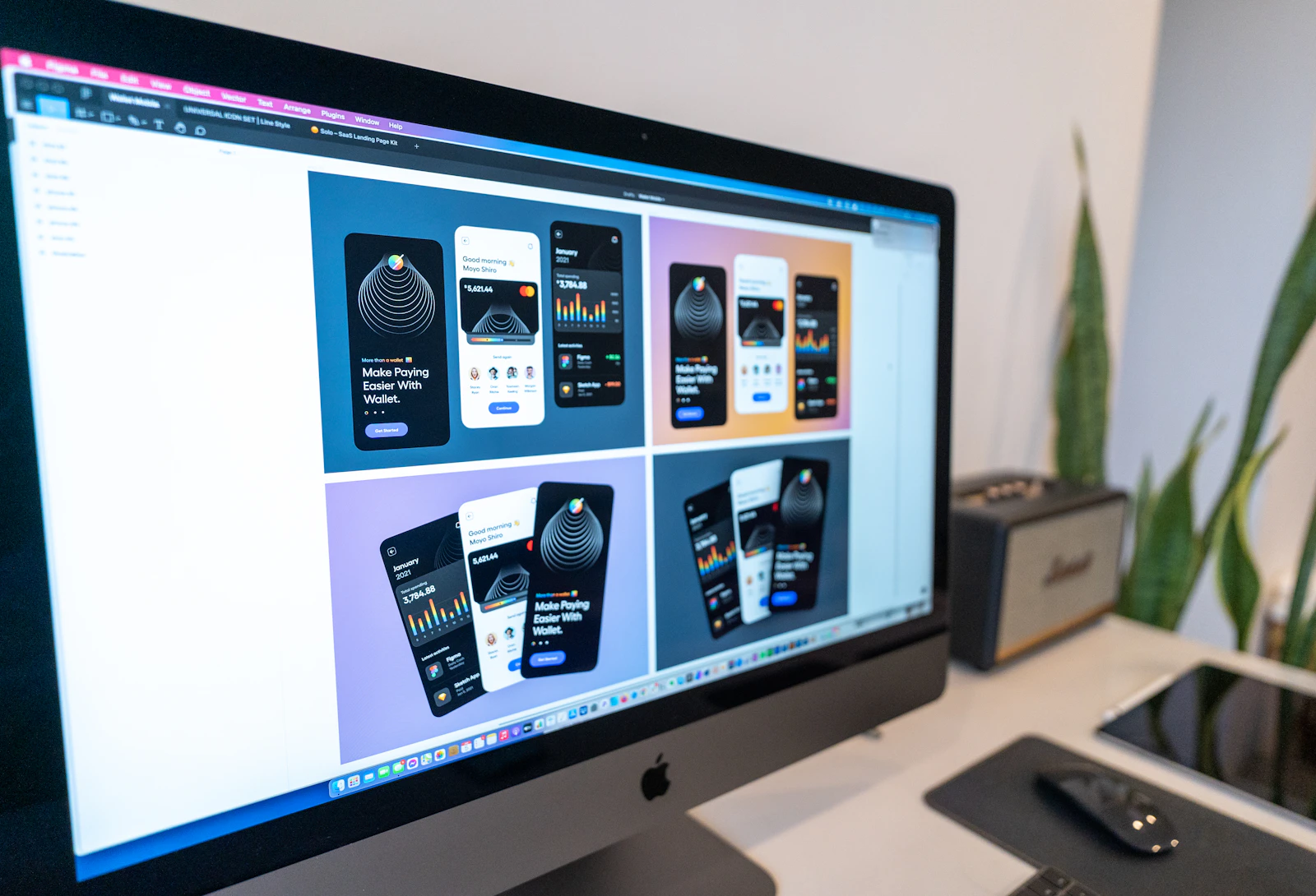
One logo file is not enough. A single horizontal logo will look great in your website header and terrible in a square LinkedIn avatar. Complete logo design for consultants includes a small family of versions built from the same pieces:
- Horizontal (primary): mark and name side by side. Used in website headers, email signatures, proposal covers and slide footers.
- Stacked: mark above the name. Used on square spaces like event signage, social graphics and the back of a business card.
- Icon only: the monogram or symbol on its own. Used as your favicon, social avatar and app icon. Google even shows favicons next to your pages in search, and its favicon guidelines explain the sizes it expects.
- One color: the whole logo in solid black and solid white. Used for embroidery, engraving, faxed documents, dark photo backgrounds and anywhere a full color version will not reproduce.
Each of these should also come in a reversed version for dark backgrounds. When a conference organizer asks for “your logo on transparent, white version please”, you want to send it in thirty seconds, not start a design request. That kind of speed is a quiet benefit of thorough logo design for consultants.
Want a logo that works everywhere from day one?We design complete logo systems for consultants, with every version and file format included.
6. Ask for the right file formats
This is the boring part of logo design for consultants, and the part that causes the most headaches later. We regularly get calls from consultants who have a logo they paid for years ago and only a single blurry JPG to show for it.
Here is what a proper logo design for consultants handover should include:
- SVG: a vector format that scales to any size with no loss of quality. Best for your website. The W3C SVG overview covers the standard if you are curious.
- PDF or EPS: vector files for printers, sign makers and promotional product vendors.
- PNG with transparent background: for slides, documents and social media, in a few sizes.
- JPG: only for places that do not accept transparency.
- Source file: the original Illustrator or Figma file, so any future designer can make changes.
Ask for these files organized into folders by version and color, with sensible names. You should own all of them outright, with no strings attached. If a designer will not hand over the source files, that is a red flag.
We also recommend a one page brand sheet: logo versions, color codes (HEX for screen, CMYK for print), typefaces and a few rules about spacing. It saves time every time someone else touches your brand.
7. Plan where the logo will live
A logo is only as good as the places it shows up. Before final approval, we mock it up in the real situations a consultant faces. That means a website header, a LinkedIn banner, a proposal cover, a slide deck title page, an email signature and a name badge at a conference.
These mockups catch problems early. A stacked logo might look lovely on its own and then feel cramped beside a headshot on a LinkedIn banner. A thin serif might work on screen and break up when printed small on a report. Testing in context is how logo design for consultants moves from a nice drawing to a working tool.
This is also where your logo connects to the rest of your brand. If you are planning a new site, read our notes on consultant website design, and if your banner needs a refresh too, our guide to LinkedIn banner design shows how to carry the logo across.
How logo design for consultants works with us
Every studio has its own approach to logo design for consultants. Here is ours, so you know what to expect if you work with us.
Step 1: A short discovery call
We talk for about thirty to forty five minutes about your clients, your competitors, where you want to be in three years and which brands you admire (in any industry). I want to know who signs your contracts, because they are the real audience for your logo.
Step 2: Research and sketches
We look at the logos in your niche so yours can stand apart from them, then sketch widely: wordmarks, monograms and a few symbol ideas. Most of these never leave the sketchbook.
Step 3: Two or three directions
We present a small number of distinct directions, each shown in real mockups like your website header and LinkedIn profile. You see how each one behaves in your world, not floating on a white page.
Step 4: Refinement
You pick a direction and we refine it together: spacing, color, weight and the small details that make it feel finished. This is where good logo design for consultants turns from promising to polished.
Step 5: Final files and brand sheet
We deliver every version in every format, organized and named clearly, plus the brand sheet. If we are also building your site through our website design services, the logo goes straight into the build.
Timelines depend on how quickly feedback comes back and how many people need to approve. Cost depends on scope too, so we talk it through on a call rather than quote a number blind.
Logo design for consultants: mistakes we see often
Most of the logos we redesign share the same handful of problems. If your current logo has two or more of these, it is probably worth a fresh look, because logo design for consultants is easier to fix early than late.
- Literal clichés. Shields for security, lightbulbs for ideas, handshakes for partnerships, puzzle pieces for problem solving. They make you look like everyone else in your field.
- Too much detail. Fine lines, gradients and tiny text disappear at small sizes.
- Trendy fonts. A font that feels fresh this year can look dated in three. Consultants need marks that age slowly.
- Too many colors. Three or four colors in one logo usually reads as busy rather than bold.
- No vector files. A logo that only exists as a small JPG will cause trouble on the first banner or sign you order.
- Designing by committee. Asking ten friends which option they prefer gives you the safest, blandest choice. Ask the two or three people whose opinion maps to your actual buyers.
- Inconsistent use. A good logo applied with different colors on your site, LinkedIn and proposals looks like three different firms.
The last mistake is the sneakiest. Strong logo design for consultants only pays off when it is used the same way everywhere, for years.
Frequently asked questions
Do I really need professional logo design for consultants, or can I use a free logo maker?
A logo maker can get you started, but the results tend to look generic and rarely come with proper vector files or a full set of versions. If you sell judgment and expertise, a considered mark is worth it. It is one of the few brand assets you will use on every single document.
In logo design for consultants, should the logo include my photo?
No. Your headshot belongs on your website, LinkedIn and speaker materials, not inside the logo. Photos do not scale down well and they date quickly.
How long does logo design for consultants usually take?
With quick feedback, a focused project usually takes a few weeks from discovery call to final files. Larger firms with several decision makers take longer, mostly because of scheduling rather than design.
Can you redesign my existing logo instead of starting over?
Often, yes. Not every logo design for consultants project starts from zero. If your current logo has some recognition, we can refine it: clean up the type, simplify the shape and build out the missing versions and files. Clients who know you will still recognize it.
What should I do with my logo once it is finished?
Update your website, LinkedIn profile, email signature, proposal template and slide deck in the same week. Then retire every old version so nothing outdated slips back in.
Give your expertise a mark that matches it
Your logo will not win a contract on its own. What it can do is remove a small doubt at the exact moment a buyer is deciding whether to take you seriously. That is why logo design for consultants is worth getting right once, properly, with all the versions and files you need.
If you are starting fresh or your current logo no longer fits the work you do, we would be glad to help. You can browse our work, learn more about us, or simply book a free call and tell us about your practice. We will tell you honestly if you need a new logo or just a cleaner version of the one you have.