
Mobile friendly website design is no longer a nice extra for consultants, because the first time most people see your site, they are holding a phone. A law firm partner gets your name from a colleague over lunch and searches you before the check arrives. An event planner scrolls your speaker page in a taxi. An HR director clicks your link from a LinkedIn post while waiting for a meeting to start.
None of those people are sitting at a desk with a big monitor. They are standing, walking, distracted and impatient. If your text is tiny, your menu is fiddly or your contact form fights them, they leave. They may come back on a laptop later. Often they do not.
We have rebuilt many consultant sites that looked great on the designer’s screen and fell apart on a phone. This guide walks through what mobile friendly website design actually means in practice: the details we check on every project, how we test, and why Google cares as much as your visitors do.
- Mobile friendly website design starts from the phone layout, not a shrunken desktop page.
- Tap targets, readable font sizes and a simple menu fix most mobile complaints.
- Short forms, tappable phone numbers and properly sized images make it easy for a busy buyer to reach you.
- Google uses the mobile version of your site for indexing and ranking, so mobile problems are SEO problems.
- Test on real phones, not only in a desktop browser window.
Why mobile friendly website design matters for consultants
Think about how people find a consultant. They hear a name at a conference, see a post on LinkedIn, get a referral in a text message, or search on the way to somewhere. Almost all of those moments happen on a phone. The desktop visit, if it happens at all, comes later when they are comparing options.
That means your phone layout makes the first impression. If it feels cramped, broken or slow, the visitor quietly decides you are a bit out of date. That is unfair, especially if you are excellent at what you do, but it is how people judge. Mobile friendly website design protects you from losing a client before you ever hear about them.
It also matters for search. Google ranks sites based on how the mobile version works, which we cover further down. So good mobile friendly website design helps you twice: once with the people who visit and once with the search engine that sends them.
Your phone layout is not the small version of your website. For most first visits, it is the website.
1. Start the design on a phone screen
The most reliable way to get mobile friendly website design right is to plan the phone layout first. When we sketch a new site, we draw the mobile version of each key page before the desktop version. A phone screen forces hard choices: what goes first, what can wait, what can go.
If you design desktop first and squeeze it down later, you end up with long stacks of content in the wrong order, side columns that land at the bottom and images that make no sense when they shrink. Starting small gives you a cleaner structure that expands naturally to bigger screens.
For a consultant, the phone order is usually: a clear headline about who you help, a single button, a line of proof, a short list of services, then a way to contact you. Everything else supports those pieces. Our guide to homepage design best practices covers that order in more detail.
2. Make every tap target easy to hit
A tap target is anything a visitor touches: buttons, links, menu icons, form fields, checkboxes. On a phone, fingers are much less precise than a mouse pointer. If two links sit too close together, people hit the wrong one, get annoyed and often give up.
In mobile friendly website design, we follow a few simple rules:
- Make buttons large enough for a thumb, roughly the size of a fingertip, with space around them.
- Keep at least a little breathing room between links in lists and menus.
- Make the whole button clickable, not just the text inside it.
- Avoid tiny text links in paragraphs as the only path to an important page.
The W3C accessibility guidelines include a target size rule for exactly this reason. Easy tapping helps everyone, not just people with motor difficulties. Our website accessibility checklist covers related points.
3. Use mobile friendly website design font sizes people can read
Text size is where mobile friendly website design most often fails. Small text is the most common problem we see on consultant sites built a few years ago. It looked elegant on a laptop. On a phone, it forces people to pinch and zoom, which nobody wants to do while standing on a train platform.
Body text
Set body text to at least 16 pixels on mobile, and often a bit larger for long articles. Line height should be generous, around one and a half times the font size, so lines do not crowd each other.
Headings
Headings need to be clearly larger than body text but not so huge that a single word wraps across three lines. A heading that fills the whole first screen pushes your button out of sight. Good mobile friendly website design scales headings down for phones while keeping a clear hierarchy.
Contrast
Light grey text on white looks refined in a mockup and becomes unreadable in sunlight. Use strong contrast between text and background. It is one of the cheapest improvements you can make.
4. Keep the mobile menu simple
On a phone, your main menu usually hides behind a menu icon. That is fine, as long as what appears when someone taps it is short and clear. A mobile menu with fourteen items and three levels of dropdowns is a maze.
Mobile friendly website design keeps the menu tight:
- Five to seven top items, in plain language.
- Dropdowns only where they truly help, and easy to open with a tap.
- A visible contact or booking button that stays in the header, outside the hidden menu.
- A menu icon that is large enough to tap and clearly recognizable.
Some sites also use a sticky header that stays at the top while scrolling. That can help, as long as it is slim. A sticky header that takes a third of the screen is worse than none.

5. Design forms that are painless on a phone
Forms test mobile friendly website design harder than any other element. They are where many consultant sites lose their best leads. Someone is ready to reach out, opens your contact page on a phone, and finds a form with twelve fields, a dropdown that does not scroll properly and a captcha they cannot read. They close it and tell themselves they will email you later.
For mobile friendly website design, we keep forms short and phone aware:
- Ask only for what you need: name, email, organization and a short message is usually enough.
- Use the right input types so the phone shows the correct keyboard (email keyboard for email, number pad for phone).
- Put labels above fields, not inside them, so people do not forget what they are typing.
- Make the submit button full width and clearly labeled.
- Show a friendly confirmation message so they know it worked.
Also make your phone number a tappable link and your email address clickable. For many busy buyers, one tap to call is the easiest path of all.
6. Size and compress images for mobile
Images are usually the heaviest part of a page, so mobile friendly website design treats them carefully. A large photo meant for a wide desktop screen can take a long time to load on a phone using cellular data. Heavy images are the most common reason we see slow mobile pages on consultant sites.
A few habits that help:
- Serve different image sizes to different screens, so phones download smaller files.
- Use modern formats such as WebP where possible.
- Compress every image before upload.
- Lazy load images further down the page so the top loads first.
- Check that crops still make sense on a narrow screen. A wide team photo may turn into a slice of one shoulder.
Fast loading is part of mobile friendly website design, not a separate topic. Our website speed optimization guide goes deeper into the technical side.
Not sure how your site looks on a phone?We will check your key pages on real devices and send you a short list of fixes.
7. Understand Google mobile first indexing
Google now uses the mobile version of your site for indexing and ranking. This is called mobile first indexing. In practice, it means Google looks at your site as a phone user would. If something is missing or broken on mobile, Google treats it as missing or broken, period.
Google explains this in its mobile first indexing best practices. The main points for a consultant site:
- Show the same main content on mobile as on desktop. Do not hide important text on phones.
- Use the same headings, structured data and meta information on both versions.
- Make sure images and videos on mobile have proper alt text and are crawlable.
- Do not block resources that Google needs to render the page.
A responsive site, where one set of code adapts to all screens, handles most of this automatically. That is how we build nearly every site. Mobile friendly website design and SEO are tied together, which is why our SEO services always include a mobile review.
8. Order content for a narrow screen
On a desktop, content sits side by side. On a phone, it stacks. The question is what stacks first. A layout with an image on the left and text on the right may push a large image above the words on mobile, forcing people to scroll past it before they learn anything.
Mobile friendly website design pays attention to stacking order. Important text usually comes before decorative images. Calls to action come right after the content that earns them. Sidebars move below the main content or disappear. Tables become scrollable or turn into simple cards.
It helps to look at each page on a phone and ask: if someone only read the first two screens, would they know what this page is for and what to do next?
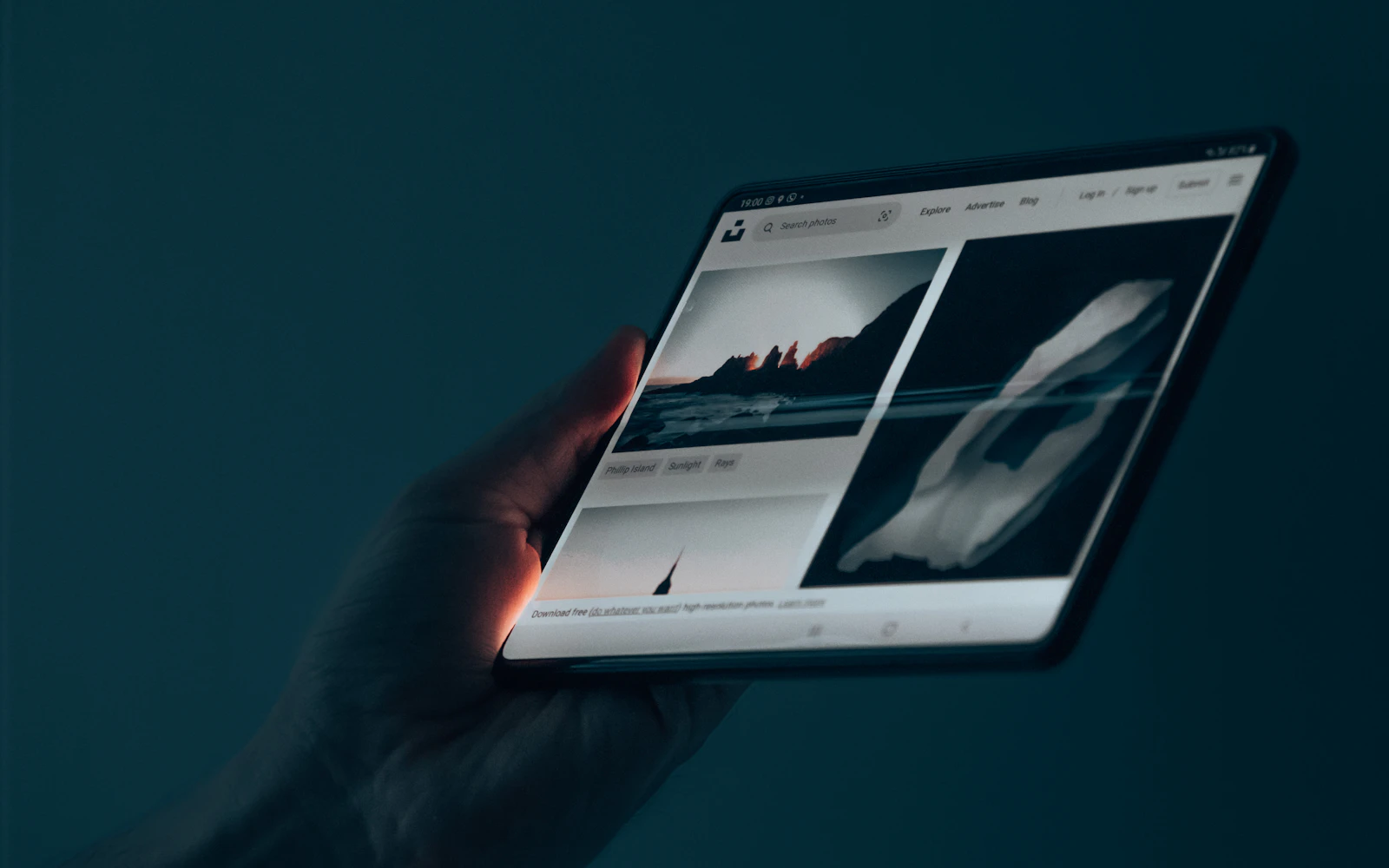
9. Test mobile friendly website design on real devices
No mobile friendly website design is finished until it has been tested on actual phones. Desktop browsers have tools that pretend to be a phone. They are useful during development, but they are not the same as a real device. Real phones have different browsers, different font rendering, notches, rounded corners and real network speeds.
Our testing routine for mobile friendly website design includes:
- At least one recent iPhone and one Android phone, in both Safari and Chrome.
- An older, smaller phone to catch layout breaks.
- Portrait and landscape orientation.
- A test over cellular data, not only office wifi.
- Filling out and submitting every form on a phone.
- Tapping every button and menu item with a thumb, one handed.
Google’s PageSpeed Insights adds performance data for mobile, including Core Web Vitals. Use it alongside real device tests, not instead of them.
10. Keep it mobile friendly after launch
Sites drift. Someone adds a wide table to a blog post, uploads a huge photo straight from a camera, or installs a popup plugin that covers the whole phone screen. Six months later, the site that launched clean is a mess on mobile.
Good mobile friendly website design needs a little ongoing care. Check your key pages on a phone every few months. Review new content on mobile before you publish it. Keep plugins and themes updated, because updates often fix mobile bugs. If you would rather not think about it, our WordPress maintenance services include regular checks.
Mobile friendly website design checklist
Use this mobile friendly website design table to run a quick review of your own site. Open it on your phone and go row by row.
| Area | What to check | Common fix |
|---|---|---|
| Tap targets | Can you tap every button and link easily with a thumb? | Increase button size and spacing |
| Font size | Can you read body text without zooming? | Set body text to 16 pixels or more |
| Menu | Is the menu short, clear and easy to open? | Cut items, keep contact button visible |
| Forms | Can you complete and submit the form on a phone? | Remove fields, use correct input types |
| Images | Do images load quickly and crop sensibly? | Compress, resize and lazy load |
| Content order | Does key text appear before decorative images? | Adjust stacking order for mobile |
| Contact | Is the phone number tappable? | Wrap it in a tel link |
| Popups | Does any popup cover the whole screen? | Remove or delay it, make closing easy |
Quick tip: Hand your phone to someone outside your field, open your site, and ask them to find your contact details and send you a message. Watch without helping. You will learn more in two minutes than from any report.
What mobile friendly website design looks like for different consultants
The basics of mobile friendly website design are the same for everyone, but the priorities shift depending on what you do.
Speakers
Event planners often check speaker sites on their phones. They want a short video that plays smoothly, a list of talk topics and a fast way to check availability. Our speaker website design guide covers this in detail.
Expert witnesses
Attorneys vetting an expert may skim a CV page on a phone between hearings. A downloadable CV that opens properly on mobile and a clean list of case areas matter more than visual flair. See our post on the expert witness website for more.
Security and safety consultants
School administrators and facility managers often look you up after an incident or a board meeting, on whatever device is in hand. Clear service pages and a tappable phone number are key. Sites like stonecampussafety.com, which we built, are designed with that visitor in mind.
Frequently asked questions
What is mobile friendly website design?
It is designing a site so it works well on phones: readable text, easy tap targets, a simple menu, short forms, fast loading images and content ordered sensibly for a narrow screen. It usually means a responsive design that adapts to any screen size.
Does mobile friendly website design affect SEO?
Yes. Google uses the mobile version of your site for indexing and ranking. If content is missing or hard to use on mobile, it can hurt how your pages perform in search.
Is a responsive website the same as a mobile friendly one?
Responsive means the layout adapts to screen size. That is a good start, but a responsive site can still have tiny text, cramped buttons or heavy images. Mobile friendly means it actually works well on a phone.
How do I test mobile friendly website design on my own site?
Open it on a real phone, ideally both an iPhone and an Android device. Tap through the menu, read a full page, fill out a form and check loading speed on cellular data. Then run PageSpeed Insights for performance data.
Can you fix my existing site or do I need a redesign?
Often we can fix the biggest mobile problems without a full redesign. If the site is old or built on a rigid theme, a rebuild may be the better long term choice. We will tell you honestly after a quick review.
Make your first impression on the screen people actually use
Your next client will probably meet you on a phone. Mobile friendly website design makes sure that first meeting goes well: clear words, easy taps, quick loading and a simple way to get in touch. None of it is flashy. All of it adds up.
If you want us to look at your site on real devices, or build a new one that starts from the phone, see our website design services and recent work, then contact Design Fly 24 to book a short call.