
Coaching website design has one job that most coaches underestimate: it has to make a stranger feel understood before they have ever spoken to you. Think about a VP of operations who just got promoted and is quietly struggling. Her CEO mentioned that a coach might help. She searches on her lunch break, opens four coaching sites, and closes three of them within a minute because they all say the same thing: “reach your full potential.”
The fourth site talks about exactly her situation. New senior leaders, a team that used to be her peers, a board that expects results in ninety days. There is a short program page, a few real client words, and a button to book a twenty minute call. She books it.
That gap between “generic coach” and “the coach for me” is mostly a website problem. We have built sites for trainers, consultants and leadership specialists, including bethjsanborn.com and ballingerandassociates.com, and the patterns are clear. Here is how we think about coaching website design for executive, leadership and business coaches.
- Strong coaching website design starts with a clear niche: who you coach, through what change, with what result.
- Program pages should explain format, length and who it fits, so prospects can picture working with you.
- A simple discovery call booking flow with a calendar tool beats a contact form for most coaches.
- Testimonials need to be real, specific and permitted by the client. Start collecting them now.
- A lead magnet and an honest about story keep the right people coming back until they are ready.
Why coaching website design is harder than it looks
Coaching is a service people can’t see or touch before they buy. A prospect can’t test drive a coaching engagement. They have to trust a promise about a personal change. That puts a lot of weight on your site.
The other challenge is that the coaching market is crowded and full of the same words. Transformation, clarity, potential, mindset. When every site uses them, none of them mean anything. Good coaching website design replaces vague language with specific situations, specific people and specific outcomes.
Signs your coaching website design needs work
- Your homepage headline could fit any coach in any niche.
- Your services are listed as “1:1 coaching” with no detail.
- Booking a call takes more than two clicks.
- Your testimonials are first names only, with no role or context.
- Your about page starts with your certifications instead of your story.
If two or more of these sound familiar, the coaching website design fixes below will help more than a new color palette.
1. Define your niche on the first screen
The most useful thing in coaching website design is a headline that names who you serve. “Leadership coaching for first time executives in tech and healthcare” tells the right visitor to keep reading and tells the wrong one to move on. Both outcomes save time.
Coaches often resist this part of coaching website design because they worry about turning people away. In practice, a clear niche brings in more inquiries, because the people who match feel seen. You can still take other clients. Your site just speaks most directly to your best ones.
A simple headline formula
- Who you coach (role, stage, industry).
- The change they want (from what, to what).
- How you help (format or approach, in plain words).
Example: “I help newly promoted directors lead former peers with confidence, through a focused six month coaching program.” It isn’t poetry, but it works. Our brand messaging framework guide shows how to build this kind of line step by step.
2. Build program pages people can picture
“1:1 coaching” is not a program. A program page should describe what working with you actually looks like. Prospects want to know the length, the format, how often you meet, what happens between sessions and who it is right for.
In coaching website design, clear program pages do two jobs. They help prospects self qualify before the call, and they make your discovery calls shorter and more productive, because people arrive already knowing the shape of the work.
What to include on each program page
- A headline naming the program and who it is for.
- The problem it solves, in the client’s own words.
- Format: number of sessions, length, in person or virtual.
- What happens between sessions (assessments, check ins, resources).
- Who it is a good fit for and who it is not.
- A clear button to book a discovery call.
Coaching website design doesn’t require prices on the page. Skip them if you prefer to discuss scope on a call; many executive coaches do. Just say so plainly, so prospects don’t feel you are hiding something.

3. Make discovery call booking effortless
This is where coaching website design either converts or leaks. Most coaches get clients through a discovery call, so the path to that call should be obvious and short. A visitor should be able to book from the homepage, every program page and the about page.
Use a scheduling tool such as Calendly, Acuity or a similar booking widget embedded on a dedicated page. Ask only a few questions: name, email, role, company and “what made you reach out now?” That last question gives you gold for the call and helps you prepare.
Booking page checklist
- A short line about what the call is (and isn’t).
- How long it takes and whether it is by video or phone.
- Your time zone shown clearly, with automatic conversion for visitors.
- A confirmation email with a calendar invite and a short “how to prepare” note.
- A reminder email the day before.
Our landing page design guide explains how to build a focused booking page that keeps distractions out of the way.
4. Collect real, specific testimonials
Testimonials are the most persuasive part of coaching website design, and they are the part coaches most often leave until last. Don’t. Start asking now, even if your site launch is months away.
Only publish words real clients said, with their permission. Never write testimonials for clients or polish them until they sound like ad copy. If you offer anything in return for a review, check the FTC guidance on endorsements so you disclose it properly.
How to ask for useful testimonials
- Ask at the end of an engagement, when results are fresh.
- Ask three specific questions: what was going on before, what changed, and what they would tell a peer.
- Request permission to use their name, title and company, or agree on an anonymous version.
- Ask for a LinkedIn recommendation at the same time. Our guide to LinkedIn recommendations covers how.
In coaching website design, place testimonials near the decision points: under program descriptions and next to booking buttons. A specific line from a real executive beats a page full of generic praise.
Nobody buys coaching from a list of features. They buy it from a person who seems to already understand them.
5. Tell your about story with purpose
Clients hire coaches they relate to. Your about page should explain why you do this work, what you did before, and why that background matters to the people you coach. A former CFO coaching finance leaders has a story worth telling. So does a coach who burned out in a startup and now helps founders avoid the same trap.
Lead with the story, then add credentials such as ICF certification, assessments you are trained in and relevant education. You can find more on credentials at the International Coaching Federation. Our full guide on how to write an about page walks through structure and openings. In coaching website design, the about page is often the second most visited page, so give it real attention.
Want more of the right people booking calls?We’ll review your coaching site and map out a clearer path from first visit to discovery call.
6. Offer a lead magnet worth signing up for
Most visitors are not ready to book a call on their first visit. A lead magnet gives them a reason to stay in touch. For executive and leadership coaches, the best ones are practical and short: a self assessment, a one page framework, a checklist for a first ninety days in a new role, or a short email course.
Put the signup in a few places: the homepage, the end of blog posts, and a dedicated landing page you can share on LinkedIn. Then follow up with a short welcome sequence that shares your thinking and invites a call. Our guide on email marketing for consultants explains how to set this up without spamming people.
Lead magnet ideas for coaches
- A leadership self assessment with a short scoring guide.
- “Five conversations every new director should have in month one.”
- A template for a personal development plan.
- A recorded mini workshop on one specific challenge.
Good coaching website design makes the lead magnet feel like a natural next step, not a pop up that interrupts reading.
7. Write content that shows how you think
Articles, short videos and podcast episodes let prospects sample your thinking before they talk to you. They also help you rank for the questions your clients type into Google. “How to give feedback to a former peer” is the kind of topic a new manager actually searches.
Coaching website design should make content easy to find and easy to read: clean article layouts, short paragraphs, a clear author box and a call to action at the end. Our SEO for coaches guide covers topic planning in more detail, and thought leadership content explains how to stand out with a point of view.
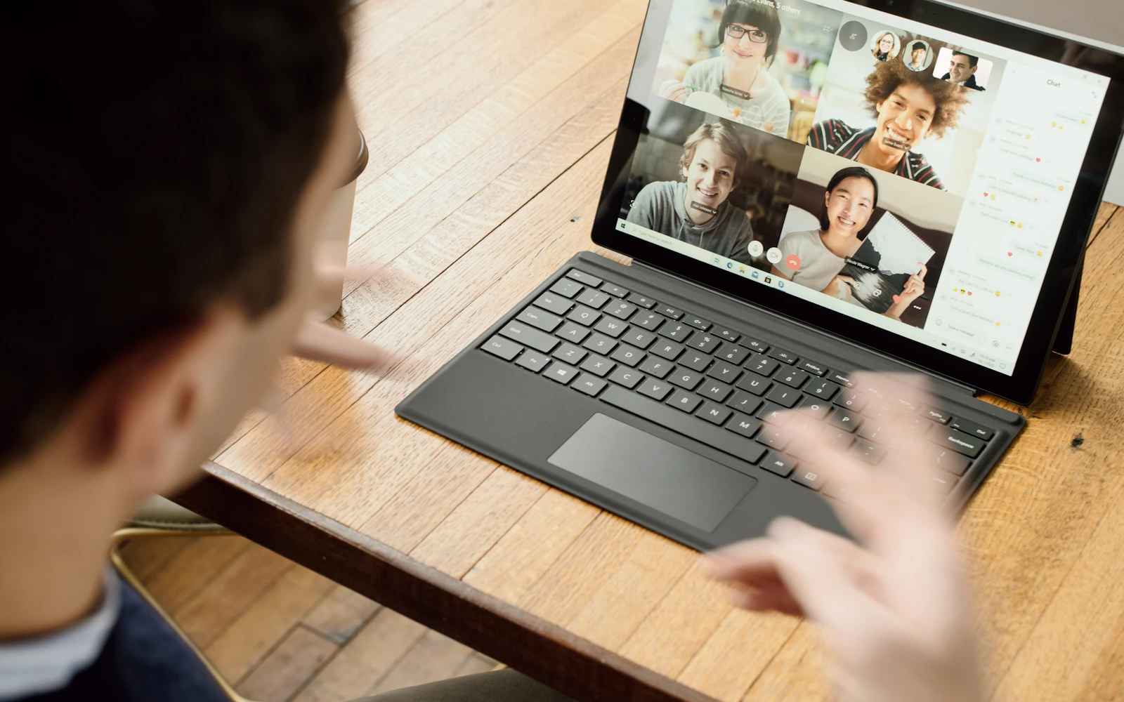
8. Use coaching website design visuals that feel like you
Stock photos of mountains, sunrises and people jumping on beaches are everywhere in coaching. They say nothing about you. Real photos of you working, speaking or sitting with a client (with their permission) feel far more personal.
Invest in a proper photo session with a range of shots: a formal headshot, relaxed portraits and a few candid working images. Pair them with a consistent color palette and fonts. Our brand identity design service and our brand color palette guide can help. Coaching website design works best when the look matches the tone of your coaching, whether that is calm and reflective or sharp and direct.
9. Connect your site and your LinkedIn profile
For executive and business coaches, LinkedIn is often where prospects first meet you. They read a post, check your profile, then click through to your site. That handoff should feel smooth.
- Use the same headline idea on LinkedIn and your homepage.
- Link your site in your profile and featured section.
- Share your lead magnet in a featured post.
- Use the same headshot and brand colors on both.
One more thing: when someone books a call, ask how they found you. If most say LinkedIn, that tells you where to spend your writing time, and which pages of the site they probably saw first. Our LinkedIn profile optimization service handles the profile side, so your coaching website design and your LinkedIn presence tell the same story.
10. Keep the site fast, clear and easy to update
Coaches change programs, add workshops and update testimonials often. Your site should make that easy. WordPress with a good page builder works well for most coaches, and so do Squarespace and Webflow. Pick the one you or your team can update without calling a developer for every change. Coaching website design that only a developer can edit goes stale fast.
Speed and mobile layout matter too. Many prospects read on a phone between meetings. Follow the basics in Google’s Search Central documentation and test pages regularly. If you would rather not deal with updates and backups, our WordPress maintenance services handle that side.
How we plan a coaching website design project
People often ask what actually happens once they hire us. The order matters, because coaching website design goes much faster when the thinking is done before anyone opens a design tool.
- Niche and message call. We talk through who you coach, the change you help with and the words your clients use. This becomes the homepage headline and the spine of every page.
- Page plan. We list every page, what it needs to answer and where each booking button goes. Most solo coaches need fewer pages than they expect.
- Copy and testimonials. You draft, we edit, or we write from interview notes. We also send you a short testimonial request you can forward to past clients.
- Design and build. Only now do colors, layouts and photos come in, built around content that already works.
- Booking and email setup. We connect your calendar tool, confirmation emails and lead magnet signup, then test the whole flow on a phone.
- Launch and review. After launch we check which pages people visit and where they drop off, then adjust.
Coaching website design done in this order rarely needs a big rewrite later. Coaching website design done the other way around, starting with a pretty template, usually does.
Quick tip: Record your next three discovery calls (with permission) and listen for the exact phrases prospects use to describe their problem. Those phrases make the best headlines you will ever write.
Coaching website design checklist
| Page or element | What good looks like |
|---|---|
| Homepage headline | Names who you coach and the change they want |
| Program pages | Format, length, fit and a booking button |
| Booking flow | Calendar embed, four or five questions, confirmation email |
| Testimonials | Real, specific, permitted, near decision points |
| About page | Story first, credentials second, call to action at the end |
| Lead magnet | Practical, short, linked to a welcome sequence |
| Content | Answers real client questions in your voice |
| Visuals | Real photos and a consistent brand look |
Run your current site through this table. Each row you can’t check is a place where coaching website design could be doing more for you.
Frequently asked questions
What pages does coaching website design need at minimum?
A homepage, one page per program, an about page, a booking page and a contact page. Add a blog or resources section and a lead magnet landing page when you are ready to grow.
Should coaches show prices on their website?
It depends on your market. Many executive coaches prefer to discuss scope on a call, while some business coaches list package prices. Either way, be clear about what happens next so prospects aren’t left guessing.
How long does coaching website design take?
A focused site for a solo coach usually takes a few weeks once the copy and photos are ready. Writing program pages and gathering testimonials often takes longer than the design, so start those early.
Is a template good enough for coaching website design?
A template can work for a first site if you rewrite every word for your niche. The template is rarely the problem; generic copy is. Custom coaching website design pays off once you know your niche and programs well.
Can coaching website design help with SEO?
Yes. Clear program pages, a fast site and helpful articles give Google plenty to work with. Pair the build with our SEO services or run Google Ads while organic traffic grows.
Ready for a site that sounds like you?
Coaching website design is not about looking polished. It is about making the right person feel understood and making it easy for them to book a call. A clear niche, real program pages, honest testimonials and a smooth booking flow do most of the heavy lifting.
We are a New York agency working with coaches and consultants across the US. See our work, learn more about us, or explore our website design services. When you are ready, reach out and we’ll talk through your goals.