Risk Mitigation Technologies helps senior leaders spot early warning behaviors and prevent workplace violence before it becomes a crisis. This threat assessment website design had one job: make a serious, sensitive service feel trustworthy from the very first second.
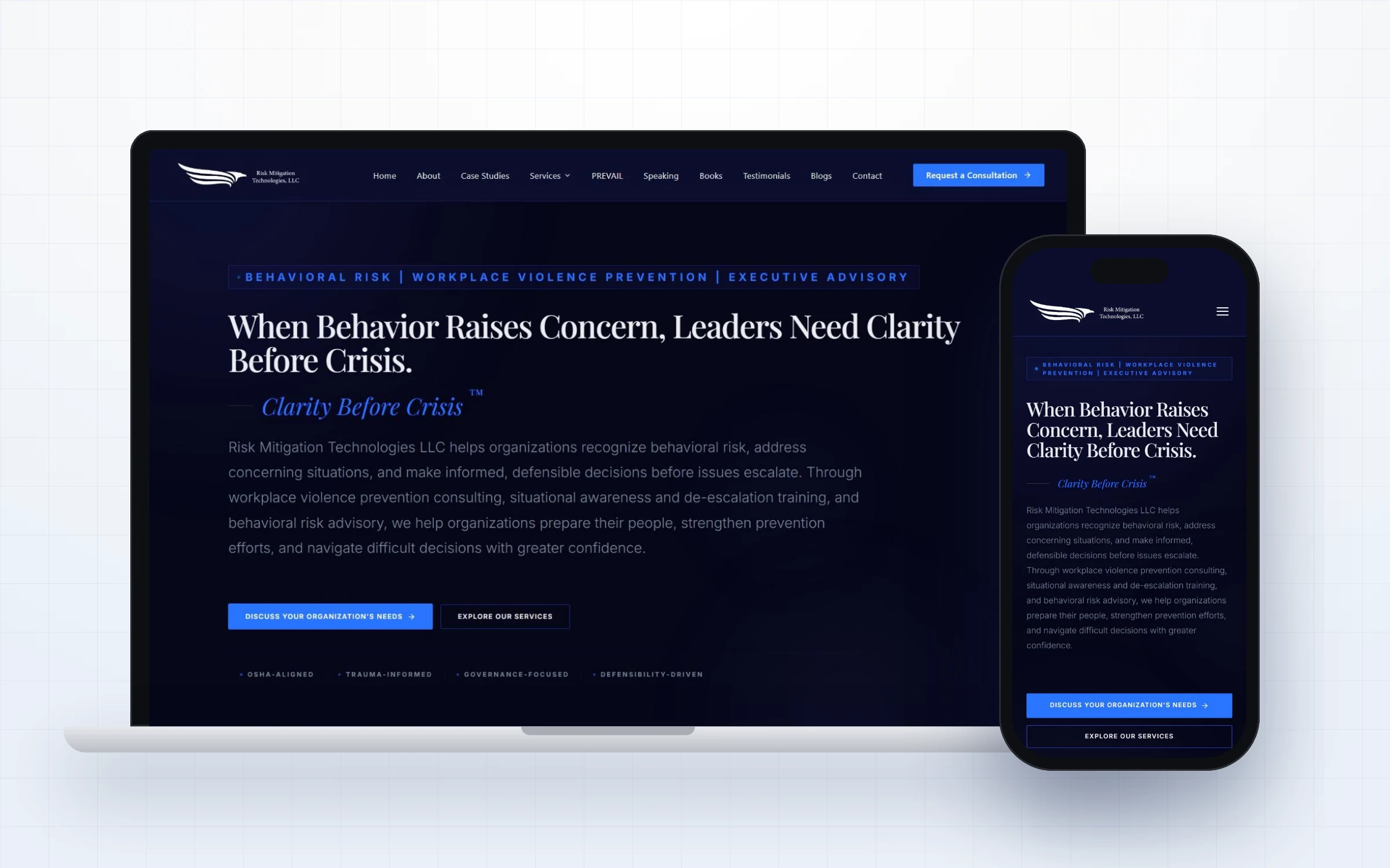
CEOs, HR leaders, general counsel and boards who must make defensible decisions under pressure.
Position the firm as the calm, expert voice leaders call first, and make a confidential consultation easy to request.
A dark editorial design, one clear call to action and a widget library the team can grow with.
Risk Mitigation Technologies LLC is a behavioral risk and threat assessment consultancy led by Joseph Paul Manley. The firm helps senior leaders recognize early warning behaviors, assess potential workplace violence threats and make clear, defensible decisions that prevent disruption, liability and crisis.
Its clients include leadership teams, HR departments, legal counsel, healthcare organizations, education institutions and corporate security groups. Alongside advisory work, the firm delivers keynote presentations, leadership training and published resources, all built around its signature PREVAIL framework.
Because the subject is sensitive, every visitor arrives with a serious question on their mind. The website needed to respect that, speak with authority and make the first conversation feel safe and private.
Threat assessment is not a service people shop for casually. When an executive lands on the site, they are often worried about a real person, a real behavior and a real risk to their organization. They need to feel, within seconds, that this firm understands the stakes and will handle the matter with discretion.
The previous online presence did not carry that weight. The message was spread thin, the visual tone felt generic and there was no single, obvious next step for a leader who was ready to talk. For a firm whose value rests on judgment and composure, the website needed to show both.
Joseph Paul Manley, founder of Risk Mitigation Technologies, shares his journey with Design Fly 24, from his LinkedIn presence to his new website. Press play to hear it in his own words.

Every choice on this project was made to build trust quickly and guide the right visitor to a conversation.
The headline speaks directly to the leader: when behavior raises concern, you have one job, to make a clear, defensible decision. It frames the firm around the outcome executives care about.
Deep navy, generous spacing and a refined serif headline create a quiet, confident mood. It feels closer to a respected advisory firm than a security vendor.
Request a Confidential Consultation appears in the header, the hero and at natural decision points across the page, so a ready leader never has to hunt for it.
Media features, the founder profile and the PREVAIL framework sit close to the top, so credibility is established before a visitor scrolls far.
For a threat assessment website design, proof matters more than style. Buyers in this field want to see credentials, books and real experience before they ever pick up the phone, so we put that proof where it is seen first in this threat assessment website design.
We created custom Elementor widgets for the homepage and inner pages, so the team can add speaking topics, case studies and resources without breaking the design.
Great websites are planned around how people actually decide. This threat assessment website design walks every visitor through four simple stages.
A clear headline tells visitors within seconds that they are in the right place and that Risk Mitigation Technologies understands their situation.
Short sections explain the services in plain language, so visitors know exactly what is offered and who it is for.
Credentials, real experience and proof appear right where doubts usually come up, before the visitor has to ask.
The main button, Request a Confidential Consultation, is always within reach, so a ready visitor can take the next step in one click.
Most websites in this space lose enquiries for the same few reasons. Here is what we deliberately designed out of this threat assessment website design.
Here is the complete homepage presented section by section, so you can see how the story flows from first impression to final call to action.
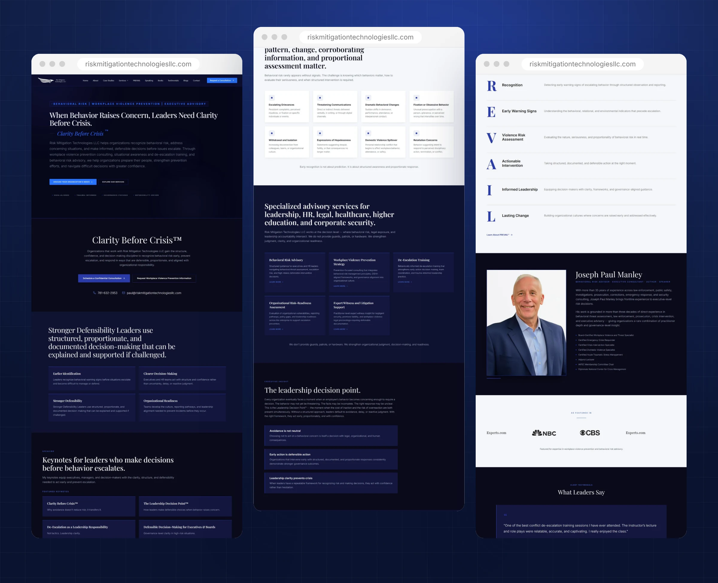
The complete threat assessment website design, presented section by section.
Here is everything included in this threat assessment website design project, from first strategy call to launch day. Each piece was designed to work together, so visitors move naturally from first impression to a confident decision without friction or confusion.
A focused narrative that moves from concern to clarity to consultation.
A polished header built through many careful revisions for desktop and mobile.
A signature methodology presented as a clear, memorable leadership system.
Dedicated sections that support keynote bookings and published work.
Media logos, founder credentials and testimonials placed where doubt usually appears.
Reusable components that keep every new page on brand.
A consistent visual language is what makes a website feel premium. For this threat assessment website design, every color, font and image choice supports one goal: trust.
A deep navy base with a single bright blue accent. The restraint keeps attention on the message and makes every call to action easy to spot.
A refined serif for headlines paired with a clean sans serif for body copy. The serif adds gravity and calm; the sans serif keeps long explanations easy to read.
Real photography of the founder and quiet, professional settings instead of alarming stock images. The tone stays composed even when the subject is serious.
Generous spacing, short sections and one idea per block, so an executive can scan the page in under a minute and still understand the offer.
Many executives first open a link like this on their phone, often between meetings. The mobile layout keeps the same calm tone with a readable serif headline, a short introduction and a full width consultation button that sits within easy reach of the thumb.

Scroll inside the window to explore the complete threat assessment website design.
Every project follows the same clear five step process, so clients always know what happens next and nothing is left to chance.
We started with a focused conversation about Risk Mitigation Technologies, the people it serves and the questions those buyers ask before they reach out. That conversation became the brief for the threat assessment website design.
Before any commitment, we designed the homepage so Risk Mitigation Technologies could see the direction, the message and the visual style. Feedback at this stage shapes everything that follows.
Once the concept was approved, we designed the remaining pages with the same system, keeping navigation simple and every page focused on one clear next step.
We built the threat assessment website design in WordPress with Elementor, then tested every page on phones, tablets and desktops, checking speed, forms, links and readability.
At launch we connected analytics and Search Console, checked indexing and handed over a site the team can update with confidence, with ongoing support whenever it is needed.
A threat assessment website design only pays off when the right people find it. After launch, we can support it with SEO, LinkedIn branding for the founder and email campaigns, so this threat assessment website design keeps bringing in training and consulting inquiries.
Because the homepage concept comes first, there are no surprises later. Risk Mitigation Technologies saw the direction early, shaped it with honest feedback and moved into the full build with confidence. That same rhythm of design, review and refine continued until every page felt right, and it is the reason our clients describe the process as calm and easy to follow.
A strong threat assessment website design is less about decoration and more about trust. Leaders in this space are cautious buyers. They read carefully, compare quietly and reach out only when they feel safe. Every layout choice on this project, from the restrained color palette to the single call to action, was made to lower that hesitation and invite a confidential first conversation.
Just as important, the website now works as a long term business asset rather than a static brochure. It explains the offer clearly to new visitors, supports referrals from people who already know Risk Mitigation Technologies, and gives every marketing effort, from LinkedIn posts to speaking events, a credible place to send people. When someone hears about Risk Mitigation Technologies and looks them up, the website confirms everything they hoped to find.
Want to see more? Browse our full web design portfolio, learn how our website design services work, or check your own site against our free website checklist for consultants. You can also view the live Risk Mitigation Technologies website.
Premium design needs a solid foundation. Here is how this threat assessment website design is built and maintained.
A flexible, widely supported platform that gives Risk Mitigation Technologies full ownership of the website and its content.
Custom built sections and widgets keep the design consistent while making everyday edits simple.
Reliable hosting, page caching and compressed modern images keep pages quick for every visitor.
Connected tracking shows how people find and use the site, so decisions about content are based on real data.
Every section answers a real question that clients of Risk Mitigation Technologies ask before they reach out, in the order they usually ask it.
Proof, credentials and a calm, confident visual style work together so the expertise behind the site is obvious at a glance.
A reusable component system and ongoing care keep the website current, fast and on brand as the business grows.
A beautiful website only works if the right people can find it. Search visibility and speed were part of this threat assessment website design from the first page, not added at the end.
If you work in a similar field, these lessons from the threat assessment website design for Risk Mitigation Technologies can help you win more of the right clients from your own website.
Executives do not search for features. They search for help with a specific worry. Lead with the decision they need to make and the site instantly feels relevant.
In a sensitive field, alarming visuals push serious buyers away. A composed design signals that you will handle their situation with the same composure.
Many visitors cannot discuss their issue publicly. A clearly labeled confidential consultation lowers the barrier to that first message.
A named framework like PREVAIL gives buyers something memorable to repeat to colleagues, which helps referrals spread.
Speaking pages, books and resources will keep coming. A reusable component library means each new page launches quickly and stays on brand.
If your clients are careful, senior or under pressure, the principles behind this threat assessment website design apply to your business too. Buyers like these rarely decide in a single visit. They come back, compare two or three names and look for signs that you understand their situation better than anyone else.
That is why we start every project the same way: a short call to understand your audience, then a free homepage concept built around the exact questions your best clients ask. You see the direction before you commit to anything, and the finished site is built so you can keep it fresh long after launch.
Whether you need a new threat assessment website design or a refresh of an existing site, the goal is the same: a clear message, visible proof and an easy next step on every screen.
You do not need to have every answer before we talk. Bring your goals, your best client stories and any questions you have. We will turn them into a clear plan, a homepage concept you can see and react to, and a website that represents your expertise with the same care you give your own clients.
Answers to the questions we hear most about this threat assessment website design and how we work.
Like most of our builds, it started with a free homepage concept. Once the direction was approved, we designed and built the remaining pages in focused rounds, with the client reviewing each step.
Yes, when it is handled with care. Generous spacing, readable type and one bright accent color keep a dark design calm and confident rather than heavy.
Yes. Every section was built as a reusable Elementor widget, so new pages and updates stay consistent with the original design.
Buyers in this field are cautious and senior. A specialist website speaks their language, respects confidentiality and shows the judgment they are paying for.
Yes. We shape the messaging with you, from the headline to each service description, so the words match the quality of the design.
Yes. Images are compressed, code is kept lean and caching is configured, so pages open fast on desktop and mobile.
Yes. We can handle updates, backups and new pages every month so the site stays current without extra work for your team.
Usually a short discovery call, a review of the homepage concept and quick feedback on the remaining pages. We handle the design, build and technical setup.
Yes. The website, its content and its design are yours, built on WordPress so you are never locked in.
Book a free strategy call. We will talk through your goals and then design your homepage concept before you commit to anything.
Yes. Design Fly 24 is a full service agency, so the same team that builds your website can grow it with SEO, Google Ads management, LinkedIn branding, email marketing and monthly website care. One point of contact, one plan, and everything working together to bring you clients.
Tell us about your work and we will design your new homepage free. If you love it, we build the rest. If not, you owe nothing.