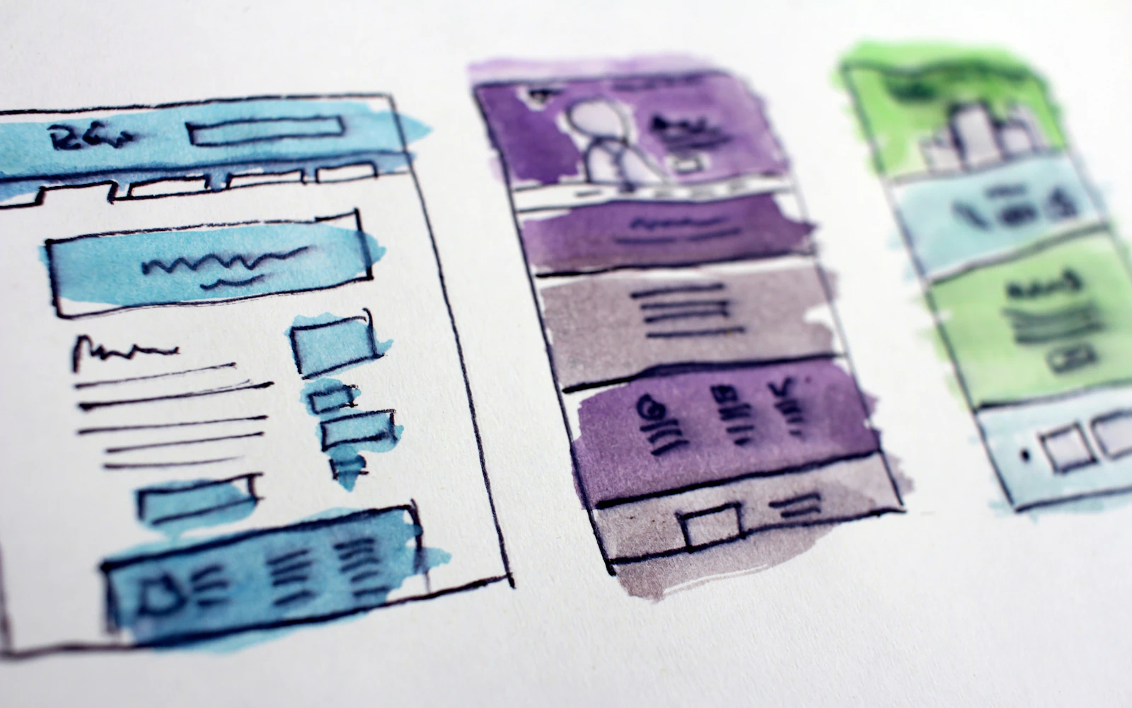
Homepage design best practices matter most on the day a stranger lands on your site with a real decision to make. Picture a school district safety director who got your name from a colleague. She has twelve minutes before her next meeting, she opens your site on her phone, and she wants to know three things: what you do, whether you have done it for people like her, and how to reach you.
If your homepage answers those three questions fast, she books a call. If it opens with a vague slogan, a slow slider and a menu with eleven items, she closes the tab and calls the next name on her list. She will never tell you that happened.
We have designed homepages for security consultants, expert witnesses, keynote speakers, HR advisors and small professional firms. This guide covers the homepage design best practices we actually use on client projects, in the order a visitor experiences them. No theory for its own sake, just what works for service businesses that sell trust.
- Homepage design best practices start with the first screen, which has one job: say who you help, what you do and what to do next, in plain words.
- Proof belongs high on the page. Logos, credentials, a short testimonial or a recognizable client name beat clever copy.
- A short services overview with links to deeper pages helps both visitors and search engines.
- One primary call to action, repeated, works better than five competing buttons.
- Speed and mobile are part of design, not technical extras. Most first visits happen on a phone.
Why homepage design best practices are different for service businesses
A lot of homepage design best practices online are written for software companies or online stores. Those homepages are built to get a free trial signup or an add to cart click. A consultant’s homepage has a different job. Nobody buys a workplace violence assessment or an expert witness engagement from a homepage. They buy a conversation.
So the homepage design best practices for a service business are about reducing doubt. The visitor is asking: is this person credible, do they understand my problem, and is it easy to take the next step? Every section on the page should answer one of those questions. If a section answers none of them, it is decoration.
The other difference is the buyer. Your visitors are often lawyers, HR directors, event planners, superintendents or business owners. They are careful, busy and a little skeptical. They are not impressed by animation. They are impressed by clarity and evidence.
1. Make the first screen do the heavy lifting
The area a visitor sees before scrolling is the most valuable space on your site. Among all homepage design best practices, getting this right moves the needle the most. On a phone, that space is small, so every word has to earn its spot.
Write a headline that says what you do
Your headline should describe the outcome you deliver for a specific kind of client. “School safety consulting for districts that want calm, prepared campuses” tells a visitor more in one line than “Excellence in Every Engagement” ever will. If a stranger cannot repeat what you do after reading your headline once, rewrite it.
Add one supporting line
Under the headline, add a sentence that names who you serve and how. Something like: “We help K to 12 districts assess threats, train staff and plan for emergencies, across the US.” That line does the work a paragraph used to do.
Show one clear button
Put a single primary button on the first screen: “Book a consultation,” “Check availability” or “Request a proposal.” A secondary text link such as “See our work” is fine. Three or four buttons in a row just make people pause.
Use a real photo of you
For most consultants, a professional photo of the actual person beats any stock image. People hire people. A good headshot or an image of you speaking or working on site builds trust before a word is read. Our professional headshot tips cover how to get one that works.
2. Put proof near the top, not at the bottom
Many homepages save the testimonials for the very end, after the visitor has already decided to leave. One of the simplest homepage design best practices is to move some proof right under the first screen.
Proof can take several forms:
- Logos of organizations you have worked with (with permission).
- Credentials that your buyers recognize, such as board certifications, licenses or published books.
- A short, specific testimonial with a real name and title.
- Media mentions or conference names where you have spoken.
- A simple fact line: years in the field, sectors served, states you work in.
Keep this strip short and scannable. When we built schoolsecurity.org, the media and expert credibility was the asset worth putting forward, because that is what a district or a reporter checks first. Your proof will be different, but the principle holds.
Visitors do not read your homepage. They interrogate it. Answer the questions before they ask them.

3. Give a short services overview that links deeper
Following homepage design best practices, your homepage should not try to explain every service in detail. It should show the menu and send people to the right page. A grid of three to six service cards, each with a short title, one or two sentences and a link, is usually enough.
Write the cards from the buyer’s side. “Threat assessment training for school staff” is clearer than “Training Solutions.” If you serve very different audiences, such as law firms and corporate HR teams, consider splitting the overview by audience instead of by service.
This structure also helps search. Each service card links to a dedicated page that can rank on its own, and the homepage passes authority to those pages through internal links. We explain more about that in our guide to SEO for consultants.
4. Keep navigation simple and predictable
Navigation is not the place for creativity. Visitors expect a logo on the left, a menu across the top (or a menu icon on mobile) and a contact button on the right. Following those conventions is one of the quieter homepage design best practices, and it saves people effort.
Some rules we follow on almost every build:
- Keep the main menu to five to seven items. Group the rest under a dropdown or move them to the footer.
- Use plain labels: Services, About, Work, Speaking, Insights, Contact. Skip cute names like “Our Story Begins.”
- Put the contact or booking button in the header so it is visible on every page.
- Make the logo link back to the homepage.
- Use the footer for secondary links, address, phone and social profiles.
The Nielsen Norman Group has researched homepage usability for decades, and their findings keep pointing to the same thing: people want to find what they came for without thinking about the menu.
5. Plan your calls to action like a conversation
A call to action is just the next step you are inviting someone to take. Good homepage design best practices treat these as a sequence, not as random buttons scattered around.
One primary action
Decide the single most useful action for a ready buyer. For most consultants, that is booking a call or sending an inquiry. Repeat that same button in the header, the first screen, after the services, and at the bottom of the page. Consistent wording helps.
One softer action for people not ready yet
Some visitors are early in their research. Give them something lighter: a checklist download, a newsletter, a case study or your LinkedIn profile. That way you keep the relationship without forcing a sales conversation too early.
Want a second set of eyes on your homepage?We will review your first screen, proof and calls to action and tell you what we would change first.
6. Treat speed as one of your homepage design best practices
A homepage that takes six seconds to show anything useful is a design problem, not just a hosting problem. Large hero videos, heavy sliders, five different fonts and a stack of tracking scripts all slow things down. Visitors on a mobile connection feel every one of those choices, which is why fast loading belongs on every list of homepage design best practices.
Fast homepages come from decisions made early:
- Use one strong hero image, compressed and sized properly, instead of a slider.
- Limit yourself to one or two font families.
- Load only the scripts you actually use. Old chat widgets and abandoned pixels add weight.
- Lazy load images below the first screen.
- Choose decent hosting and a lean theme.
You can test your homepage with Google’s PageSpeed Insights, which reports Core Web Vitals on real devices. For the deeper fixes, our website speed optimization guide goes step by step.
7. Apply homepage design best practices on the phone first
For most of the consultants we work with, the first visit to the homepage happens on a phone. Someone hears your name at a conference, gets your card, or sees a LinkedIn post and taps through. That first look decides whether they come back later on a laptop.
Mobile versions of homepage design best practices look like this:
- The headline and button should be visible without scrolling on a typical phone.
- Body text should be at least 16 pixels so nobody has to zoom.
- Buttons need enough space around them to tap with a thumb.
- Phone numbers should be tappable links.
- Sections should stack in a logical order, with the most important content first.
We wrote a whole guide on mobile friendly website design if you want the detailed version.
8. Say who you are, briefly
Homepage design best practices favor a short, human introduction. An “about” block gives the visitor a human to connect with. Two or three sentences and a photo, then a link to your full About page. Mention your background in terms the buyer cares about: former police chief, licensed engineer, 20 years in HR leadership, author of a book on campus safety.
This is where many expert sites go wrong. They either skip the person entirely and sound like a faceless agency, or they put a full biography on the homepage. Keep it short here. Our guide on how to write an about page covers the longer version.
9. Show work or outcomes, not just claims
Homepage design best practices come down to evidence here: if you can show work, show it. A speaker can show a short video clip and a list of events. A security consultant can describe the type of assessments done, with client permission. A designer can show screenshots. An expert witness can list case types and areas of testimony.
If confidentiality limits what you can share, describe the situation in general terms: “Helped a regional hospital system rebuild its visitor management process after an incident.” That still tells the visitor you have handled problems like theirs. A full write up belongs on a case study page, and our case study guide explains how to structure one.
10. Write homepage copy that sounds like you
Most homepage copy sounds the same because it is written to impress instead of to inform. Words like “solutions,” “excellence” and “innovative” do nothing. Your visitors want to hear how you think.
A few habits help:
- Write the way you talk to a client on the phone.
- Name the specific problem before naming your service.
- Use short paragraphs and clear subheadings so people can scan.
- Cut every sentence that would fit on any competitor’s site.
Copy is where homepage design best practices and good writing overlap. A clean layout cannot rescue unclear words. Our website copywriting tips go further on this.
11. Build in the basics for search
Homepage design best practices also cover search. Your homepage is usually the strongest page on your site in the eyes of search engines, so set it up well. That means a clear title tag with your main service and location if relevant, a meta description that reads like an invitation, one H1 that matches what you do, and internal links to your key service pages.
Add structured data for your organization or professional service so search engines understand who you are. Make sure images have descriptive alt text. None of this is complicated, but it is easy to skip during a redesign. If you want help, our SEO services include a homepage review as part of every project.
12. Measure and adjust after launch
Homepage design best practices do not stop at launch. After launch, look at where people click, how far they scroll, and which pages they visit next. Google Analytics 4 can show you the path people take from the homepage to your contact page. Our GA4 guide for small business shows the reports worth checking.
Make one change at a time and give it a few weeks. Move the proof strip higher. Rewrite the headline. Simplify the form. Small, steady improvements based on what visitors actually do will beat a full redesign every two years.
Homepage design best practices checklist
Use this table to review your current homepage against these homepage design best practices. If you answer “no” to more than three rows, it is probably time for a rework.
| Section | What good looks like | Quick test |
|---|---|---|
| First screen | Clear headline, one supporting line, one button, real photo | Can a stranger say what you do in five seconds? |
| Proof | Logos, credentials or a named testimonial right below the first screen | Is there evidence before the first scroll ends? |
| Services | Three to six cards linking to dedicated pages | Does each card link somewhere useful? |
| Navigation | Five to seven plain menu items and a header contact button | Can you find Contact in one tap on mobile? |
| Calls to action | One primary action repeated, one softer option | Is the main button wording consistent? |
| Speed | Compressed images, few scripts, no heavy slider | Does it load quickly on a phone over cellular? |
| Mobile | Readable text, thumb friendly buttons, tappable phone number | Did you test it on a real phone? |
| About block | Two or three sentences and a photo, link to full page | Does it mention credentials buyers recognize? |
Quick tip: Ask a friend who does not know your field to look at your homepage on their phone for ten seconds, then tell you what you do. Their answer is the most honest audit you will get.
How we apply homepage design best practices on client projects
When we start a homepage for a consultant, we begin with a short call about the buyer: who visits, what they worry about, and what makes them pick up the phone. Then we write a rough outline of the sections in order, with real copy, before any design happens. That is how homepage design best practices turn into a real page: design follows the message, not the other way around.
That approach has worked for sites like jackson-chambers.com and hrexpertconsultants.com, where the visitor needed to see expertise and a clear next step quickly. You can browse more examples in our work. Strong branding helps too, and our brand identity design service makes sure the homepage looks as credible as you are.
Frequently asked questions
What are the most important homepage design best practices for a consultant?
A clear first screen that says who you help and what you do, proof near the top, a short services overview, one consistent call to action, fast loading and a strong mobile layout. Get those right before anything else.
What do homepage design best practices say about length?
Long enough to answer the visitor’s main questions and short enough to scan. For most service businesses, that is six to nine sections. Length matters less than whether each section earns its place.
Do homepage design best practices change for mobile?
The principles stay the same, but the priorities get sharper. On a phone, the first screen is smaller, so your headline and button need to be visible right away, and text and buttons must be easy to read and tap.
Should I use a video on my homepage?
Most homepage design best practices treat video as optional. A short clip can work well for speakers and coaches, especially if it shows you in action. Avoid autoplay background videos that slow the page down. A thumbnail that plays on click is usually the better choice.
How often should I update my homepage?
Review it against these homepage design best practices at least once a year, and any time your services, audience or proof change. Small updates to the headline, testimonials and calls to action keep it accurate without a full redesign.
Your homepage is a first meeting
Think of your homepage as the first meeting with a client who has not decided to trust you yet. Be clear about what you do, show evidence quickly, make the next step obvious, and do not make them wait. These homepage design best practices are simple on paper. The hard part is applying them with discipline to your own business.
If you would like help applying homepage design best practices to your own site, we are happy to look at your current site and share what we would change. Learn more about our website design services or our team, then contact Design Fly 24 to set up a short call.