

Before and after · Security consulting
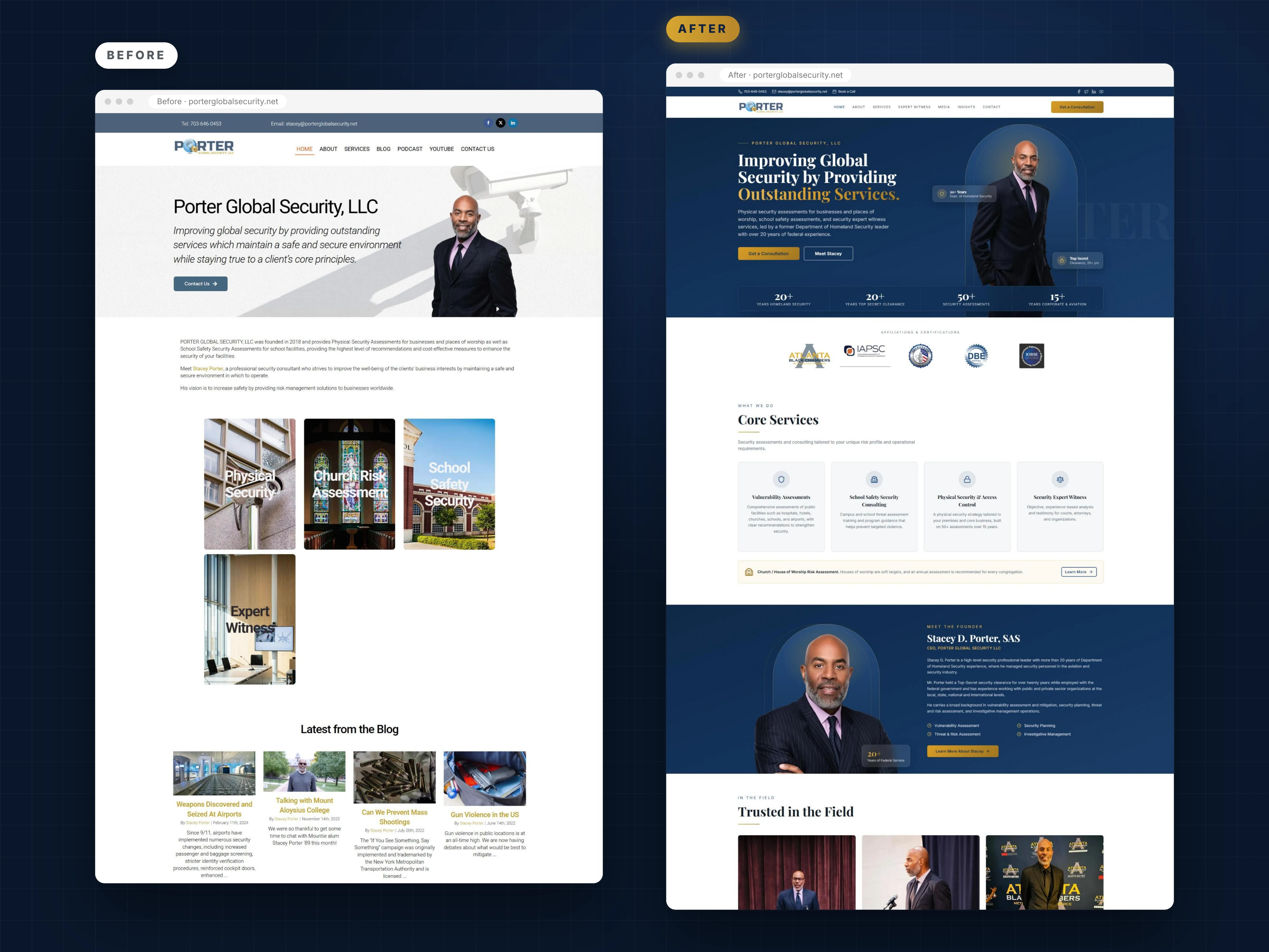
This security consultant website redesign shows how we turned a plain template site into a credible, conversion focused home for Stacey D. Porter, SAS, a former Department of Homeland Security leader with more than 20 years of federal experience. Drag the slider below to see the difference for yourself.
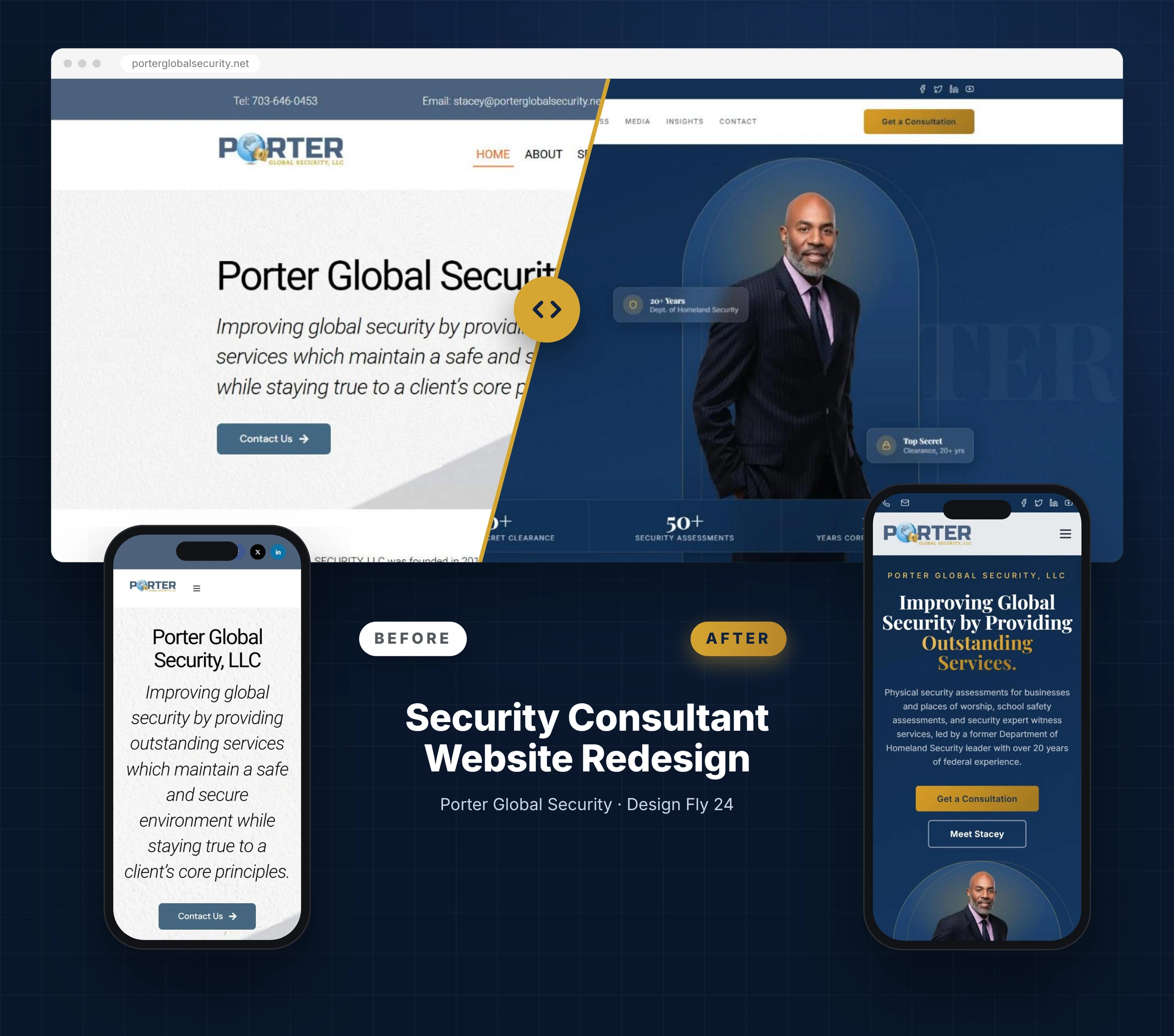
Same company, same founder, same photo. The difference is structure, hierarchy and proof. Move the gold handle to see the first screen a visitor gets before and after the security consultant website redesign.

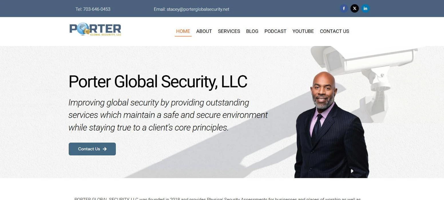
Security consultant website redesign compared on the desktop homepage at 1920 pixels wide, captured October 21, 2026.
Stacey D. Porter spent more than 20 years with the Department of Homeland Security, managing security personnel in aviation, and held a Top Secret clearance for over two decades. He founded Porter Global Security in 2018 to deliver physical security assessments for businesses and houses of worship, school safety assessments and security expert witness services.
We already knew Stacey well. Our team had rebuilt his LinkedIn presence with a new banner, headshot and Featured section, and he left us a LinkedIn recommendation. When we looked at his website next, the gap was obvious: an expert with this background deserved a site that looked as serious as his résumé.
None of these numbers appeared anywhere on the old homepage. That was the core problem this security consultant website redesign had to solve.
Before designing anything, we audited the existing site the way a school district, church board or attorney would see it on a first visit. Here is what we found, and what the redesign changed.
| Area | Before | After |
|---|---|---|
| First impression | Company name as the headline, then a long italic sentence | A clear promise in a strong serif headline with a gold accent |
| Credibility | No federal background, clearance or numbers above the fold | 20+ years DHS, Top Secret clearance and 50+ assessments on the first screen |
| Calls to action | One small Contact Us button | Get a Consultation, Meet Stacey and Book a Call in the top bar |
| Services | Photo tiles with hard to read text and an orphaned fourth tile | Four clean service cards plus a dedicated house of worship strip |
| Affiliations | IAPSC, InfraGard, DBE and IOBSE logos buried above the footer | Moved directly under the hero as proof |
| Founder story | One line of text linking to another page | A full Meet the Founder section with expertise and a photo |
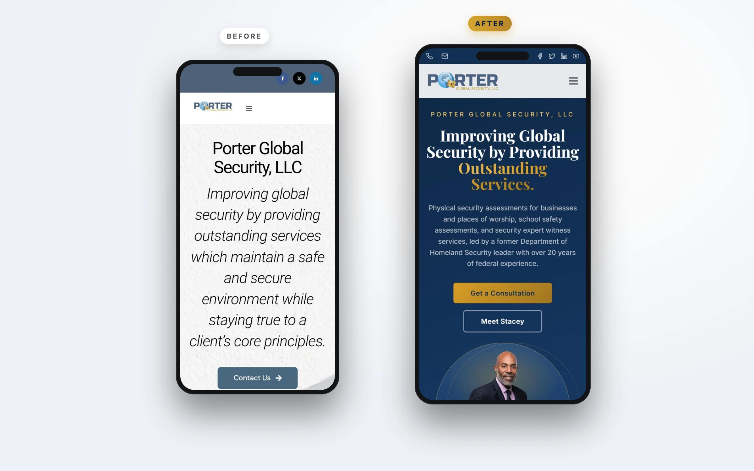
| Mobile | Seven lines of italic text before any photo or button | Headline, summary and two buttons before the first scroll ends |
| Content | Blog, podcast and YouTube scattered in the menu | Organized into Insights and Media with clear categories |
Both homepages scroll on their own below. The old site ends after a few photo tiles and a blog strip. The redesigned page tells a complete story: who Stacey is, what he does, who trusts him, what he has published and how to book him.
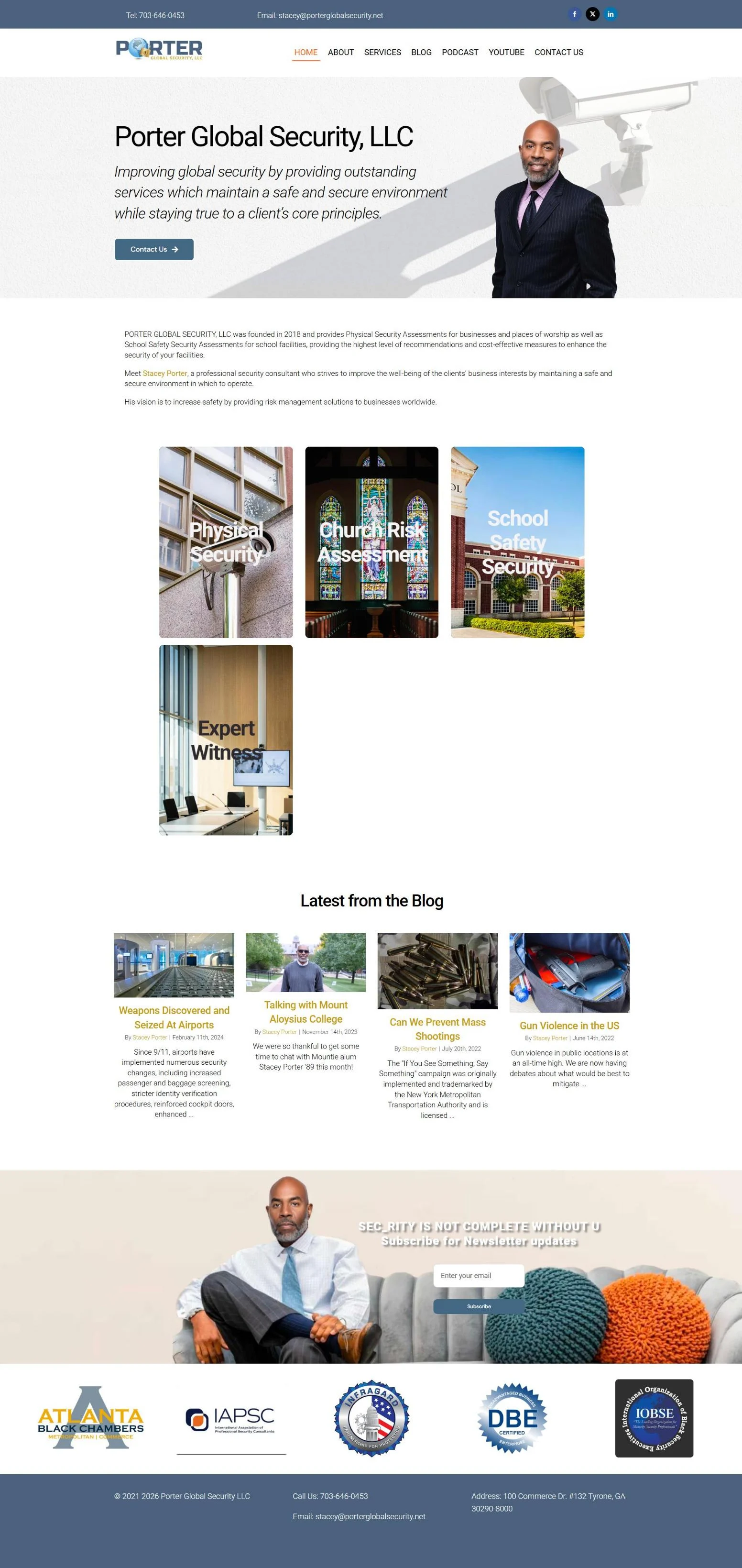
Before the security consultant website redesign
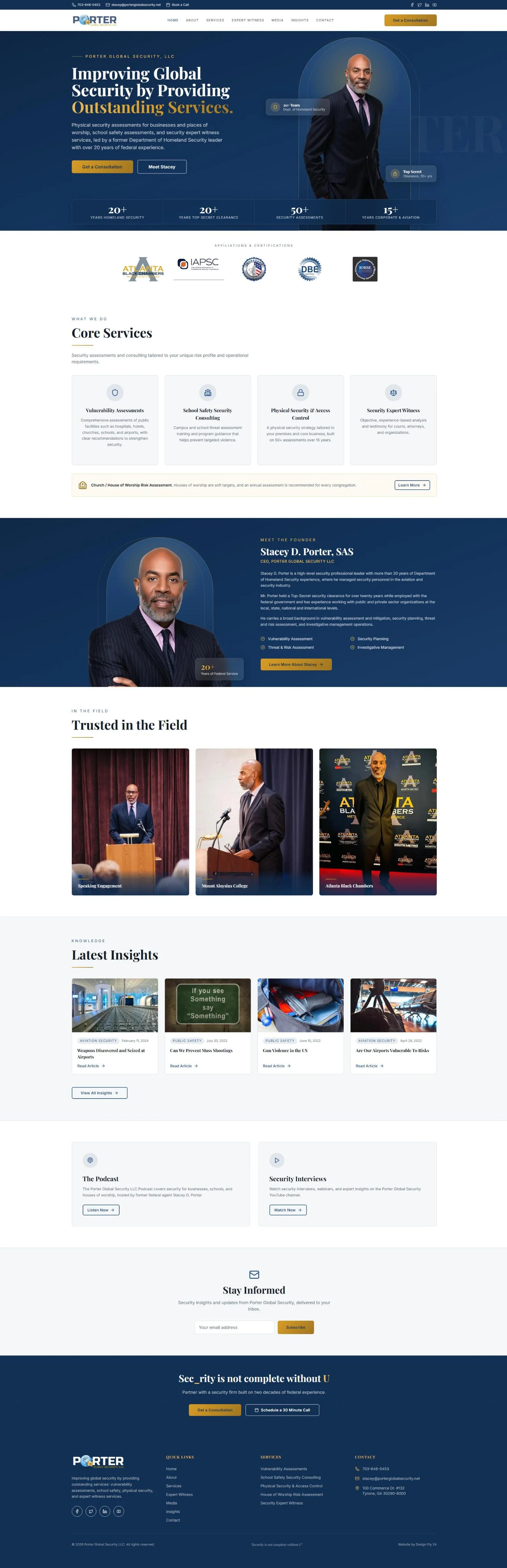
After the security consultant website redesign
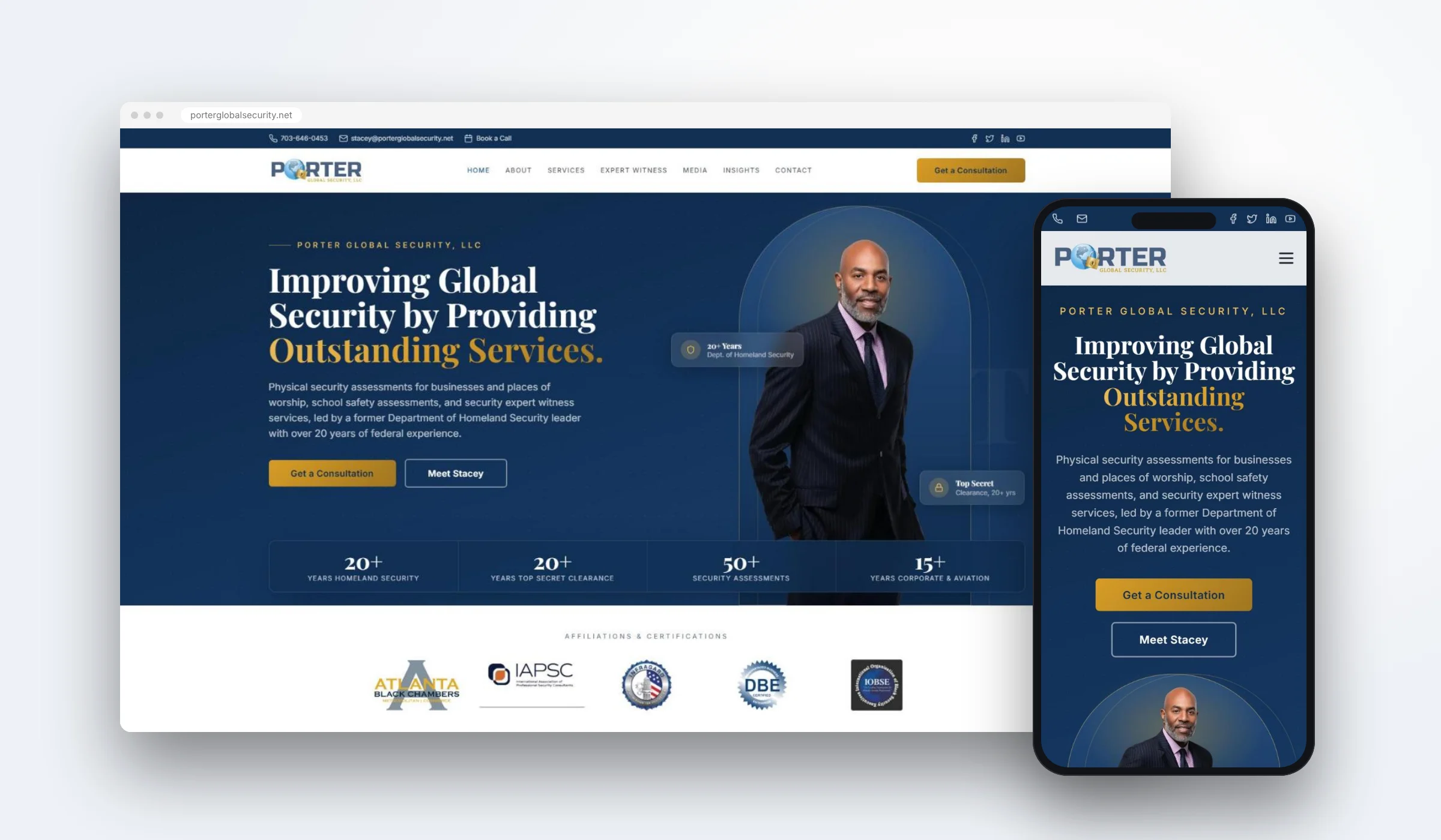
Security buyers want calm, serious and dependable, so the security consultant website redesign needed a look to match. We built the new look around a deep navy taken from the existing Porter logo, paired with a muted gold accent that signals seniority without feeling flashy. Headlines use a classic serif so the site reads like a professional firm, and body text uses a clean sans serif that stays easy to read on any screen.
Many decision makers first see a consultant on a phone, often from a LinkedIn link. On the old site, a phone visitor saw the company name and then seven lines of italic text before reaching a button or a photo of Stacey.
The security consultant website redesign fixes that. The phone view now opens with a short eyebrow, a confident headline, a one paragraph summary that mentions Homeland Security, and two large buttons. Stacey's photo follows right after, inside the same arch used on desktop.
As part of the security consultant website redesign, we reorganized the navigation around the questions buyers actually ask. Each one now has a clear home on the new site.
Vulnerability assessments, school safety consulting, physical security and access control, and house of worship risk assessment.
A dedicated page for attorneys who need objective, experience based security testimony.
The Porter Global Security podcast and security interviews on YouTube, now presented as proof of expertise.
Existing articles on aviation security and public safety, sorted with category tags and dates.
Header. The old header had a thin blue bar with a phone number and email, then a logo and a plain text menu. The new header keeps the contact details but adds a Book a Call link, a cleaner menu with Expert Witness and Media pages, and a gold Get a Consultation button that stays visible on every page.
Hero. The old hero showed the company name in large type over a security camera background. The new hero leads with a promise, explains the services in one sentence, mentions Homeland Security experience, and gives two clear buttons. Credential badges and a stats bar sit right beside the founder photo.
Services. The old services were four photo tiles with white text placed over busy images, which made them hard to read, and the fourth tile sat alone on its own row. The redesign uses four even cards with icons and short descriptions, plus a highlighted strip for house of worship assessments, which deserve their own call out.
Founder. On the old site Stacey was mentioned in one line. In the security consultant website redesign he gets a full section with his title, his federal background, four areas of expertise and a button to read his full story.
Proof. Speaking photos, professional affiliations and published articles were spread across the old site. They now appear in a clear order: affiliations under the hero, speaking photos in the Trusted in the Field gallery, and articles in Latest Insights with categories and dates.
Footer. The old footer had three lines of contact text. The new footer includes a short description, quick links, a full services list, contact details and social links, so visitors who reach the bottom of the page always have somewhere useful to go next.
Every page ends with the same two options: get a consultation or schedule a 30 minute call. A buyer never has to hunt for the next step.
A new website deserves a proper launch. Alongside the security consultant website redesign, we produced a 30 second vertical reel so Stacey could announce the site on LinkedIn and Instagram the day it went live.
Every frame comes from the security consultant website redesign itself: the new first screen, the mobile view, the core services and the consultation page. No stock footage, just the new site showing exactly what clients will see.
 Stacey D. Porter, SAS
Principal Consultant | Security Expert Witness
Porter Global Security, LLC
LinkedIn recommendation
October 22, 2026
As a security consultant, I understand the importance of professionalism, credibility, and attention to detail when representing a business. I had the pleasure of working with Mr. Imtiaz Ahmed to develop and redesign my online presence for Porter Global Security, LLC, and I couldn’t be more pleased with the results.
He took the time to understand my business, my services, and the importance of presenting a professional image to potential clients. His creativity, communication, patience, and commitment to bringing my vision to life made the entire process a positive experience. The finished website provides a professional platform to showcase my security consulting services and communicate the value of vulnerability assessments and security solutions to the organizations I serve.
I highly recommend his services to business owners, entrepreneurs, and professionals looking to strengthen their online presence. If you’re looking for someone who listens, understands your vision, and delivers quality work, I encourage you to consider working with Imtiaz.
Stacey shared this recommendation on LinkedIn after her security consultant website redesign went live.
Every security consultant website redesign we take on follows the same simple process. It keeps the project focused on the people who hire the consultant, not on our own design preferences.
Stacey's clients are not casual visitors. They are school superintendents, church leadership teams, facility managers, corporate security directors and attorneys looking for an expert witness. Each of them is about to trust an outside expert with the safety of people or the outcome of a case. They need to feel certain before they call. So the first question we asked was simple: what does each of these buyers need to see in the first ten seconds to feel safe reaching out?
The answers were consistent. They want to know who the consultant is, what he has done, whether serious organizations trust him, and how to get in touch. The old site answered almost none of those questions on the first screen. The redesign answers all of them before the visitor scrolls.
We did not invent anything for this security consultant website redesign. Stacey's federal background, his clearance history, his assessment experience, his professional memberships, his articles, his podcast and his speaking photos already existed. Some lived on his LinkedIn profile, some on inner pages of the old site and some in his own files. We gathered everything into one list and ranked each item by how much it would reassure a nervous buyer.
The highest ranked items became the hero badges and the stats bar. Professional affiliations such as IAPSC and InfraGard moved directly under the hero. Speaking photos from Mount Aloysius College and the Atlanta Black Chambers became the Trusted in the Field gallery, which shows Stacey in front of real audiences.
We always design the homepage before anything else. It sets the tone for every other page and gives the client something concrete to react to. For Porter Global Security, the homepage concept came together around the navy and gold palette, the arched portrait frame and the serif headlines. Once that direction felt right, the inner pages for services, expert witness work, media and insights followed the same system.
Security buyers do not want marketing language. They want plain statements they can verify. We rewrote the homepage copy so each section makes one clear point. The hero states what the firm does and who leads it. The services section names each service in the words buyers search for. The founder section reads like a professional biography. The closing section offers two simple choices: a consultation or a 30 minute call.
Because Stacey is active on LinkedIn, many visitors will arrive on a phone after tapping a link in his profile or a post. We tested the security consultant website redesign at phone width throughout the build, checked that every button is easy to tap, and made sure the first screen on mobile includes the headline, the summary and a clear call to action.
If you run a security, safety or risk consulting firm, you can use this checklist to review your current site today:
If several of these are missing, a full security consultant website redesign is usually faster and more effective than patching the old site piece by piece. We are happy to review your current website and tell you honestly which changes would matter most.
A security consultant website redesign is rarely about adding more. Stacey already had the experience, the photos, the articles and the affiliations. They were simply in the wrong order and hidden in the wrong places.
Read more about what buyers look for in our guide to the security consultant website, see how we approached the Galleria On Third case study, or learn how to improve your LinkedIn profile. For background on the profession, visit the International Association of Professional Security Consultants.
The first screen. Visitors should see who you are, what you assess, and why you are credible within a few seconds. Credentials like federal service, clearances and professional memberships belong near the top, next to a clear button to book a call.
Most consultant redesigns take a few weeks from the first call to launch. We design the homepage first so you can approve the direction before we build the remaining pages.
Yes. In this project the existing articles, podcast and video links were kept and reorganized into clearer Insights and Media sections, so nothing valuable was lost.
Yes. Every page is designed for mobile first. On the old Porter site the phone view showed a wall of italic text before any photo or button. The redesign puts the headline, the call to action and the founder photo in the first two scrolls.
Every project is different, so we quote after a free call once we know your pages and goals. You see your new homepage concept before you commit.
No. We also build websites for consultants, speakers, coaches and local businesses, but security and safety experts are one of our core specialties.
If your experience is stronger than your website, we can close that gap. Book a free 15 minute website review and we will show you exactly what to fix first.

Imtiaz has spent about seven years designing websites and LinkedIn brands for security consultants, safety experts and specialist firms. He led this security consultant website redesign personally. Read his story.