

Case study · MedTech consulting
This MedTech consultant website design case study shows how we built a site for a scientist turned advisor. Michael Harman, PhD guides medical device and diagnostics innovators from idea to market. We designed and built a website that carries the same authority he brings to a boardroom: calm, scientific, credible and easy to act on.
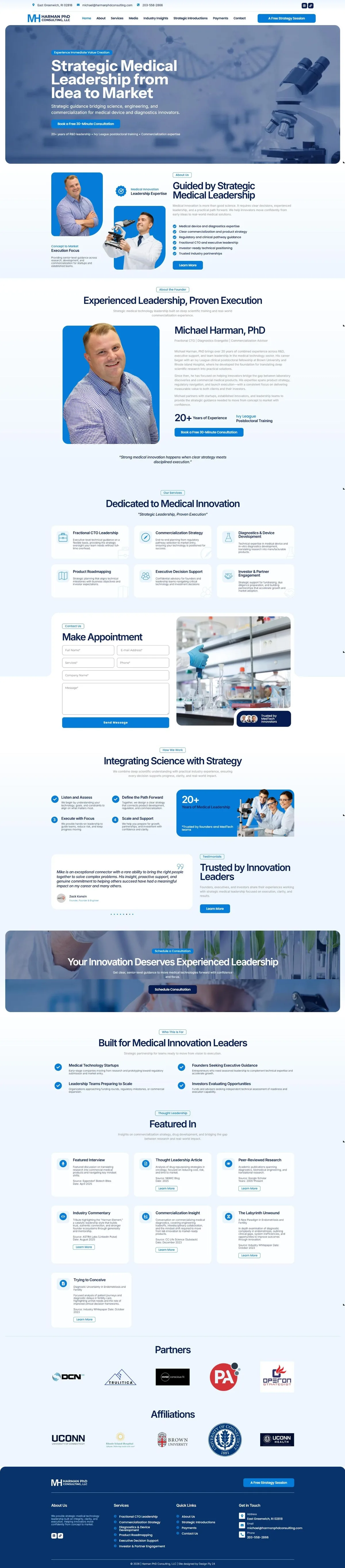
The full homepage scrolls on its own. Hover to pause.
Michael Harman, PhD has spent more than 20 years across R&D, executive support and team leadership in medical technology. His career began with an Ivy League clinical postdoctoral fellowship at Brown University and Rhode Island Hospital. Today he works as a fractional CTO and commercialization advisor for MedTech startups, established innovators and leadership teams.
The people who hire him are founders preparing for a funding round, teams approaching regulatory milestones and investors who need an independent technical opinion. They are smart, busy and skeptical. A MedTech consultant website design for this audience has one job: prove in a few seconds that Michael understands the science and the business, then make it effortless to book a conversation.
Every section of this MedTech consultant website design answers a question a founder or investor asks before picking up the phone. We planned the page around those questions first, then designed around them.
"Strategic Medical Leadership from Idea to Market" tells a founder exactly what they get. The supporting line names medical device and diagnostics innovators, so the right visitor knows they are in the right place.
Deep navy and medical blue with soft laboratory imagery. It feels like science without feeling cold, and it keeps the focus on Michael's words.
20+ years of R&D leadership, Ivy League postdoctoral training and commercialization expertise sit right under the first call to action, where skeptical readers look for them.
Six service cards, from Fractional CTO Leadership to Investor and Partner Engagement, each describe the decision Michael helps a team make, not just a job title.
A Featured In section organizes interviews, articles, research and industry commentary with source and date, so expertise reads as evidence rather than claims.
A strategy session button in the header, booking buttons through the page, a short contact form and a welcome popup make sure no ready buyer has to search for the next step.
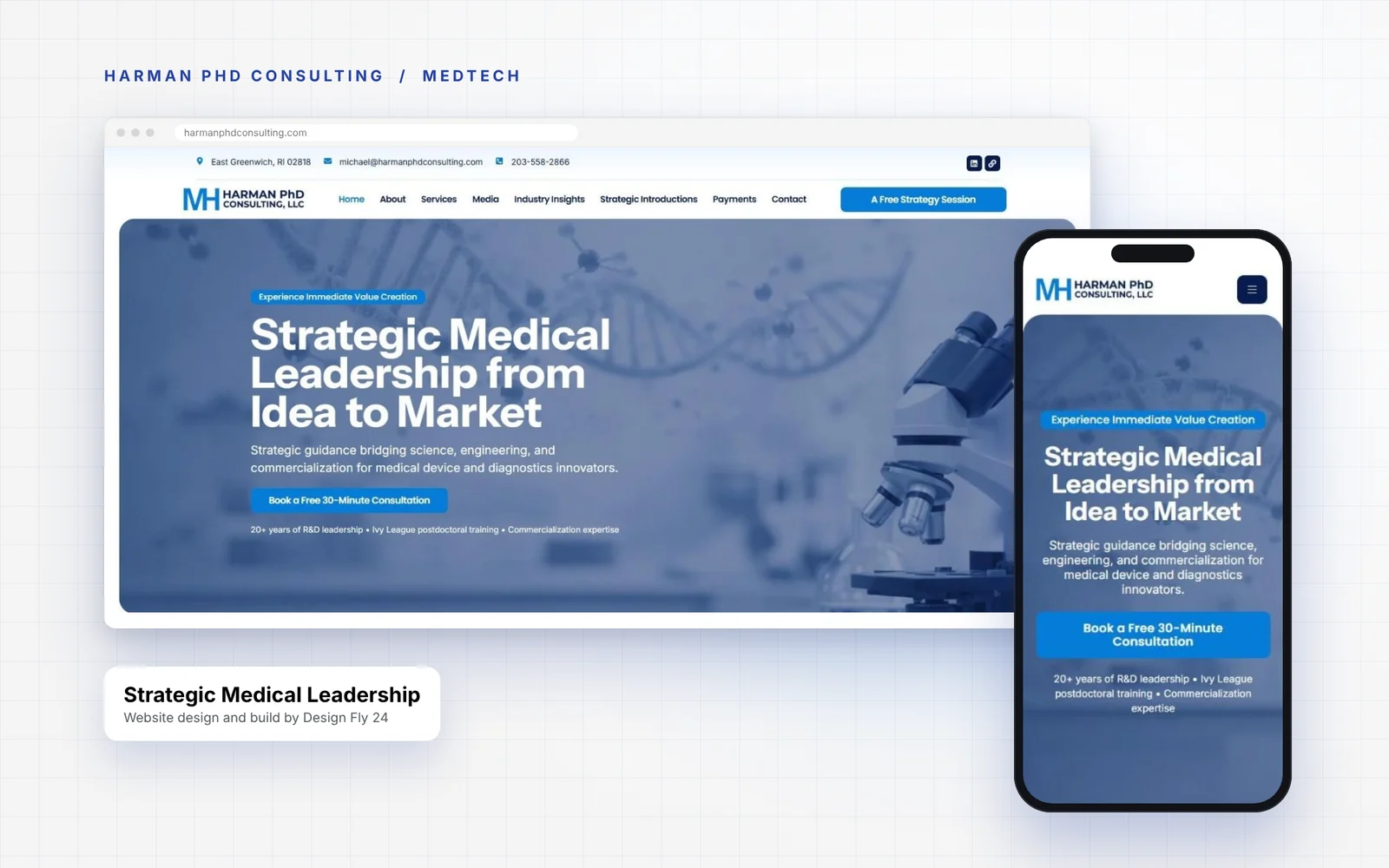
Think of the homepage as the first 30 minutes with Michael. He introduces himself, explains how he helps, shows what others say, and invites you to keep talking. The MedTech consultant website design follows the same rhythm from top to bottom.
The order matters. Founders rarely read every word on the first visit. They scan for a promise, a face, proof and a button. By placing those four things in that order, the MedTech consultant website design answers the scanning reader and still rewards the careful one who reads to the footer.
| Section | What it does for a buyer |
|---|---|
| Hero | States the promise, the audience and the free 30 minute consultation in one view. |
| Guided by Strategic Medical Leadership | Lists the six strengths founders care about most, from regulatory pathway guidance to investor ready positioning. |
| About the Founder | Introduces Michael personally, with his Brown University and Rhode Island Hospital background and a booking button. |
| Dedicated to Medical Innovation | Six service cards with icons, written in plain language. |
| Make Appointment | A short form beside a laboratory image and a "Trusted by MedTech Innovators" badge. |
| Integrating Science with Strategy | A simple four step process: Listen and Assess, Define the Path Forward, Execute with Focus, Scale and Support. |
| Trusted by Innovation Leaders | A testimonial carousel with founders and executives from companies such as GSK, Exact Sciences and Alnylam Pharmaceuticals. |
| Built for Medical Innovation Leaders | Speaks directly to startups, founders, scaling teams and investors. |
| Featured In, Partners and Affiliations | Interviews, articles and research, plus partner logos and academic affiliations such as Brown University and UConn. |
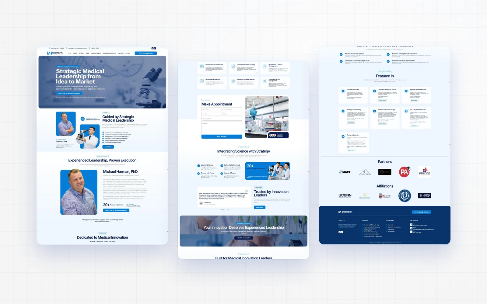
In advisory work, the strongest sales line is never your own. So we gave Michael's clients and colleagues a prominent place. The testimonial carousel sits next to a clear headline and a button, and each quote names the person and their company. For a MedTech consultant website design, that kind of named proof matters more than any slogan.
"Michael is a valuable partner. I would gladly work with him again."
Joshua D. Levin, Director, Precision Medicine and Digital Health at GSK, quoted on harmanphdconsulting.comWe paired the testimonials with a Featured In section. Each card shows the type of piece, a short summary, the source and the date: a featured interview, a thought leadership article, peer reviewed research, industry commentary and whitepapers on diagnostics. A visiting founder can see in seconds that Michael is published, quoted and respected in the field. Structured proof like this is one of the quiet strengths of a good MedTech consultant website design.
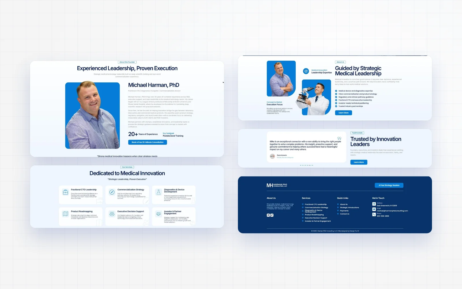
Built for founders who read on their phones.
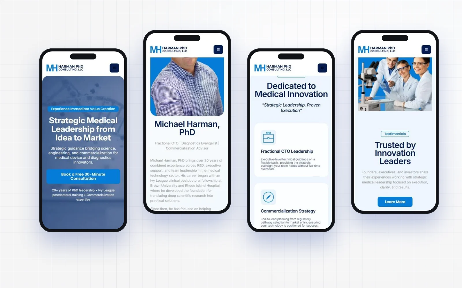
Founders check a consultant between investor calls, on a train or in a hallway at a conference. Every section of this MedTech consultant website design was rebuilt for small screens, not just shrunk. Headlines stay large and readable, service cards stack into a clean single column, and the booking button stays easy to tap with a thumb.
Consistency is what makes a small consultancy look established. Instead of designing pages one by one, we defined a small set of rules and used them everywhere. That is why the site feels calm and connected from the hero to the footer, and why this MedTech consultant website design is easy to extend as Michael adds new insights.
Navy carries authority, the brighter blue marks every action, and generous white and pale blue backgrounds keep long sections easy to read. Blue overlays on laboratory photos tie the imagery back to the brand.
Large, tight headlines state each idea in a few words. Body copy stays light and readable, so dense scientific credentials never feel heavy.
Michael's own portrait appears in the founder sections, while microscopes, DNA strands and lab benches set the scene. Visitors see both the human and the field he works in.
Small outlined labels introduce each section, cards hold services and media, and rounded panels frame the hero and call to action. The same pieces repeat, so the site is easy to extend.
This kind of system matters for any MedTech consultant website design because the audience is detail oriented. Scientists, engineers and investors notice inconsistency quickly, and small mismatches can quietly undercut trust in the expert behind the site.
A MedTech consultant website design has to support more than a first impression. Most visitors arrive on the homepage, but serious buyers click deeper before they book. Michael's work spans advisory, introductions, media and writing, so the site needed a clear structure for each.
A dedicated page for one of Michael's biggest strengths: connecting founders with the right people, partners and investors.
Room to publish interviews, commentary and articles, so the site keeps growing as his body of work grows.
A simple page for clients to pay for engagements, which removes friction after the deal is agreed.
A "Let's Work Together" popup with a strategy session button, email, phone and LinkedIn, plus a contact form on the homepage.
We follow the same five step process on every MedTech consultant website design, and it kept this project focused from the first call to launch day.
| Step | What happened |
|---|---|
| 1. Discovery call | We talked through Michael's services, his ideal clients and the questions founders ask before hiring a fractional CTO or commercialization advisor. |
| 2. Free homepage concept | We designed the homepage first so Michael could see the direction, the message and the layout before committing to the full build. |
| 3. Full page design | With the homepage approved, we designed About, Services, Media, Industry Insights, Strategic Introductions, Payments and Contact in the same system. |
| 4. Build and testing | We built the site in WordPress and Elementor, then tested every page on desktop, tablet and phone, along with forms, buttons and the popup. |
| 5. Launch and handover | After launch Michael can edit text, images and new insights himself, and we are on hand for anything bigger. |
The free homepage concept is the step clients mention most. It removes the risk of hiring a designer, because you see your new site before you pay for it. It is also where most MedTech consultant website design decisions get settled, since the homepage sets the tone for everything else.
Michael now has a MedTech consultant website design that looks and reads like the senior advisor he is. Founders see the promise, the credentials and the proof in the first scroll, and they always know how to book a strategy session. The site is fully his to update, built on WordPress and Elementor, with a footer credit to Design Fly 24.
The best signal came after launch: Michael introduced a fellow founder to us for a new start up website. When a client refers people in their own network, it usually means the site is doing its job. That is the goal of every MedTech consultant website design we take on.
If you advise medical device, diagnostics or life science companies, these are the ideas from this project that will help your own site the most.
Each of these points shaped this MedTech consultant website design, and they apply just as well to biotech advisors, regulatory consultants and clinical research experts.
A strong site is the foundation. These are the services MedTech advisors and life science consultants usually add once the website is live.
A clear promise for a specific audience, visible credentials, plain language services, named testimonials, published work or media, and an easy way to book a call. Pages for insights and introductions help when your value includes thought leadership and your network.
Most consultant sites take a few weeks from the first call to launch, depending on the number of pages and how quickly content and photos are ready. We always start by designing your homepage first so you can see the direction before committing.
Every project is different, so we quote after a free call once we understand your pages, content and goals. You also see your new homepage concept before you commit, so you know exactly what you are paying for.
Your buyers are scientists, engineers, founders and investors. They spot vague claims quickly. An agency that has built a MedTech consultant website design before knows how to present credentials, publications and advisory services in a way that earns trust with that audience.
Yes. Many scientists and advisors know their field deeply but find it hard to write about themselves. We interview you, shape the message for buyers, and you approve every line.
No. We work with consultants, security experts, coaches, speakers and small firms across the US. MedTech consultant website design is one area where clarity and credibility matter a lot, and we enjoy that challenge.
Yes. Design Fly 24 is a full service agency. We offer SEO, Google Ads, LinkedIn branding, brand identity design, email marketing and monthly WordPress care, so one team can grow the site after launch.
Send us your current website. We will design your new homepage first, completely free. If you love it, we build the rest. If not, you owe nothing.

Imtiaz has spent about seven years designing websites, running SEO and Google Ads, and building LinkedIn brands for consultants, scientists and specialist firms. He led this project personally from the first call to launch. Read his story.