Sean Bailey Wellness is a Community Interest Company focused on health and wellbeing in its community. This wellness brand identity design needed to feel caring and energetic, modern enough for social media and credible enough for partners and funders.
Decision makers who judge Sean Bailey Wellness on credibility before they ever read a proposal or book a call.
A distinctive, professional identity that looks established on day one and works on every surface.
A meaningful symbol, a disciplined palette, clear typography and a complete set of ready to use brand assets.
Sean Bailey Wellness works in a field where trust is everything. Clients and partners often meet the brand online first, through a website, a LinkedIn profile or a shared proposal, long before any conversation takes place. In those moments, the logo and visual identity do much of the talking.
The brief was to create an identity that felt established and professional without becoming cold or generic. It had to be distinctive enough to stand apart from competitors, simple enough to reproduce at any size, and flexible enough to grow with the business as new services and channels are added.
Just as important, the brand had to be practical. It needed to work in a one colour version for documents, in reverse on dark backgrounds, as a small symbol on social profiles and as a full lockup on letterhead and presentations.
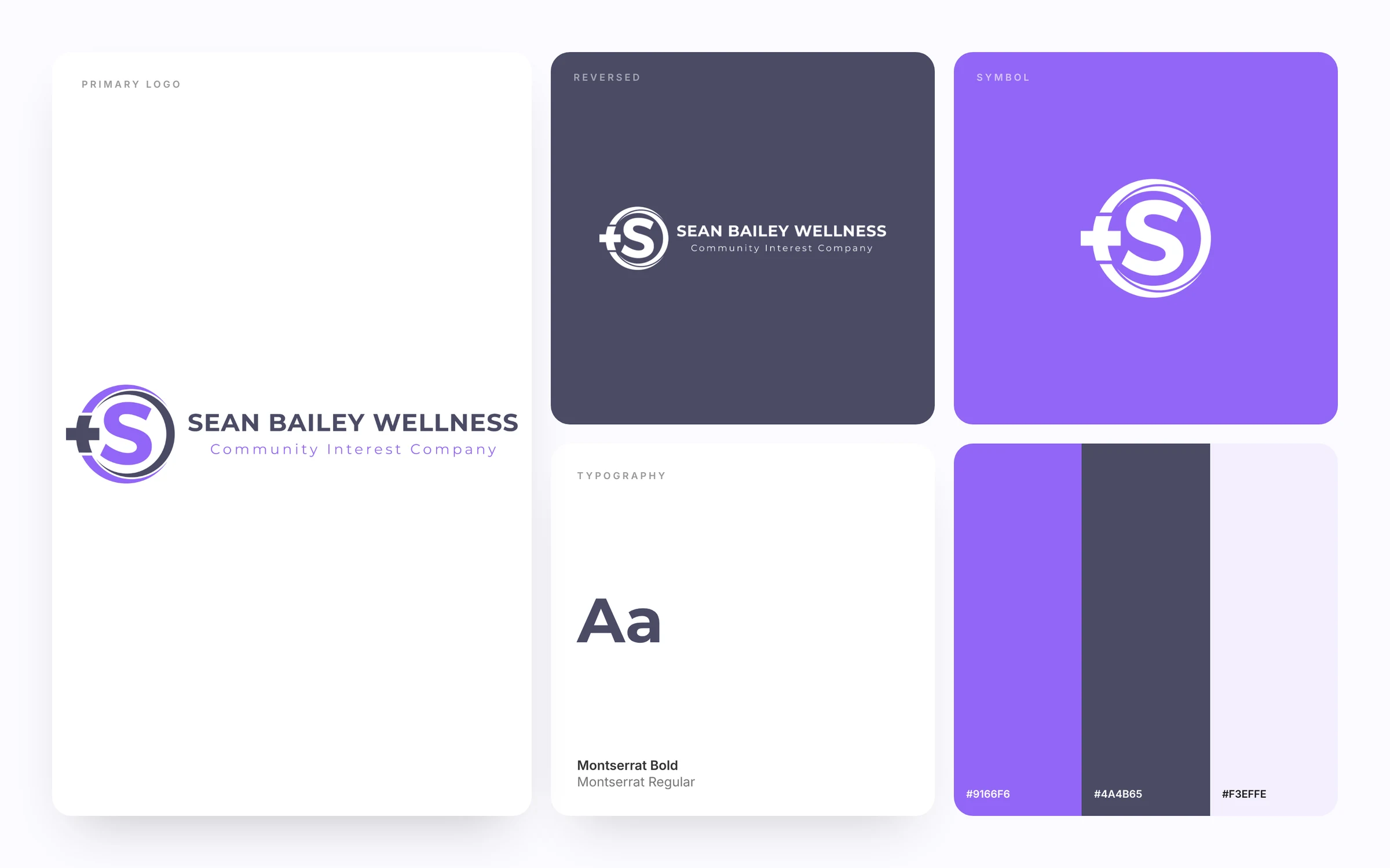
The symbol combines a bold letter S with a plus sign and circular orbits. The plus nods to health and positive change, while the circles suggest community, support and continuous care.
Lavender carries the S and the outer orbit, with slate grey used for the plus and inner ring. Together they feel modern and approachable rather than clinical, which suits a community focused organization.
The wordmark uses strong geometric capitals, with Community Interest Company set in widely spaced lettering below. The structure makes the organization type clear to partners while keeping the name front and center.
Every identity we deliver comes with clear guidelines, so the logo, colours and type are used correctly by designers, printers and team members alike. The guide for Sean Bailey Wellness covers logo usage, clear space, colour values and typography in one easy reference.
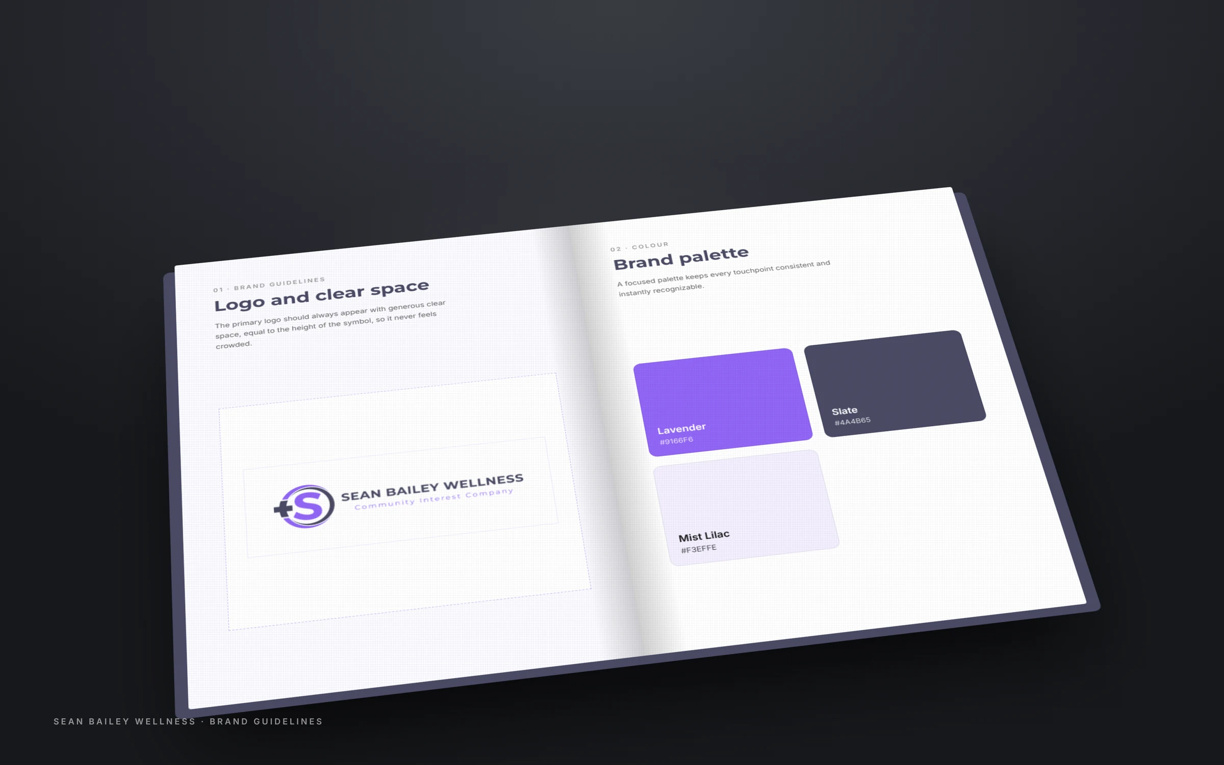
The wellness brand identity design guidelines cover and colour palette spread.
Each choice was made to build trust quickly and give Sean Bailey Wellness a brand that feels established from the first impression.
A plus sign built into the symbol signals wellbeing without using medical clichés.
Circular orbits around the S suggest support, inclusion and people coming together.
Lavender and slate feel caring and modern rather than cold or clinical.
Geometric capitals stay readable on social posts, signage and small screens.
A standalone icon makes the brand easy to use on profile images, merchandise and event materials.
A small, disciplined palette is easier to apply consistently and makes the brand instantly recognizable. Each colour in this wellness brand identity design has a specific role.
Energy, care and a friendly modern tone.
Calm, grounded and easy to read.
A gentle background for sections and documents.
Typography carries as much personality as the logo itself. The pairing below gives Sean Bailey Wellness a recognizable voice across print and digital.
Both typefaces are widely supported, which means the brand looks the same in a printed report, a website heading and a slide presentation. Clear rules for sizes and spacing keep long documents easy to read and short headlines bold and confident.
A confident geometric sans serif for the brand name and headlines.
The same family in a lighter weight, widely spaced for the descriptor.
The business card is often the first physical touchpoint. A clean white front with the full logo and a deep colour back with the symbol and contact details makes the card feel premium and memorable.
Thick paper, generous white space and a restrained layout let the logo breathe. The result is a card people keep, and a small but powerful reminder of Sean Bailey Wellness long after the first meeting.
Letterhead, envelope and cards share the same palette, spacing and logo placement, so every document Sean Bailey Wellness sends looks like it came from one carefully run organization.
The standalone symbol works on profile pictures, app icons, favicons and social media, on white, on the brand colours and in reverse. This flexibility is what keeps a wellness brand identity design consistent wherever it appears.
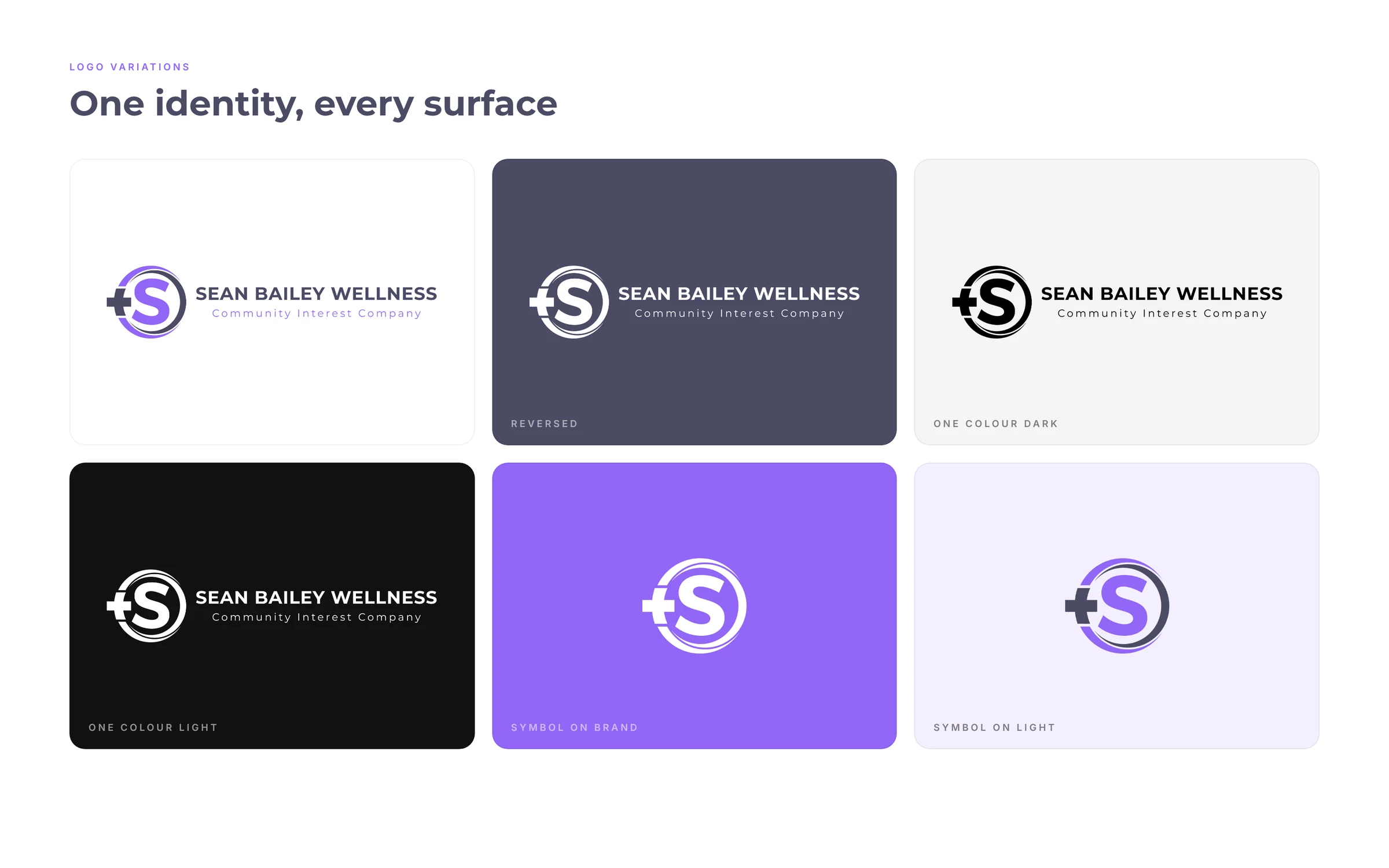
A strong logo is a system of parts that work together. Understanding each part makes it easier to use the brand correctly and explains why it feels balanced.
The symbol is the heart of the wellness brand identity design. It carries the core idea, works on its own in small spaces and becomes the most recognizable part of the brand over time.
The name is set with careful letter spacing and weight so it reads clearly at a distance and holds its own next to the symbol without competing with it.
The supporting line tells people what Sean Bailey Wellness does. Set in a lighter style, it adds clarity without adding visual noise.
A brand only works when it is used consistently. These are the places where the new identity for Sean Bailey Wellness shows up most often.
Seeing a logo at full scale is the final test. Signage shows whether the proportions, spacing and colours hold up when the brand is the first thing a visitor sees.
If you are planning your own brand, these lessons from the wellness brand identity design for Sean Bailey Wellness can help you make better decisions from the start.
The best symbols carry a real idea about the business, which makes them easier to remember and explain.
A small palette used consistently is far more recognizable than a rainbow of options.
If a logo works as a tiny profile picture, it will work almost everywhere else.
A clear contrast between headline and body fonts gives the brand personality and readability.
Simple guidelines protect the brand as more people start using it.
Many professional service brands fall into the same traps. They rely on generic stock icons, use too many colours, or choose fonts that look dated within a year. Others design a logo that only works large and falls apart on a phone screen or a social profile.
The identity for Sean Bailey Wellness was designed to avoid all of these. The symbol is original and meaningful, the palette is deliberately limited, the type pairing is timeless and every version was tested at small sizes and on dark and light backgrounds before it was approved.
The result is a brand that will still feel current years from now, without needing a costly redesign every time the business grows or adds new services.
The project ended with a complete, organized set of files that Sean Bailey Wellness can use immediately with any printer, designer or web developer.
The full lockup in colour, single colour and reversed versions.
A standalone icon for profiles, favicons and small spaces.
Exact values for print and screen, with usage guidance.
Headline and body fonts with sizing and spacing rules.
Business card, letterhead and envelope designs ready to print.
A clear reference that keeps every future design on brand.
Every brand project follows the same clear process, so there are no surprises and every decision is made together.
At each stage Sean Bailey Wellness saw the work, gave feedback and approved the direction before we moved on. That rhythm keeps the project focused, avoids wasted rounds and makes sure the final brand feels personal rather than generic.
We started by learning about Sean Bailey Wellness, its audience, its competitors and the impression it needed to make. That conversation shaped the creative brief for the wellness brand identity design.
We explored several directions for the symbol and wordmark, focusing on ideas that carried real meaning rather than decoration.
The chosen direction was refined for balance, spacing and readability, then tested at very small and very large sizes.
We built the palette and type pairing around the symbol, checking contrast and legibility on screen and in print.
Finally we prepared every logo version, the stationery set and the guidelines, delivered in organized folders ready to use.
A strong wellness brand identity design does more than look good. It tells people what to expect before a single conversation takes place. For Sean Bailey Wellness, the new identity creates a confident first impression, ties every touchpoint together and gives the business a professional foundation to grow on.
The identity also connects naturally to the rest of the marketing. The same colours and type flow into websites, LinkedIn banners, presentations and printed materials, so every channel reinforces the same message about Sean Bailey Wellness.
Want to see more? Browse our full web design portfolio, learn about our brand identity design service, or explore LinkedIn profile optimization to carry your new brand onto LinkedIn.
A brand identity is one of the few marketing investments that keeps working every single day. Every business card handed out, every proposal sent and every profile viewed reinforces the same image, building recognition over months and years.
For Sean Bailey Wellness, the identity now acts as a foundation for everything that follows. New services, new websites, event materials and social campaigns can all be created faster because the core decisions about colour, type and logo usage are already made.
That consistency is what turns a logo into a brand. Over time, people begin to recognize the symbol before they read the name, and that recognition builds the trust that brings in referrals and repeat work.
Because the guidelines are written down, the brand also stays consistent when new people join the team or outside designers and printers get involved. Nobody has to guess which colour, font or logo version to use, so the identity stays strong no matter who is producing the next brochure, banner or web page.
Buyers form an opinion about a business in seconds, and the logo is often the first thing they see. A homemade or generic logo quietly signals that a business is small or temporary, even when the expertise behind it is exceptional.
A professional identity closes that gap. It helps consultants and organizations win larger clients, charge with more confidence and stand out in crowded markets where many competitors offer similar services.
Most importantly, a clear brand system saves time. Once the logo, colours and type are defined, every new website page, proposal or social post is faster to create and always looks consistent.
If you are launching a practice, rebranding an established firm or simply tired of a logo that no longer reflects the quality of your work, a focused identity project is one of the most valuable investments you can make.
We start every brand project with a short call to understand your audience and goals. From there we design concepts, refine the chosen direction with you and deliver a complete set of assets you can use immediately.
Whether you need a new wellness brand identity design, a refresh of an existing logo or a full brand system with website and LinkedIn design, the goal is the same: a brand that represents your expertise with the same care you give your own clients.
You receive every logo version in print and web formats, the colour values, font details, stationery designs and a brand guidelines document.
We explore several directions, then refine the strongest one with you until it feels right for your business.
Yes. We often design the website and LinkedIn profile as part of the same project, so everything matches from day one.
Yes. We test every identity at small and large sizes, on light and dark backgrounds, in print and on screen.
Most projects move from first call to final files in a few focused weeks, depending on feedback and scope.
Yes. Once the project is complete, the logo and brand assets are fully yours to use.
Yes. A new logo works best when everything matches, so we can apply it to your website with website design, your profile with LinkedIn branding and your newsletters with email marketing. One team handles the whole rollout, so your brand looks consistent from day one.
Tell us about your business and we will show you a first direction for your new identity. If you love it, we build out the full brand system.