
Good consultant website design does one job: it turns a curious stranger into someone who books a call with you. That’s it. Not awards, not clever animations, not a homepage that looks like a tech startup. A call on your calendar.
Here’s the moment I think about with every project. A school district’s safety director gets your name from a colleague. Before she replies to your email, she opens your site on her phone between meetings. She has maybe ninety seconds. In that window she decides whether you look like the person who can help her, or one more name on a list she’ll get to later.
We’ve built more than 30 websites at Design Fly 24, most of them for consultants and experts: security advisors, HR consultants, coaches, expert witnesses, keynote speakers. The same eleven elements of consultant website design show up on every site that actually produces calls. This post walks through each one, plainly, so you can check your own site against it tonight.
- Consultant website design is about one outcome: more qualified people booking a call with you.
- Your headline should say who you help and with what, in plain words a buyer would use.
- Proof (case studies, credentials, media, real client names) does more selling than any paragraph about yourself.
- Each service deserves its own page with a clear next step, not one long page called “Services.”
- Speed, mobile layout and SEO basics are part of consultant website design, not extras you add later.
Why consultant website design is different from a regular business site
A bakery sells a croissant. You sell judgment. Nobody can taste your judgment before they buy it, so your site has to stand in for the first meeting. That changes the priorities a lot.
Most templates are built for products. Big hero image, a grid of features, a “Shop now” button. For a consultant that layout falls flat because the buyer isn’t comparing features. They’re asking three quiet questions: Do you understand my problem? Have you solved it for people like me? Will you be easy to work with?
Every element of consultant website design below answers one of those questions. That’s the lens we use for consultant website design at Design Fly 24, and it’s the lens I’d suggest you use when you review your own site.
1. A positioning headline that says who you help
The first line on your homepage carries more weight than any other sentence on the site. Most consultants waste it. “Strategic Solutions for a Changing World” tells a buyer nothing. Neither does your name in big letters with “Consulting” under it.
A strong headline names the person you help and the result they want. Something like “Workplace violence prevention for hospitals and health systems” or “HR support for growing companies without a full HR team.” A buyer reads it and thinks, yes, that’s me.
How to write the headline in your consultant website design
- Name the buyer: the role, the industry, or both.
- Name the problem or result in their words, not yours.
- Keep it under about twelve words. Put the detail in the line beneath it.
- Add one clear button right there: “Book a call” or “Schedule a consultation.”
If you serve two very different audiences, pick the one that brings in the most revenue for the homepage and give the other its own page. Trying to speak to everyone in one headline is the most common mistake we see in consultant website design.

2. Proof near the top of the page
Right under your headline, show the buyer that other people already trust you. This is where a logo strip, a short testimonial, or a line like “Advising school districts in 30 states” belongs, as long as it’s true.
In consultant website design, proof works best when it’s specific. “Great to work with!” from “J.S.” does almost nothing. A two sentence testimonial with a full name, title and organization does a lot. If clients can’t be named for confidentiality reasons (common in security and legal work), describe them: “a regional hospital system in the Northeast.”
When we redesigned schoolsecurity.org for Ken Trump, the sheer volume of his media and district work was the proof. The design job was to surface it quickly instead of burying it ten clicks deep.
3. Case studies written like short stories
Case studies are where consultant website design either sells or stalls. A good case study reads like a story a buyer could see themselves in. A bad one reads like a list of deliverables.
Use a simple shape that works for almost any consultant:
- The situation. Who the client was and what was going wrong.
- What you did. Your approach, in a few clear steps.
- What changed. The result, in numbers only if you truly have them, otherwise in plain description.
- A line from the client, if they’ll give you one.
Three solid case studies beat fifteen thin ones in any consultant website design. Put them on their own page, and link the most relevant one from each service page. That way a buyer reading about your HR audit service sees an HR audit story right there.
4. Credentials, shown with context
Certifications, degrees, years in law enforcement, board seats, published books. Buyers in serious fields want to see them. The trick is context. A row of acronyms means little to a busy procurement officer. “Board certified in security management (CPP)” means something.
In our consultant website design projects we usually put a short credentials block on the About page and a compact version on the homepage. Keep the About page about the buyer too. Start with why you do this work and who you do it for, then the résumé. If you want a model for an expert bio, our founder page follows the same idea.
Your LinkedIn profile should match your site, word for word on the important points. Buyers check both. If yours needs work, our LinkedIn profile optimization service is built for exactly this.
5. A speaking and media page
If you’ve spoken at a conference, been quoted in a newspaper, or appeared on a podcast, that belongs on your site. Media mentions do a specific job: they tell a buyer that editors and event planners already vetted you.
In consultant website design, a good speaking and media page has a short list of topics you speak on, a few recent appearances with dates, a short video clip if you have one, and a downloadable one page speaker sheet. An event planner should be able to book you without sending three emails. If speaking is a big part of your business, our guide to speaker website design goes deeper.
Quick tip: Add the month and year to each media mention. Undated press looks old even when it isn’t, and dated press shows you’re active right now.

6. Clear offer pages, one per service
This is the element I push hardest on in every consultant website design project. One page per service. Not one long “Services” page with six bullet points.
Why? A buyer who needs a threat assessment doesn’t want to read about your leadership training. A separate page lets you speak to that one buyer, answer their questions, show the right case study, and give them one clear next step. It also helps Google understand what you offer, which matters a lot for SEO.
What each offer page needs in consultant website design
- Who the service is for, in one or two sentences.
- The problem it solves and what the engagement looks like, step by step.
- What the client gets at the end (a report, a plan, a trained team).
- One related case study or testimonial.
- Short answers to the three questions buyers always ask.
- A clear button to book a call.
Should your consultant website design list prices? For most consultants, no. Scope varies too much. Say how engagements usually start (a discovery call, a short assessment) and let the call handle the rest.
7. A contact flow that respects their time
You’d be surprised how many good consultants lose leads at the very last step. A contact form with twelve required fields. A “Contact” page with only an email address. No way to just book a time.
The best contact flow in consultant website design is simple: a short form (name, email, organization, a line about what they need) plus a scheduling link for people who want to skip the back and forth. Put a “Book a call” button in the header so it’s on every page.
Tell people what happens next. “I reply within one business day” or “You’ll get a calendar invite and a short questionnaire” lowers the nerves of reaching out to someone new. It’s a small line that makes consultant website design feel human.
Consultant website design doesn’t close the deal. It earns you the call where you close the deal.
Not sure where your site is losing people?We’ll review your current site on a free call and tell you the three changes that would matter most.
8. Speed that doesn’t test anyone’s patience
Busy buyers don’t wait. If your homepage takes forever to load on a phone, plenty of them hit the back button and click the next name on the list. Speed is a quiet part of consultant website design that people only notice when it’s missing.
Most slow consultant sites we audit have the same causes: huge uncompressed photos, a heavy theme with features nobody uses, and too many plugins. Google’s Core Web Vitals guide on web.dev explains the measures that matter in plain terms. You don’t need a perfect score. You need a site that loads fast on an ordinary phone connection.
Keep it fast after launch too. Plugins update, images pile up, and sites slow down over time. Regular WordPress maintenance catches that before buyers feel it.
9. A mobile layout built for thumbs
Go back to that safety director checking you out between meetings. She’s on her phone. So are most of your first visitors, especially the ones who heard your name from a colleague.
Mobile friendly means more than “it shrinks.” It means the headline is readable without zooming, the “Book a call” button is easy to tap, the menu is short, and your phone number is tappable. We test every consultant website design on real phones before launch. Test your site on your own phone right now. If anything feels like work, it’s work for your buyer too.
Accessibility belongs here as well. Readable font sizes, good color contrast and proper headings help everyone, and the W3C accessibility guidelines are the standard to follow. Government and education buyers increasingly expect it.
10. SEO basics every consultant website design should include
SEO isn’t something you bolt on after launch. The structure you choose during consultant website design decides how easily Google can understand and rank your site. Get the basics right on day one and everything after is easier.
- One clear topic per page, with a matching title tag and meta description.
- Real headings (H1, H2, H3) in a logical order.
- Service pages that use the words buyers actually search, like “workplace violence prevention training” instead of “Organizational Resilience Solutions.”
- Location mentions if you serve a region.
- A Google Business Profile that links to your site.
- Fast pages and descriptive image alt text.
Google’s own SEO Starter Guide is short and worth an hour of your time. For a full plan written for solo consultants and small firms, read our post on SEO for consultants, or look at our SEO services if you’d rather hand it off.
11. Trust signals that remove doubt
The last element of consultant website design is a collection of small things. None of them sells on its own. Together they remove the little doubts that make a buyer hesitate.
- A real photo of you, recent and professional. Not a stock photo of a handshake.
- A physical business address or at least a city and state.
- A privacy policy, especially if you collect form data.
- An SSL certificate (the padlock in the browser).
- A copyright year that isn’t three years old.
- Consistent branding: the same logo, colors and fonts everywhere.
That last point is bigger than it looks. A mismatched logo on your site, your LinkedIn banner and your proposal PDF makes you look smaller than you are. If your brand feels patched together, our brand identity design work can tie it up before the site goes live.
A quick consultant website design checklist
Use this table to score your current site. Be honest. Anything marked “missing” or “weak” is where your next booked call is leaking out.
| Element | What good looks like | Buyer question it answers |
|---|---|---|
| Positioning headline | Names who you help and the result | Do you understand my problem? |
| Proof near the top | Named testimonials, logos, real numbers | Do others trust you? |
| Case studies | Situation, approach, result | Have you solved this before? |
| Credentials | Explained in plain words | Are you qualified? |
| Speaking and media | Dated, with topics and a speaker sheet | Has anyone vetted you? |
| Offer pages | One page per service with a next step | What exactly do you do? |
| Contact flow | Short form plus a booking link | How do I start? |
| Speed and mobile | Fast and easy on a phone | Are you professional? |
| SEO basics | Clear titles, headings, real keywords | (Helps them find you at all) |
| Trust signals | Real photo, address, consistent brand | Are you legit and current? |
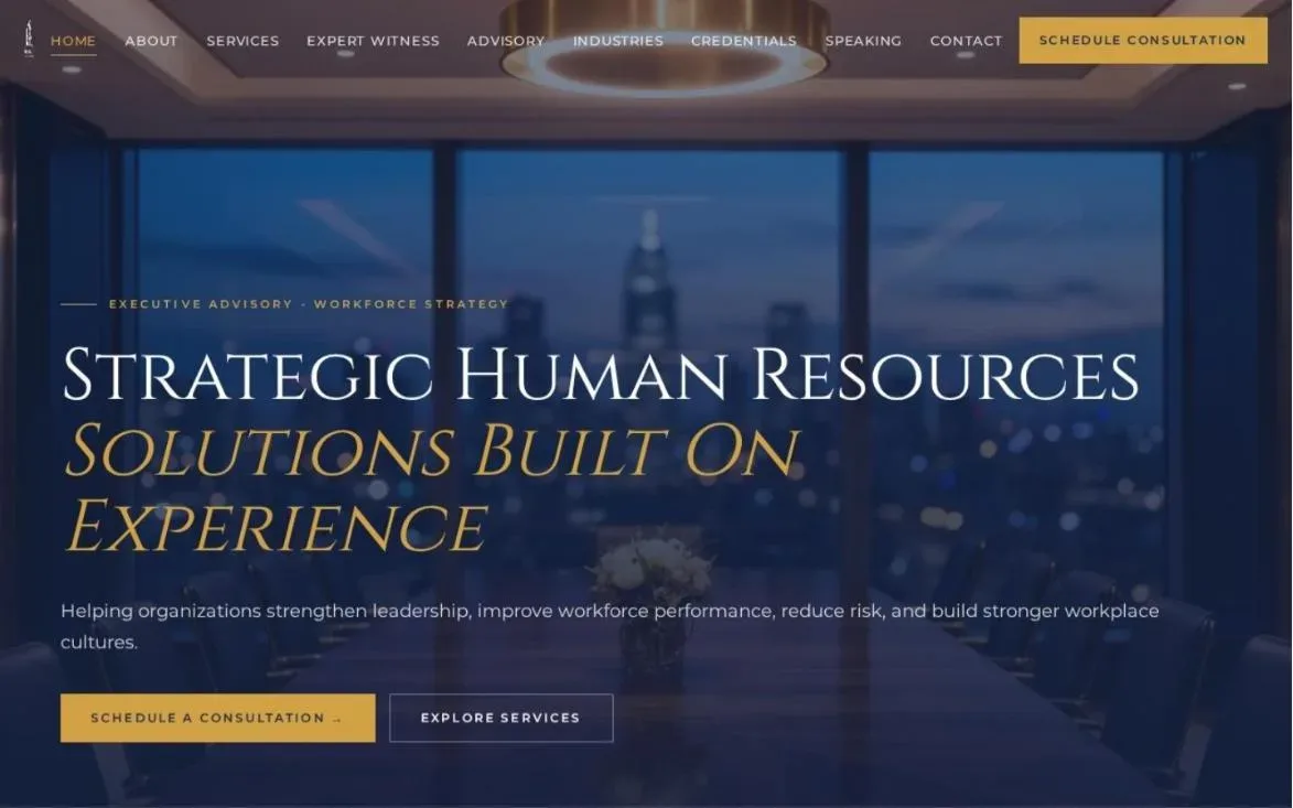
Want to see how these elements look in practice? Browse our work. Sites like HR Expert Consultants and Westshore EMR are good examples of consultant website design built around services and proof.
Frequently asked questions
How long does a consultant website design project take?
Most of our consultant website design projects take a few weeks from kickoff to launch. The biggest factor is usually content: how quickly we can gather your case studies, credentials and testimonials. We help write and shape that content so it doesn’t stall the project.
What does consultant website design cost?
It depends on scope: how many service pages, whether you need copywriting, branding or SEO, and which platform you’re on. The honest answer comes after a short call where we look at what you actually need. Book one here and we’ll give you a clear quote.
Do I need WordPress for my consultant site?
No. We build on WordPress most often because it’s flexible and easy to update, but we also work on Webflow, Squarespace, Wix, Framer, Shopify and HubSpot CMS. The right platform depends on how you want to manage the site after launch.
Can I redesign my site without losing my Google rankings?
Yes, if it’s done carefully. Good consultant website design keeps the pages that already rank, sets up proper redirects for any URLs that change, and keeps your best content. We plan for this before we touch the design.
I’m a security consultant. Is anything different for me?
A bit. Security buyers often come from school districts, corporations or government agencies, and they look for credentials, published work and RFP friendly details. We wrote a separate guide on the security consultant website for exactly that audience.
Let’s get your site booking calls
You don’t need a flashy site. You need one that tells the right buyer, quickly, that you’re the person who can help them, and then makes it easy to say hello. That’s what good consultant website design comes down to.
If you’d like a second pair of eyes on your current site, or you’re ready to rebuild it properly, I’d be glad to talk. Learn more about Design Fly 24, see our website design services, or contact us to book a free call. We work with consultants across the US from our office in New York.