
LinkedIn banner design sounds like a small cosmetic detail, until you notice it’s the first thing a buyer sees when they click your name. Before they read your headline, before they scroll to your experience, their eyes land on that wide strip at the top of your profile.
Picture an event planner shortlisting keynote speakers for a leadership conference. She has six names and fifteen minutes. She opens each profile. Four of them have a default blue pattern or a blurry photo of a city skyline. One has a banner that says “Keynote speaker on school safety and student well being,” with a photo of him on stage and his website. Guess which profile she reads first.
At Design Fly 24 we’ve designed LinkedIn banners for security consultants, keynote speakers and coaches as part of our profile work. This guide covers everything we think about: size, safe zones, what to put on it, design rules, examples by role and the mistakes we fix most often.
- Good LinkedIn banner design starts with the right size (1584 by 396 pixels) and a safe zone that avoids the profile photo.
- Your banner should say who you help, show proof, and point to a clear next step or your website.
- Contrast, one or two fonts and your brand colors matter more than clever graphics.
- Always check the banner on a phone, because the mobile app crops the edges.
- A company page banner and a personal banner do different jobs, so design them separately.
Why LinkedIn banner design matters for consultants
If you sell expertise, your LinkedIn profile is often your first sales meeting. Buyers check you out after a referral, after a webinar, after you comment on their post. They’re asking a simple question: is this the right person for my problem?
Your headline and About section answer that in words. LinkedIn banner design answers it in pictures. Your banner answers it in about two seconds, visually. A clear LinkedIn banner design tells the visitor what you do before they’ve read a single line. A blank or generic one tells them nothing, and it quietly suggests you haven’t put much thought into your profile.
It’s also free space. It sits at the top of the page, and almost nobody uses it well. Thoughtful LinkedIn banner design is one of the easiest advantages a consultant can take on the platform.
1. Get the size and safe zones right
LinkedIn recommends 1584 by 396 pixels for a personal profile background photo. That’s a 4 to 1 ratio, very wide and short. Upload JPG or PNG, and check LinkedIn Help for the current file limits, since they change from time to time.
The profile photo overlap
Your round profile photo sits on top of the banner at the bottom left. Anything you put in that corner gets covered. We treat roughly the left third of the bottom half as a no go area in every LinkedIn banner design we make.
The mobile crop
On the LinkedIn mobile app, the banner shows at a different ratio and the sides get trimmed. Text that sits right at the left or right edge on desktop can vanish on a phone. Keep your main words in the center and center right, with generous margins on every side.
- Canvas: 1584 by 396 pixels.
- Keep the bottom left clear for the profile photo.
- Keep text away from the outer edges for the mobile crop.
- Put the key message in the center right area.
Quick tip: Before you finish any LinkedIn banner design, upload a draft, then check it on desktop, on your phone and on a tablet. Five minutes of checking saves a banner with half your website address cut off.
2. Say who you help
The most useful line on a banner is a plain statement of who you help and with what. Not your job title. Not a vague slogan. Something a buyer would recognize as their own problem.
- “Workplace violence prevention for hospitals and healthcare systems”
- “Keynotes on resilience for sales teams and leadership events”
- “Executive coaching for first time managers in tech”
- “HR compliance support for growing companies in New York”
Keep it to one line if you can, two at most. Your LinkedIn banner design should repeat or sharpen what your headline says, so the two work together instead of competing. If you haven’t settled your positioning yet, start with our LinkedIn profile tips and come back to the banner once your headline is clear.
3. Add proof
A buyer trusts what other people say about you more than what you say about yourself. A small proof element on your banner does a lot of work:
- A credential that buyers recognize (for example a board certification).
- “As featured in” with two or three media logos you have permission to use.
- The title of your book.
- Logos of associations you speak for, if you’re allowed to show them.
- A short line like “Speaker at national safety conferences.”
Pick one for your LinkedIn banner design. A banner crammed with six logos and three credentials becomes unreadable at phone size. Good LinkedIn banner design chooses the single strongest proof point and gives it room.

4. Include a call to action and your website
People who like your LinkedIn banner design need somewhere to go next. A short call to action and your website address give them that path. Banners aren’t clickable, so keep the address short and easy to type, and make sure your Contact info section and featured links match it.
- “Book a call at yourname.com”
- “Free school safety checklist at yoursite.com”
- “Booking 2027 keynotes: yourname.com”
The website matters more than people realize. When a buyer leaves LinkedIn for your site, they land somewhere you control. If your site isn’t ready for that visit, our website design services are built for exactly this kind of consultant buyer.
5. Follow simple design rules
You don’t need to be a designer to get the basics right. Most of the LinkedIn banner design problems we fix come down to four things.
Contrast
Light text on a light photo disappears. Dark text on a busy background disappears. Use a solid color block or a dark overlay behind your text, and check that it reads easily on a small screen. The W3C contrast guidance was written for websites, but the same idea holds: enough difference between text and background that anyone can read it.
Fonts
One font, two at most. Pick a clean sans serif or a simple serif that matches your website. In LinkedIn banner design, make the main line big, bigger than feels comfortable on your desktop, because it will shrink on a phone.
Brand colors
Use the same colors in your LinkedIn banner design as on your website and slides. When someone moves from LinkedIn to your site, it should feel like the same business. If you don’t have defined colors yet, that’s a sign to sort out your brand identity first.
Photo or graphic
Both work. A photo of you speaking, training or working with a client is powerful for speakers and trainers. A clean graphic with a solid background and strong type often works better for consultants, because it keeps the message front and center. Avoid stock skylines and handshakes. They say nothing about you.
Your banner isn’t decoration. It’s a billboard on the one page every buyer checks before they reply.
6. Pick a banner type that fits your role
Different roles need different LinkedIn banner design approaches. Here are the patterns we use most, based on work for consultants, speakers and coaches.
| Role | Banner type | What to include |
|---|---|---|
| Security consultant | Clean graphic with strong type | Who you protect, one credential, website |
| Keynote speaker | Stage photo with text overlay | Speaking topics, “now booking,” website |
| Executive or career coach | Warm photo or soft graphic | Who you coach and the change you help create |
| Expert witness | Quiet, formal graphic | Field of expertise, credentials, website |
| HR consultant | Brand colors with a short promise | Type of companies you serve, call to action |
| Author | Book cover on a solid background | Book title, one line on the topic, website |
Security consultants
Buyers here are cautious: school administrators, facility directors, HR leaders. Calm colors, plain words and one credential work better than dramatic imagery. Skip the padlocks and red alerts. A clean LinkedIn banner design signals the steady judgment they’re hiring you for.
Keynote speakers
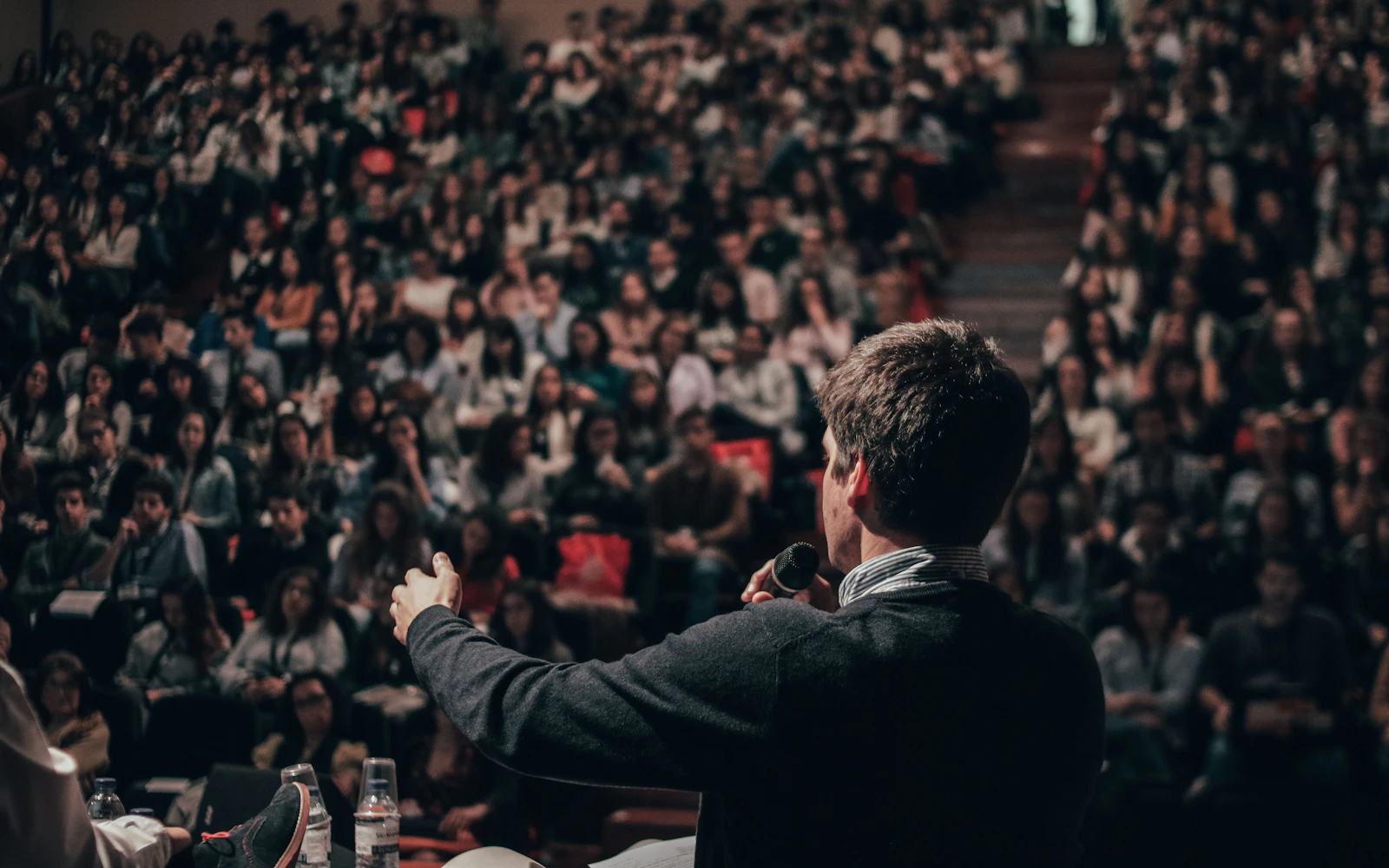
Event planners want to see you on a stage. A wide photo of you mid talk, with a dark overlay and your topic in large type, does the job. Add “Now booking” and your website. If you’re building out your speaker presence more broadly, our guide to speaker website design picks up where the banner leaves off.
Coaches
Coaching is personal, so warmth matters in LinkedIn banner design for coaches. A softer palette, perhaps a photo of a workshop or a calm setting (your face is already in the profile picture), and a line about the change you help people make. Keep the LinkedIn banner design calm and uncluttered.
Want a banner that actually brings in inquiries?We design LinkedIn banners as part of a full profile refresh: headline, About section, featured links and banner together.
7. Company page banner vs personal banner
Your company page and your personal profile do different jobs, so the LinkedIn banner design for each should be different too.
The company page cover image is a different size (LinkedIn currently recommends 1128 by 191 pixels) and the logo sits in a different spot. It represents the firm, so it should feature the company name or tagline, brand colors and the core service. It’s more about the business than any one person.
Your personal LinkedIn banner design is about you. For most solo consultants and small firms, the personal profile gets far more views than the company page, so put most of your effort there. Keep the two consistent in colors and fonts so they look like they belong together.
- Personal: who you help, your proof, your website.
- Company: what the firm does, brand colors, tagline.
- Both: same palette and fonts as your website.
8. LinkedIn banner design mistakes to avoid
These are the LinkedIn banner design problems we see again and again when we review profiles:
- Text under the profile photo. Your name or tagline sits in the bottom left and the photo covers half of it.
- Text too small. It looks fine on a big monitor and turns into specks on a phone.
- Too much information. Phone number, email, website, six logos and a list of services. Nobody reads it.
- Generic stock images. Skylines, handshakes and abstract blue waves say nothing about you.
- Low resolution. A small image stretched to fit looks blurry and careless.
- Outdated details. An old job title, last year’s event, a website you no longer use.
- No match with the headline. The banner says one thing, the headline says another.
Fixing these is usually quick. A clean LinkedIn banner design with one message, one proof point and one call to action beats a busy one every time.
Tools for LinkedIn banner design
You don’t need expensive software. Most of our clients who want to edit their own banner later use one of these:
- Canva. Easy, with a ready made LinkedIn background size. Good for small updates.
- Figma. Free to start and more precise. Great if you want a reusable template with guides for the safe zones.
- Adobe Express or Photoshop. Fine if you already know them.
Whatever tool you use, set up a template once with the safe zones marked as guides. Then every future LinkedIn banner design starts from the right canvas, and nobody accidentally puts text under your profile photo.
Photos worth taking for your banner
If you speak, train or run workshops, ask someone to take wide, horizontal photos at your next event. Vertical phone shots rarely crop well into a 4 to 1 strip. A good wide stage photo can carry your LinkedIn banner design for years.
LinkedIn banner design checklist before you upload
Run through this list before your banner goes live:
- Is the canvas exactly 1584 by 396 pixels?
- Is the bottom left clear of text and logos?
- Does the main line read clearly on a phone?
- Does the banner say who you help in plain words?
- Is there one proof point, not six?
- Is your website short, correct and easy to type?
- Do the colors and fonts match your website?
- Does the banner agree with your headline?
If every answer is yes, your LinkedIn banner design is ready. If two or more are no, fix those first. They’re usually five minute changes.
9. Keep your banner current
Your banner isn’t a one time job. Update it when your focus changes, when you publish a book, when you have a big speaking season ahead, or when you launch a new offer. A quick refresh is also a nice reason to post about what’s new.
We suggest checking your LinkedIn banner design every few months, the same way you’d review your headline or featured section. Ask one question: does this still describe the work I want more of?
How we design LinkedIn banners for clients
At Design Fly 24, banners are part of our LinkedIn profile optimization work. We don’t design the banner in isolation, because it has to match the headline, About section and featured links. Here’s how our LinkedIn banner design process usually goes:
- Short call. We learn who you want to reach and what you want them to do next.
- Message first. We agree on the one line the banner needs to say.
- Proof and assets. We gather your best credential, photos, logos and website.
- Design. We build the LinkedIn banner design in your brand colors, with safe zones for the photo and mobile crop.
- Test. We check it on desktop and phone before handing it over.
We’ve designed banners for security consultants, keynote speakers and coaches, and the process is the same each time: get the message right, then make it easy to read. If you’d like to see the kind of work we do across websites and branding, have a look at our work. For the bigger picture on standing out as an expert, read our post on personal branding for consultants.
Frequently asked questions
What size should a LinkedIn banner design be?
For a personal profile, use 1584 by 396 pixels. Keep important text away from the bottom left where the profile photo sits, and away from the edges, which can be cropped on mobile.
What should I put on my LinkedIn banner?
One line on who you help, one proof point such as a credential or book, and a short call to action with your website. That’s enough for most consultants and speakers.
Can I make my own LinkedIn banner design in Canva?
Yes. Canva has a LinkedIn background size you can start from. Follow the safe zone rules in this guide, use your brand colors and test on a phone before you call it done.
Should my company page and personal profile use the same banner?
No. They’re different sizes and do different jobs. Keep them consistent in colors and fonts, but make the personal one about you and the company one about the firm.
How often should I update my LinkedIn banner design?
Whenever your focus, offer or big news changes, and at least a couple of times a year. An outdated banner suggests an outdated profile.
Turn your banner into your first sales pitch
Your banner is the first thing a buyer sees on your profile and it costs you nothing to use well. Get the size and safe zones right, say who you help, add one piece of proof and a clear next step, and keep it readable on a phone. That’s good LinkedIn banner design.
If you’d rather have it done for you, along with a headline and About section that match, contact Design Fly 24. We’ll look at your profile together and show you what we’d change.